Building an experimentation discipline.
Challenge
Create foundational quantitative & qualitative research to grow MAU.
In 2022, the Route app was a decent tracking app that was bleeding users like crazy across its install funnels and struggled to retain users once they got in the app. I was tasked with forming a team that could use experimentation to find inflection points and optimize them.
MY ROLE
User research
Product
strategy
Experiment design
UI/UX/Motion
Design
Analysis &
Synthesis
Framework
An atomic team that can experiment fast & lean.
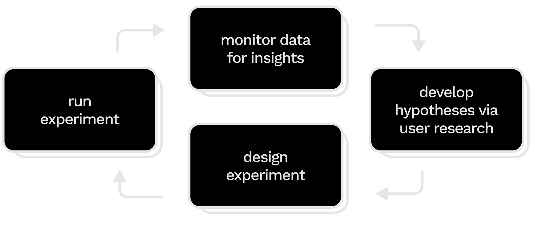
Monitor data for opportunity areas. Consumer profiling, events dashboards, and ongoing experimentats clue us into potential inflection points in the user experience where optimization has an outsize impact on retention.
Develop hypotheses via user research. Field research and interviews shed light on opportunity areas, while user testing and usability testing can start to loosely pre-validate hypotheses and refine rough prototypes.
Design experiment. We align as a team around the strongest and most varied hypotheses which form an experimentation plan. We define key and guardian metrics, duration, and cohort size.
Run experiment. Using careful guardrails we launch a series of tests. If a treatment moves the primary metric without negatively impacting the guardian metric, we roll out the treatment and move onto the next phase.
Diagnosing & reversing the sources of attrition.
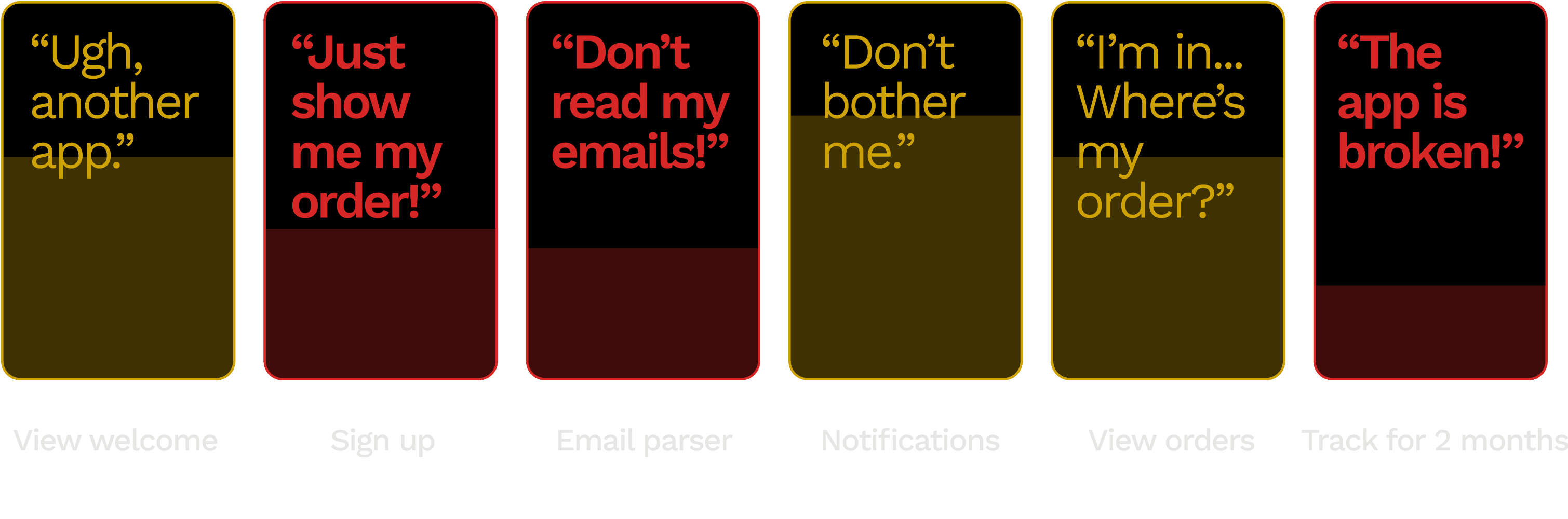
Hundreds of thousands of users were dropping off the app before ever tracking.
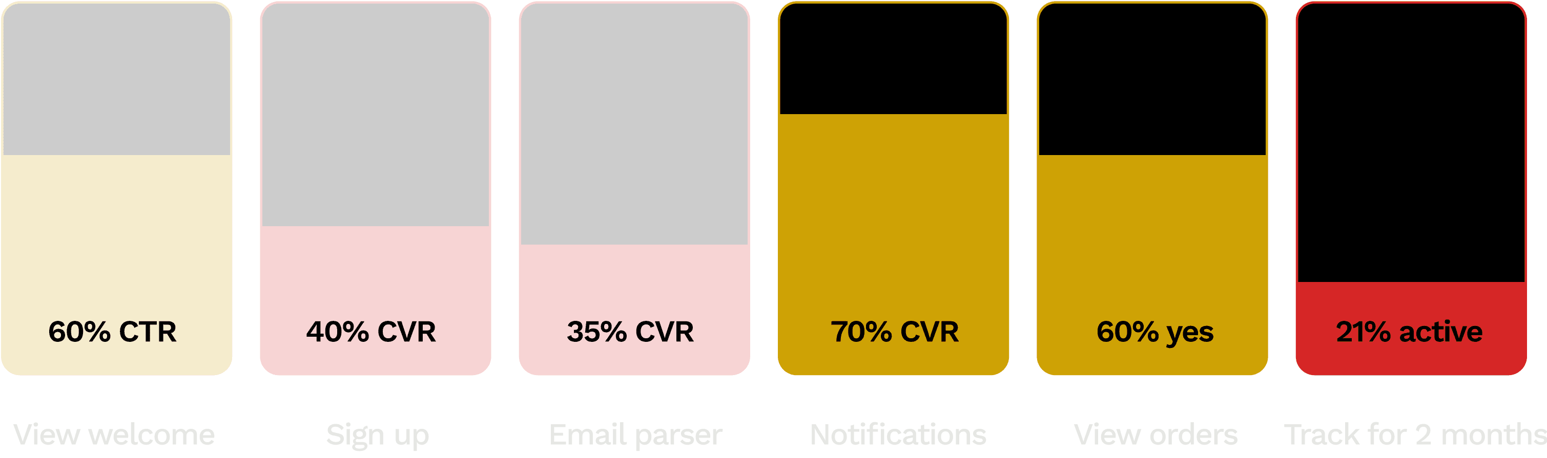
40% of new users skip the email parser step have a broken first tracking experience and churn. skip the step where Route parses orders from their email.

Users want to track without conceding private info or committing to a service. At least, not before they’ve been impressed by Route’s tracking.
Every week we reviewed user data and brainstormed new hypotheses to test, refining as we observed results.
After a year of experiments, our onboarding optimizations slowed attrition, doubled account creation and month-2 retention, and increased MAU by +50% YoY.
How we got there
Incremental testing ensures steady growth.
THE OPPORTUNITY
Shift from a culture of big bets to incremental validation.
Route, which had a design-dominated culture, had relied on experimentation as a way of validating big bets. This approach had failed to produce growth, because the bets were made on assumptions rather than evidence.
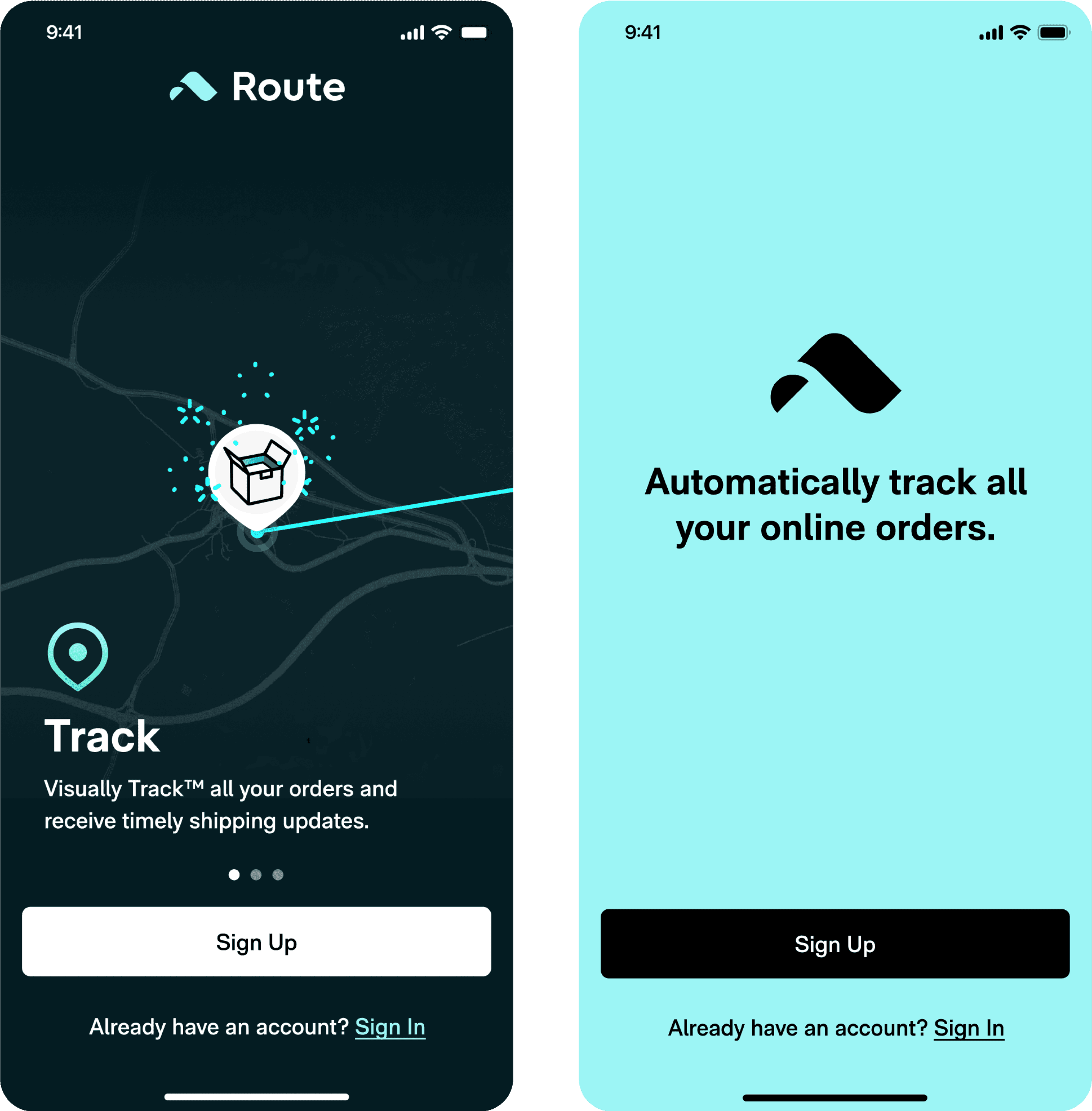
In one such “big bet” experiment (above), we tested a wholesale new welcome screen (right) to fix the messiness of a poorly performing control (left), but discovered it tested 7% worse. We gained nothing by running the test.
DEVELOPING EXPERIMENTAL RIGOR
To grow steadily, test one hypothesis at a time.
When we rebuilt ourselves as a true experimentation team, our core principle was incrementality. Requiring that every test only change one variable meant that we could attribute key metrics to a single variable 100% of the time. No need to repeat experiments or throw results away.
If the treatment wins: you’ve proven that users respond positively to that change, and continue to optimize.
If the treatment loses: you’ve proven that users respond negatively to that change, and optimize in the reverse direction.
STARTING A USER RESEARCH DISCIPLINE
I built a foundation of 1,000 user tests, interviews, & studies to support my team's hypotheses.
Journal studies
Participants self-recorded their shopping and tracking behavior participated in daily check-ins where they answered questions.
User interviews
I conducted user interviews with high-volume shoppers, including Route users, non-users, and users who dropped off onboarding.
User tests
Users ranked, sorted, rated, and gave open ended responses to unmoderated tasks on UserTesting.com.
Usability tests
We observed users interacting with experimental prototypes, going through onboarding, and tracking packages.
Focus group
We led a focus groups to discuss major pain points in the post-purchase ecosystem. Users shared tracking and shopping habits.
Feedback monitoring
We built a dashboard that aggregated user sentiment and flagged common complaints and pain points.
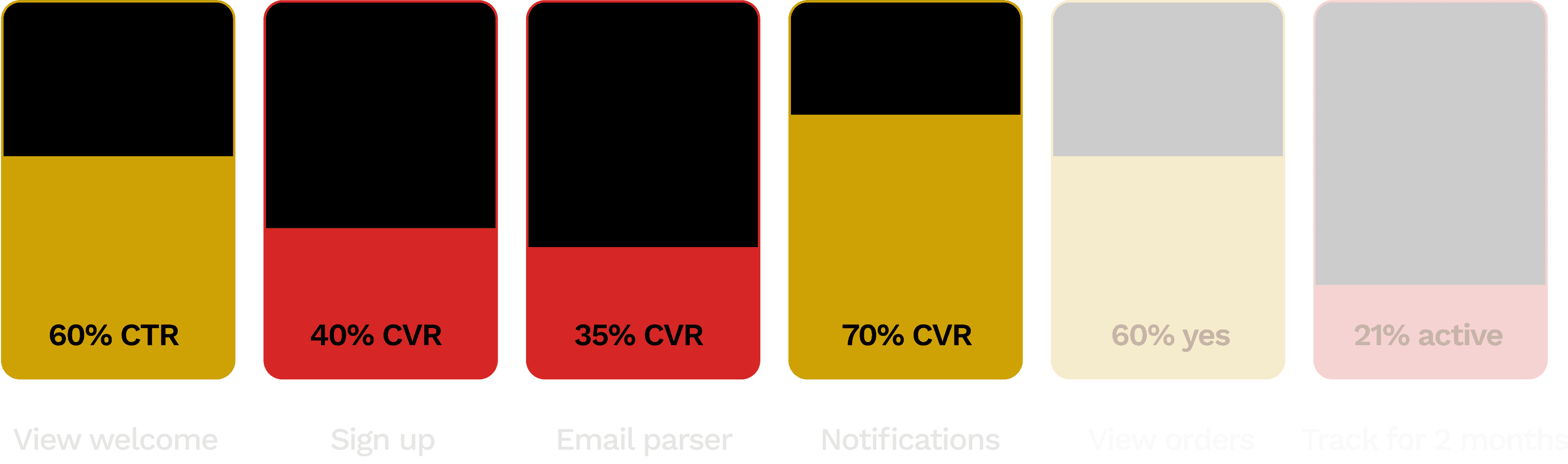
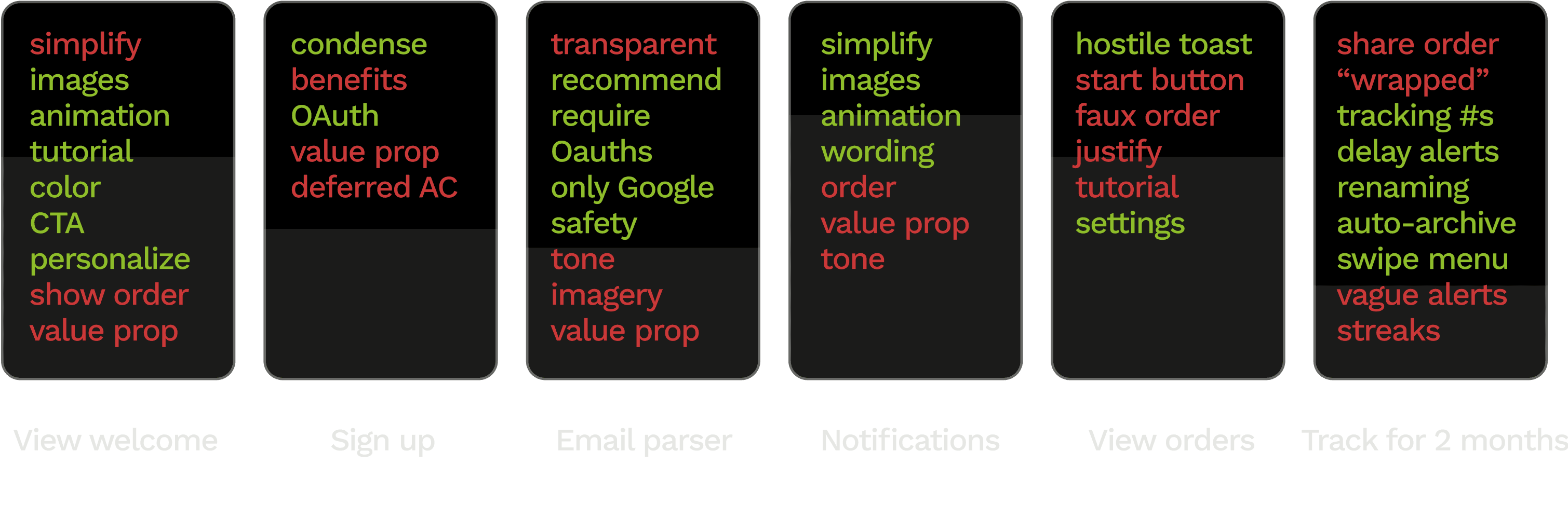
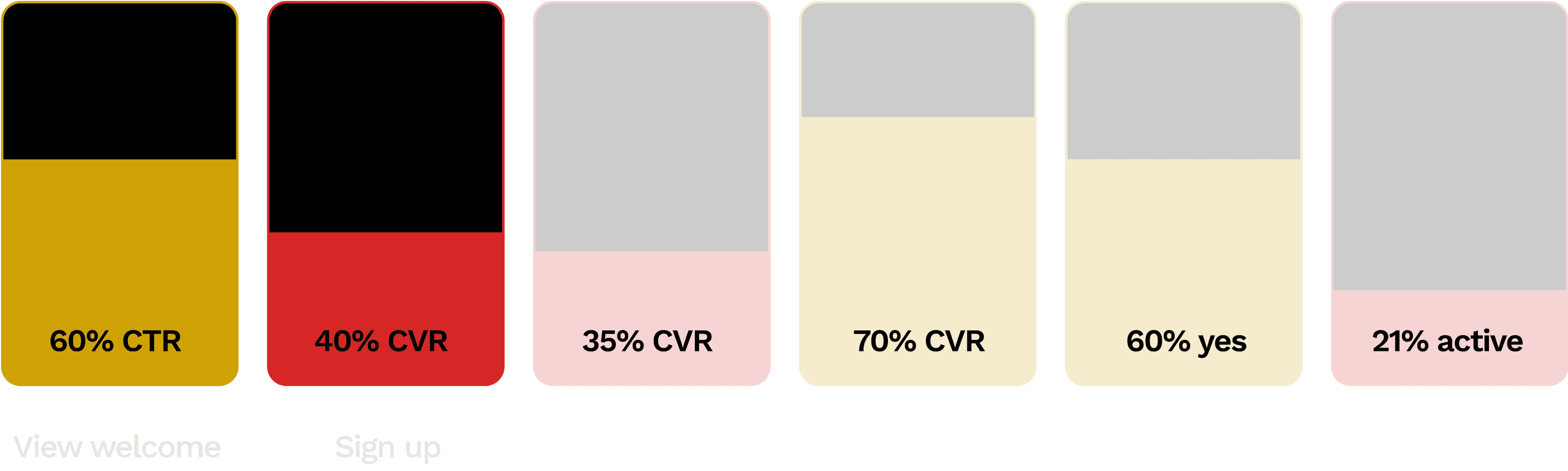
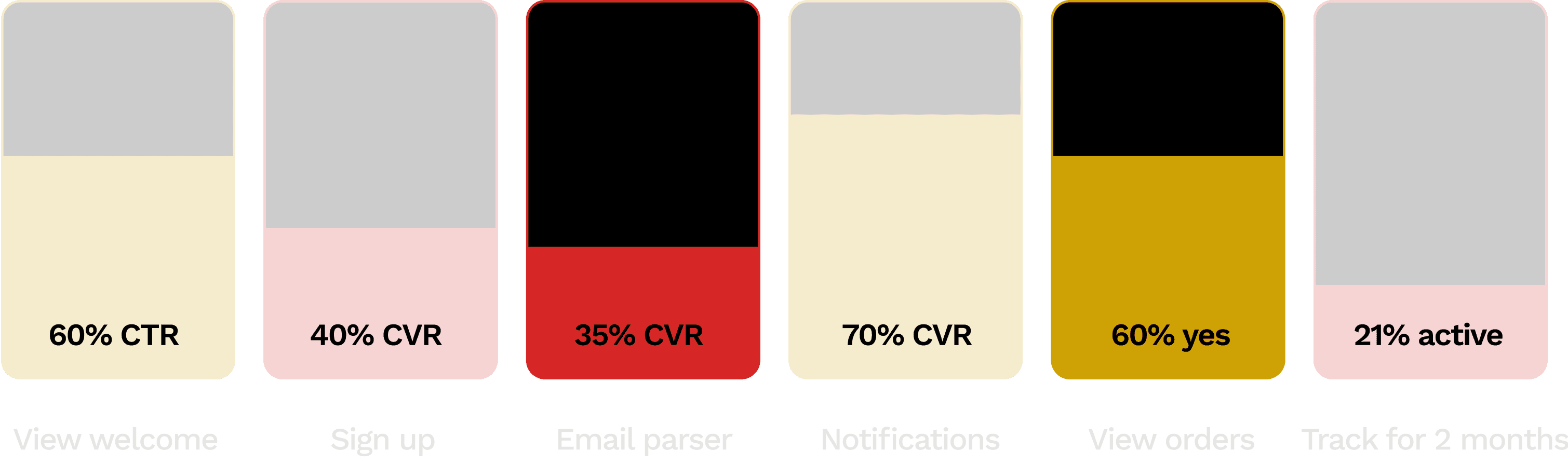
Legend
Small lift
Big lift
Big drop
No change
*Guardian metrics monitor for cannibalizing effects as your key metric improves, e.g. shortening onboarding might improve completion but could tank retention. Usually you want to see your guardian metric unchanged.
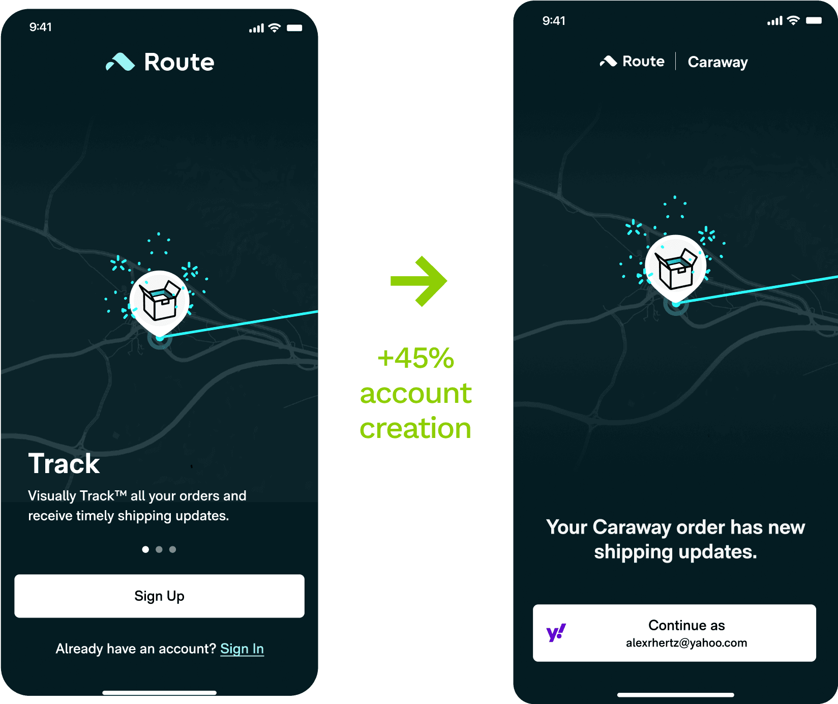
Account creation
Hundreds of thousands of motivated users drop off before ever tracking.
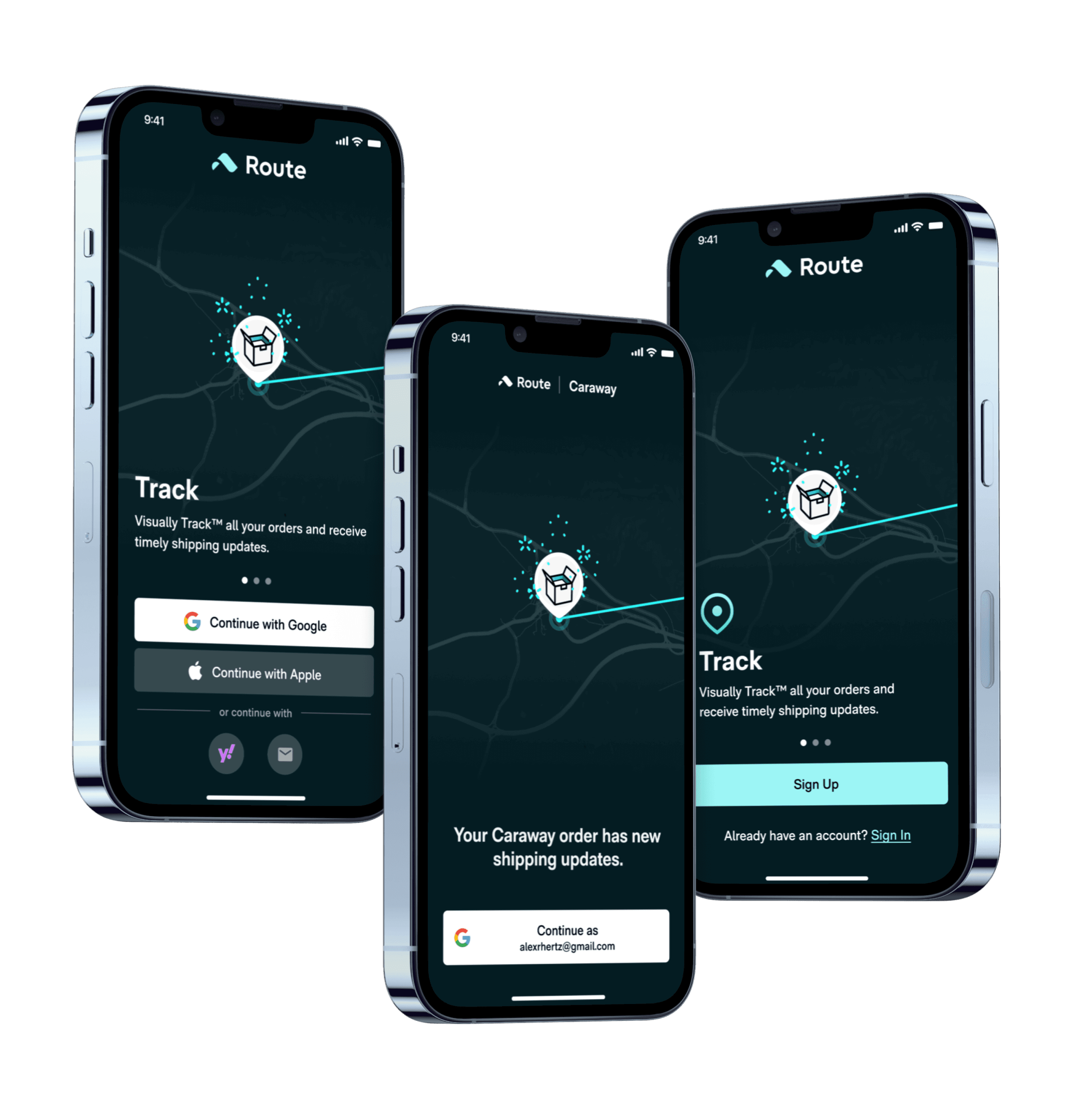
CTA test
We tested a range of CTAs against the control (“Sign Up”). The “Continue” treatment significantly improved clicks compared to a passive treatment (“allow”) and value-forward treatment (“start tracking”).
Clicks
Parser (guardian)
M2 retention (guardian)
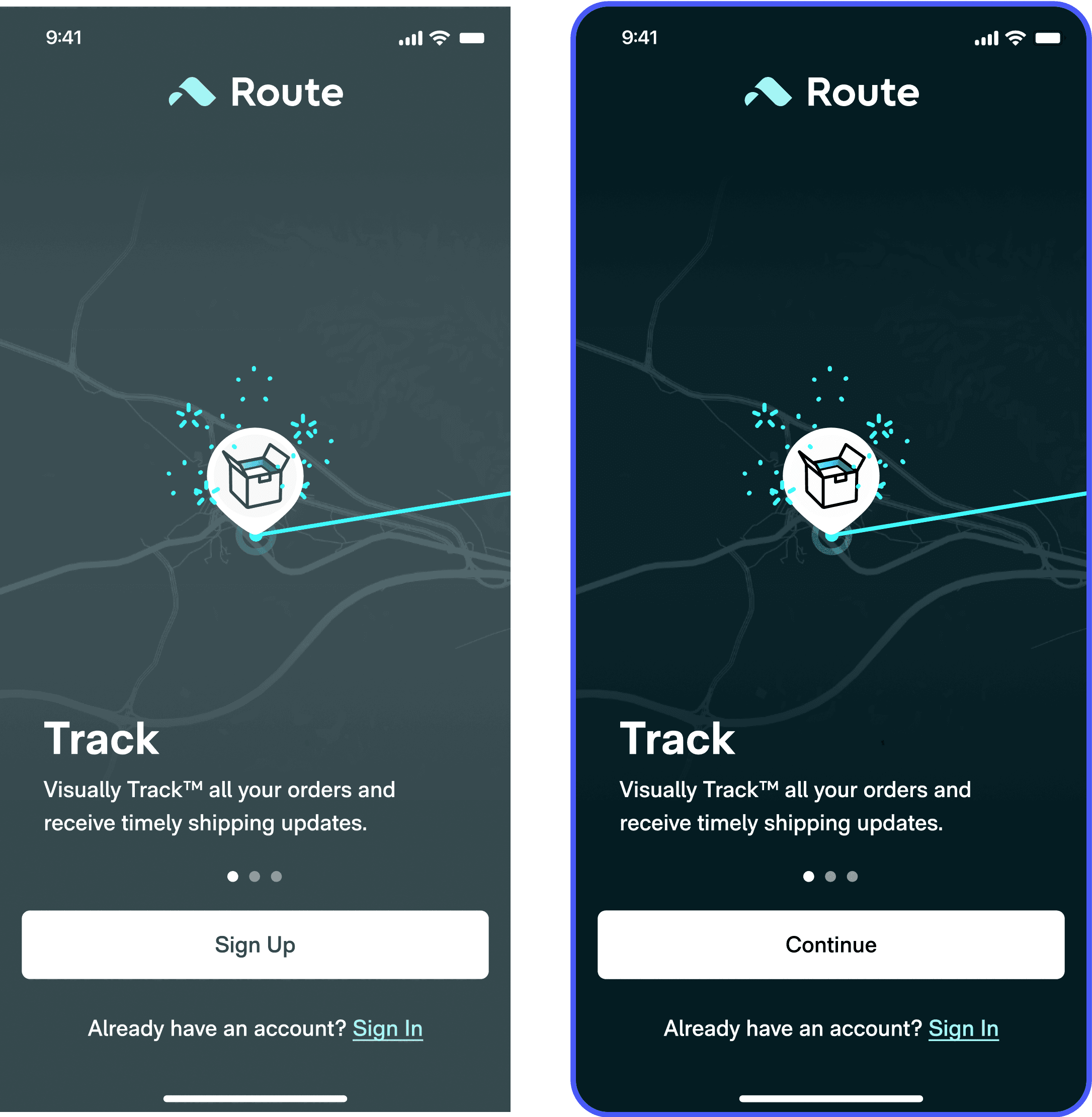
Users are more comfortable with actions that are non-commital. “Continue” is an optimal CTA in most cases.
Combined welcome screen test
We tested a single page signup + welcome screen with Oauth buttons to mixed results. Account creation grew a whopping +14%. But our guardian metrics decreased, suggesting we’d introduced friction somewhere.
Clicks
Parser (guardian)
M2 retention (guardian)
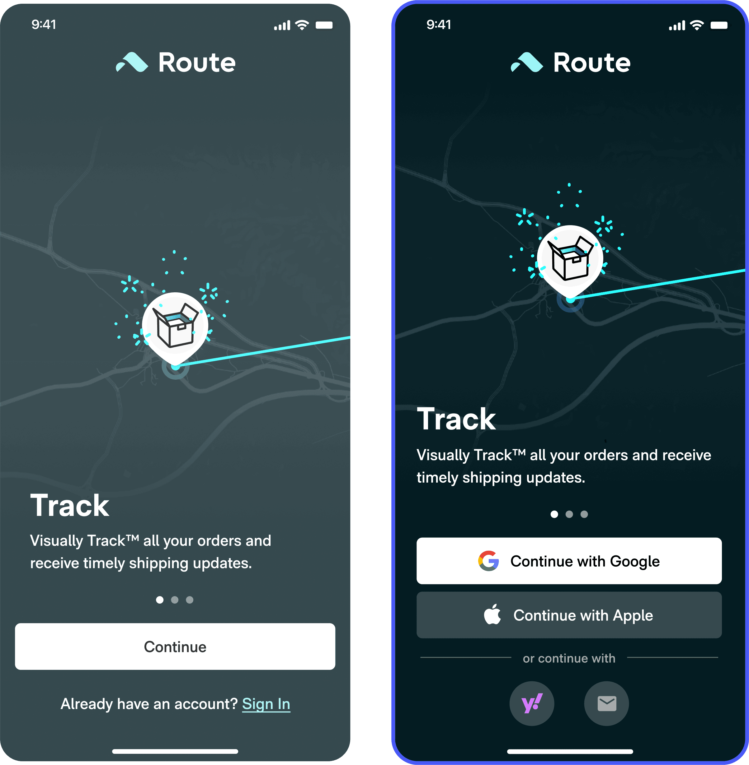
OAuth buttons feel intrinsically faster and easier because they’re associated with shortcuts. Use, if possible.
Weighted buttons test
90% of Route users use Gmail, but a significant portion of these users were account creating with Apple Oauth. Deprecating Apple Oauth funneled more users into Gmail account creation, which resolved the parser confusion created in the prior experiment.
Clicks
Parser (guardian)
M2 retention (guardian)
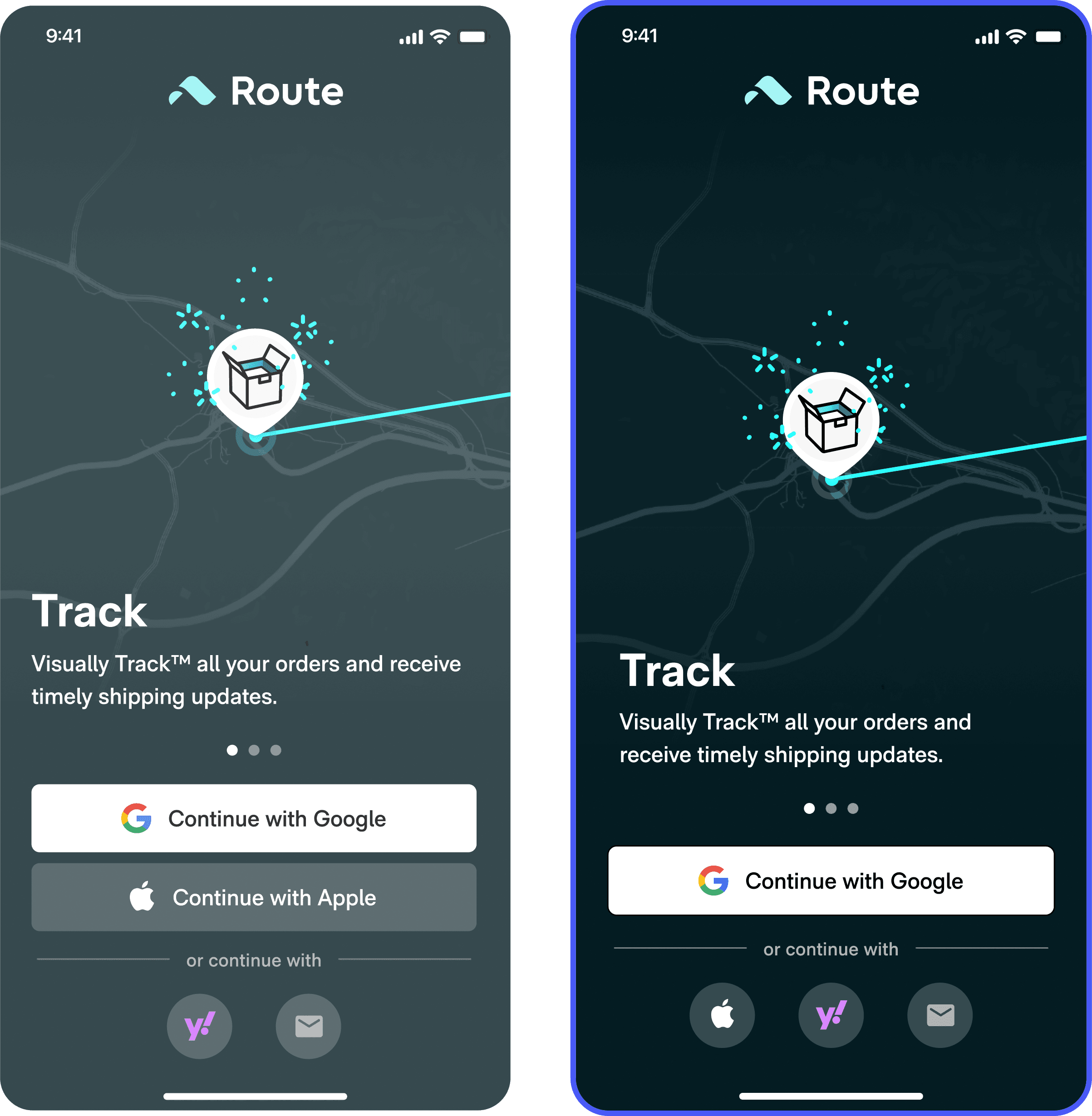
User selections are malleable. Visual emphasis and choice reduction are significant drivers.
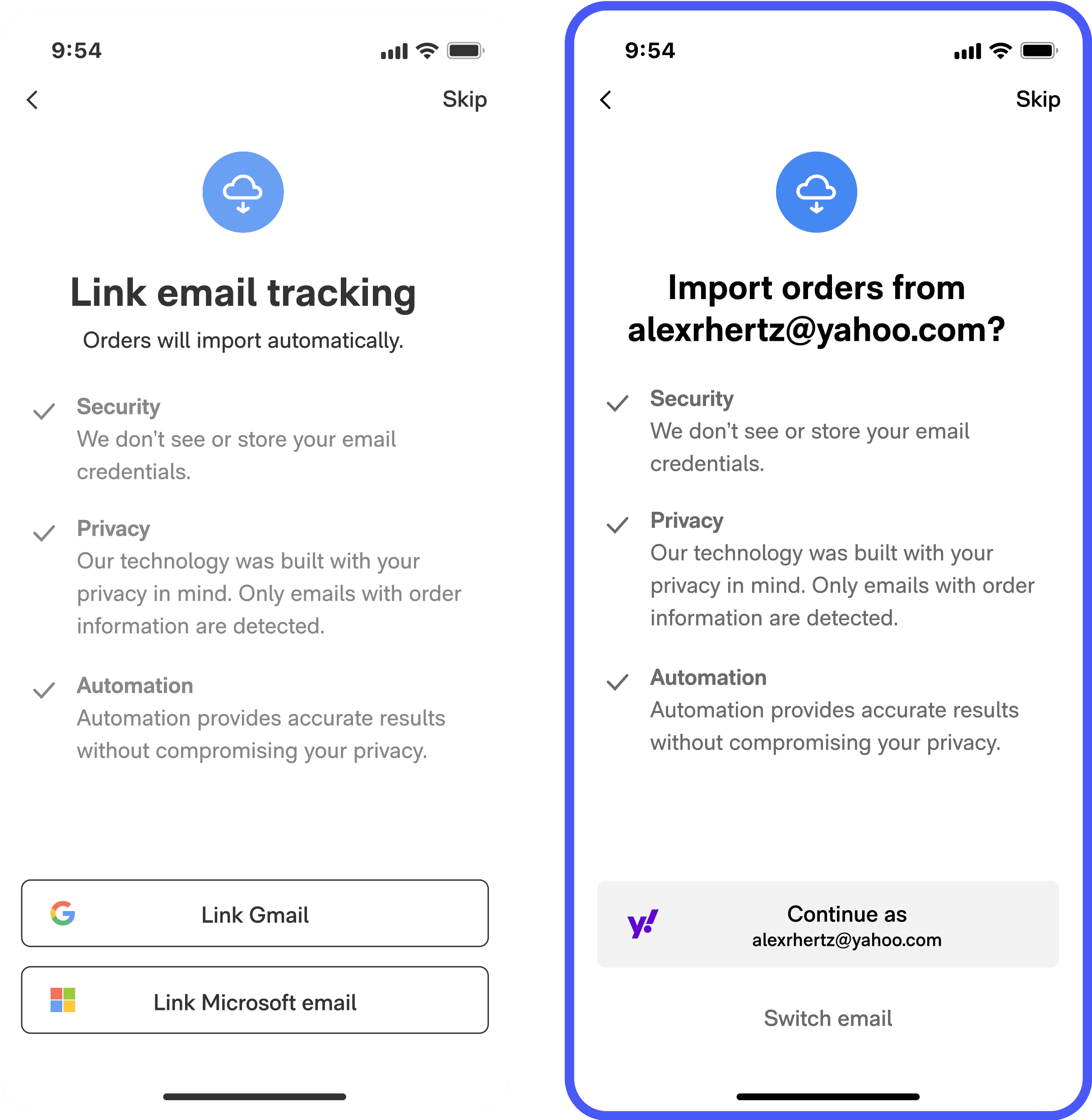
Personalized onboarding test
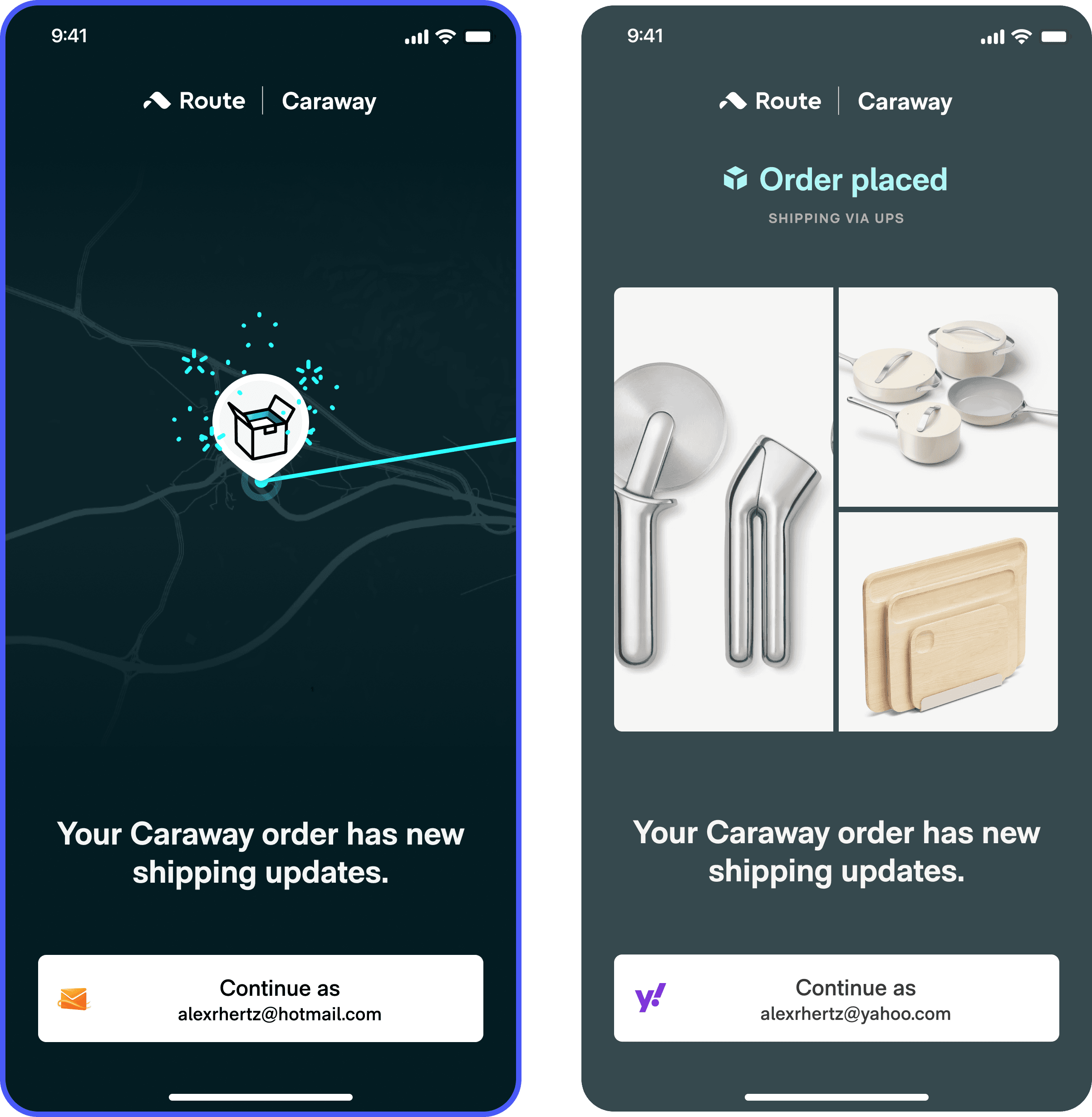
Data still showed that a lot of users were account creating – and then importing orders from – emails that they didn’t shop with. What if we could know the order they shop with, and make them account create with that?
We turned the Route download button on a user’s order confirmation into a deep link and tested showing only the email associated with the order. Account creation took off, and along with it parser connections and retention.
Clicks
Parser (guardian)
Orders detected
M2 retention (guardian)
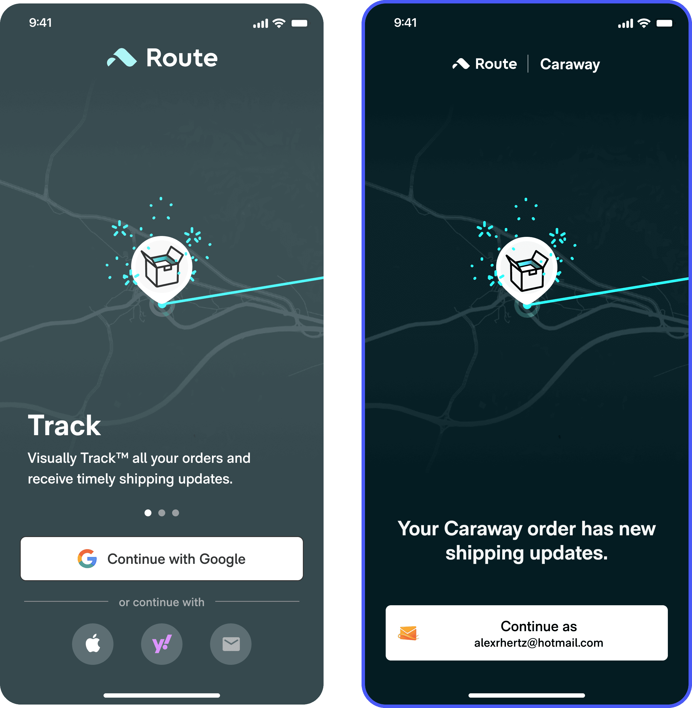
Forcing a user to account create with their shopping email guaranteed that all users would have orders detected. As a result, 100% of users with active orders started tracking.
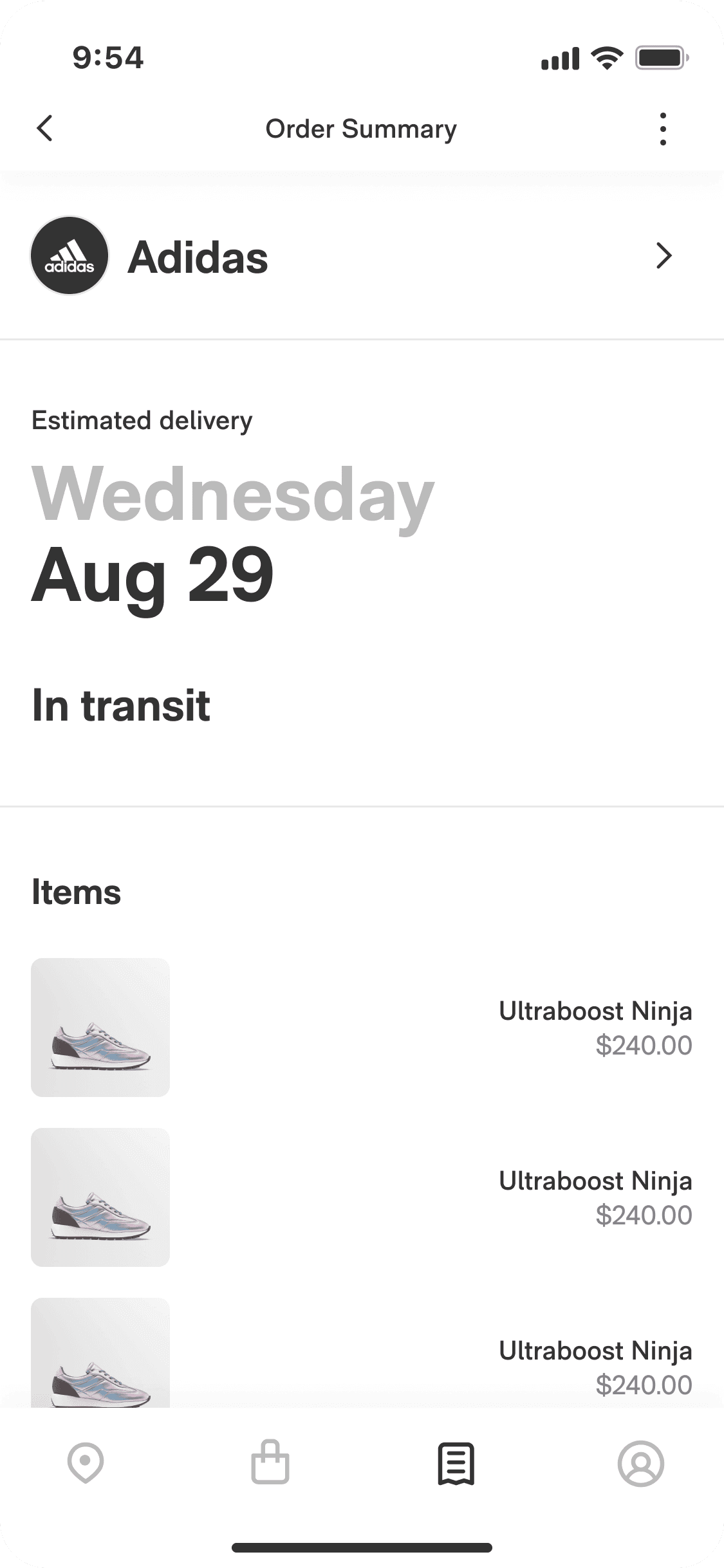
Order details test
We additively tested showing package status and contents on the welcome screen, which dropped clickthroughs as users didn’t feel the need to account create any longer.
Clicks
Parser (guardian)
M2 retention (guardian)
Witholding information can, in the right context, motivate users and provide a better overall experience.
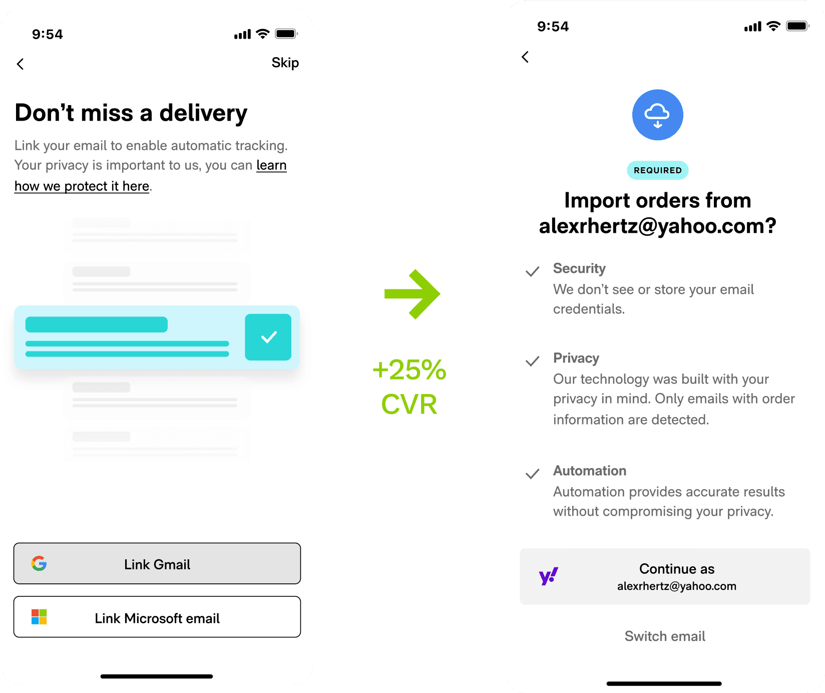
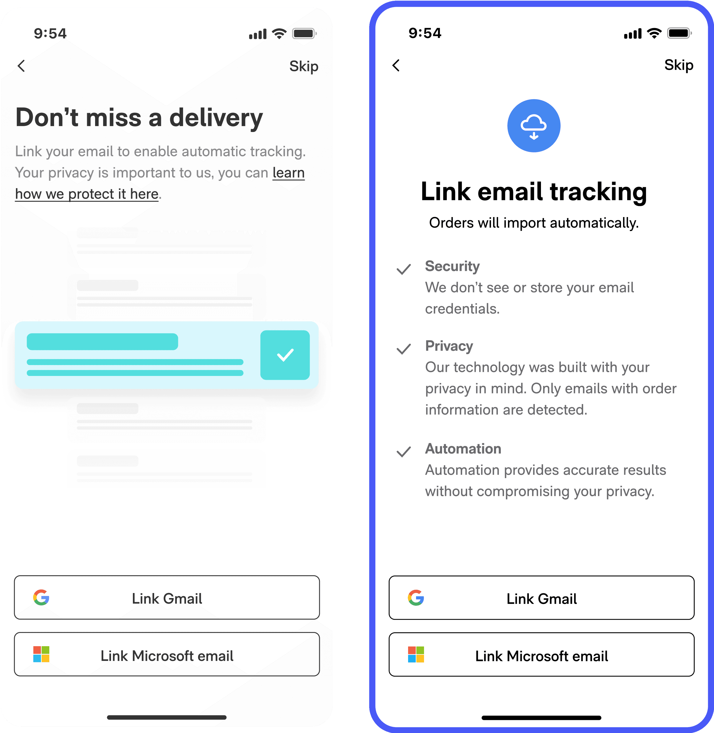
Parser connection
Required for tracking, only 40% of users synced an email to the parser.
Transparency
Users were very suspicious about Route parsing their emails for tracking info. We ran an additive test series where we swapped the fancy “importing animation” for information about data privacy. The effect was polarizing - more users connected emails, but more users dropped off rather than skip. The net result was still very positive, since email connection is closely tied to retention.
Clicks
OAuth parser connection
Onboarding completion (guardian)
Orders detected (guardian)
Calling attention to privacy makes motivated users feel safer but may scare off unmotivated users.
Foot in the door
To increase users opting in to parsing, we tested showing them a preliminary choice to track packages automatically or manually. After choosing automatically, a user would then be asked to link an email. We were surprised that this solution, which felt much simpler and agency-affirming, performed poorly compared to the control.
Clicks
OAuth parser connection
Onboarding completion (guardian)
Orders detected (guardian)
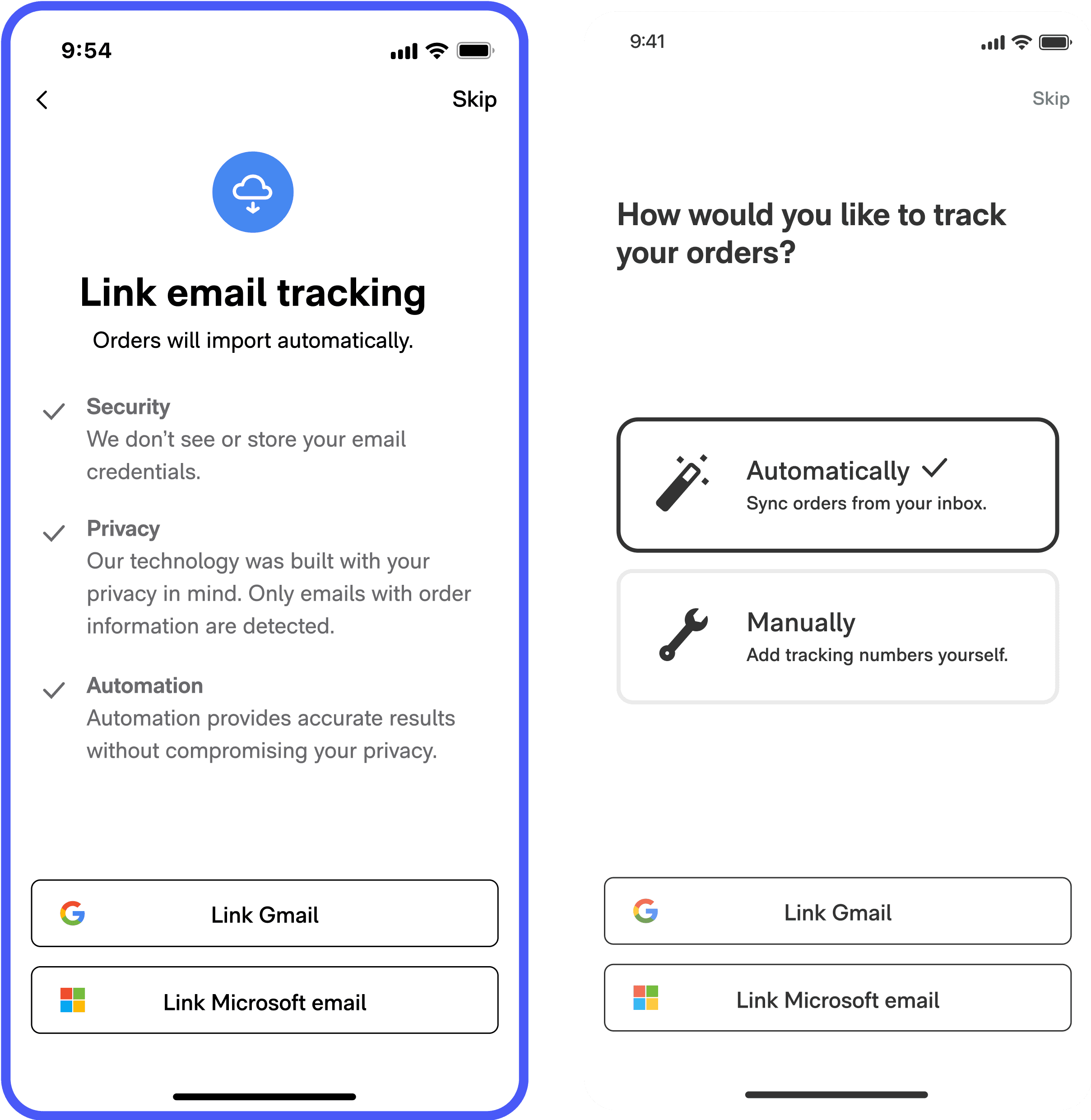
When it comes to sensitive information, transparency and authoritativeness trumps convenience and agency.
Personalized parser
The data showed that many users who connected Gmails had no order data. Reusing our learning from the personalized welcome screen test, we saw a massive increase in activation.
Clicks
OAuth parser connection
Onboarding completion (guardian)
Orders detected (guardian)
By making the email read permission passive (can we import from this email?) instead of active (link an email), users got the push they needed to connect to parser.
Make it mandatory
Users who opted out of the parser became churn risks; what if we simply required parser connection to ensure a good experience? When we removed the skip button, we recaptured users who wanted to track but were used to speeding through onboarding.
Parser CVR
Packages detected (event)
Month-2 retention (guardian)
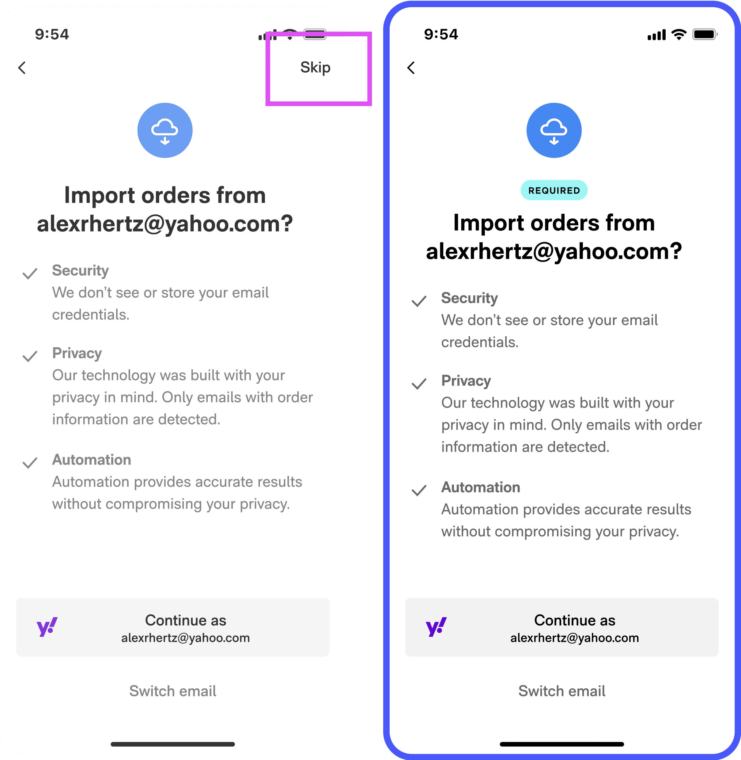
Users respond positively when you take a firm stand about what’s required to use an app. Skippability sends a signal that whatever the app is asking isn’t that important.
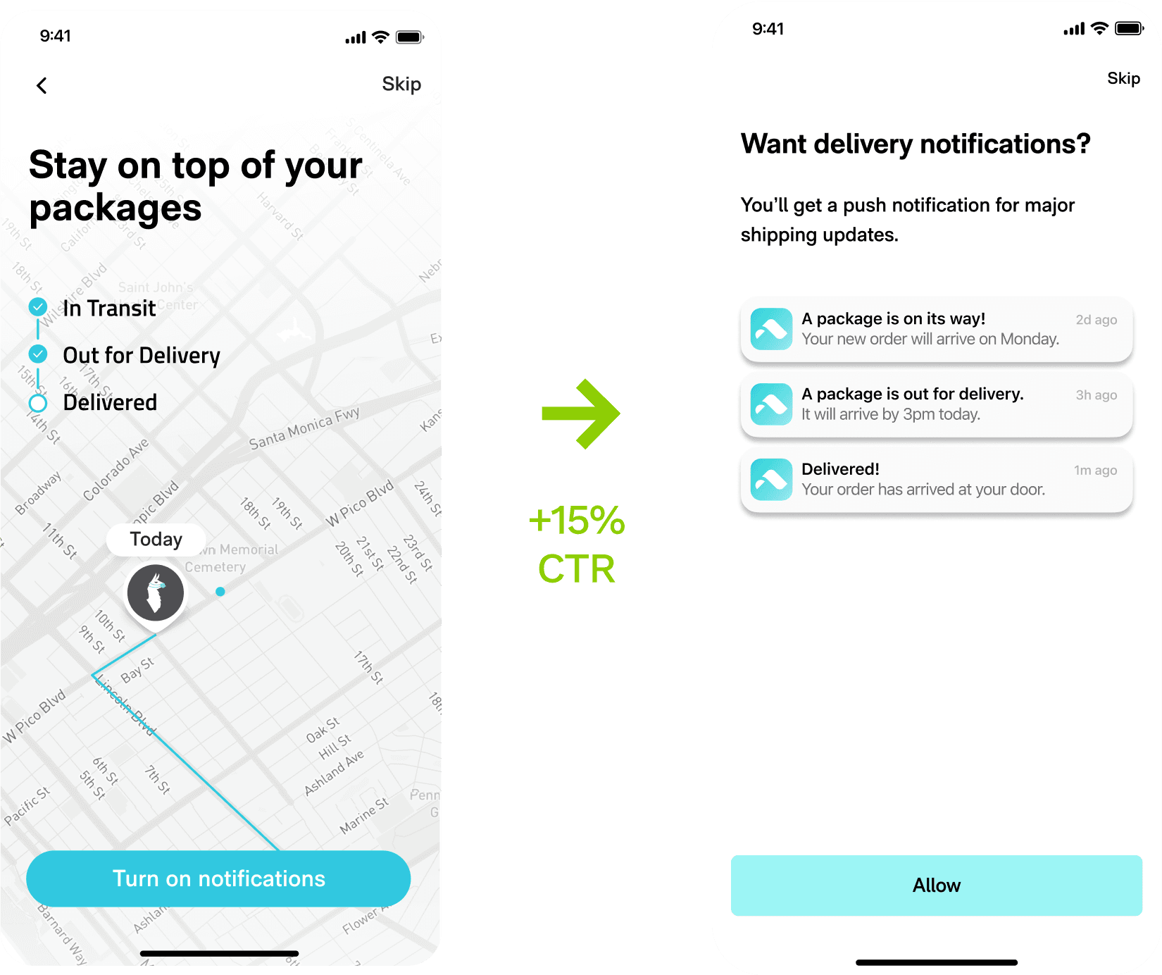
Notifications & Orders
Shipping notifications is a major inflection point.
Notifications prompt
Enabling notifications was a pre-indicator for retention, which made it an important inflection point. Additive testing validated a new treatment with clearer copy and actual animated pushes, which any user rushing through onboarding could recognize as valuable.
Notifications CVR
Onboarding completion (guardian)
Month-2 retention (guardian)
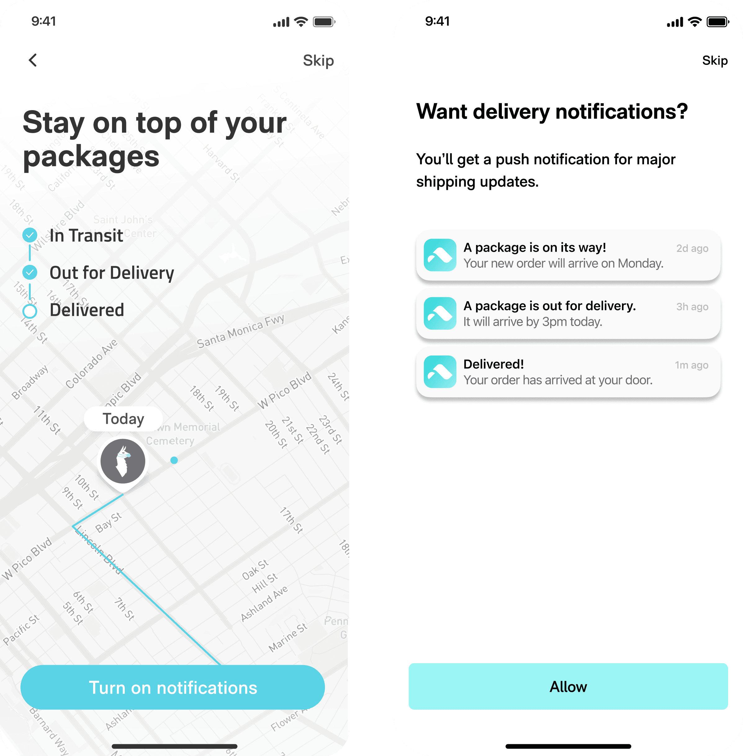
Prompts must be lean, conversational, and contain keywords. Clarifying images help too.
Amazon sign in
Amazon packages require that a user sign in to their account to sync with Route. If a user connected to parser, we prompted them to connect Amazon as well. The existing prompt was vague and performed poorly. In our additive test, clearer instructions and visuals bumped up sign-ins by 40%.
Amazon sign ins
Onboarding completion (guardian)
Month-2 retention (guardian)
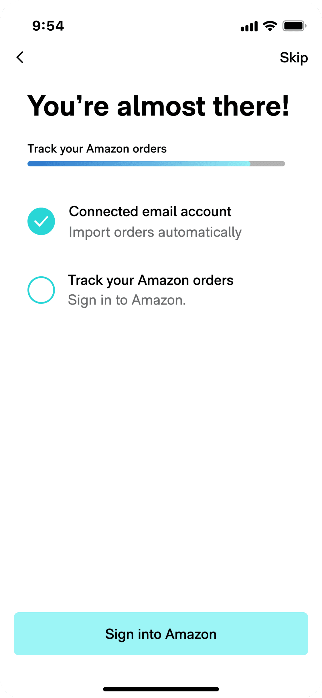

Just like the notifications test, we validated that users respond to clarity and simplicity.
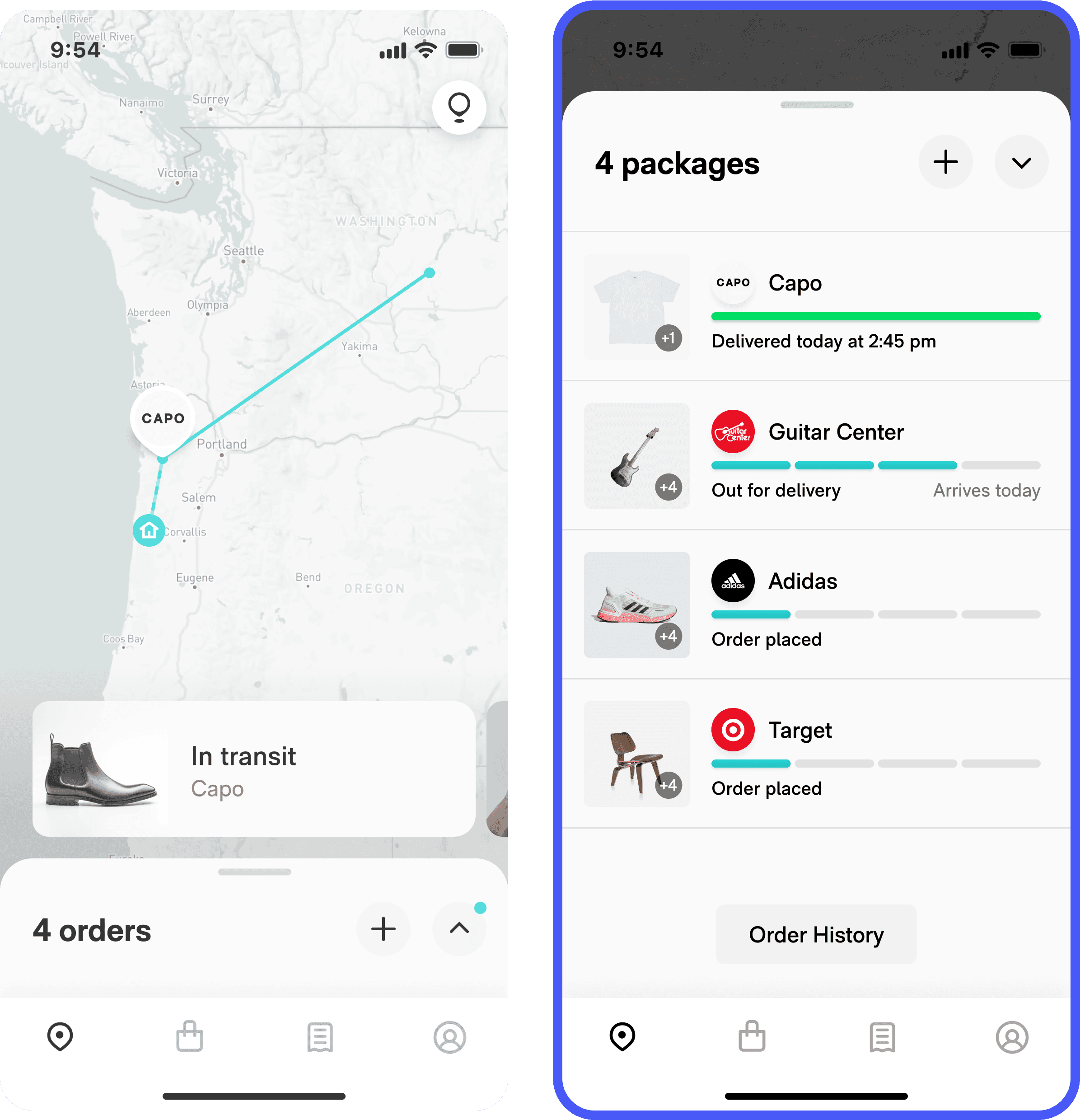
Linked account
Users would frequently have their Amazon and email accounts disconnected, then ignore a toast asking them to reconnect. We tested adding a dedicated linked accounts section on the profile, which made it easier for users to connect or reconnect their orders.
Linked Amazon accounts
Linked emails
Month-2 retention (guardian)
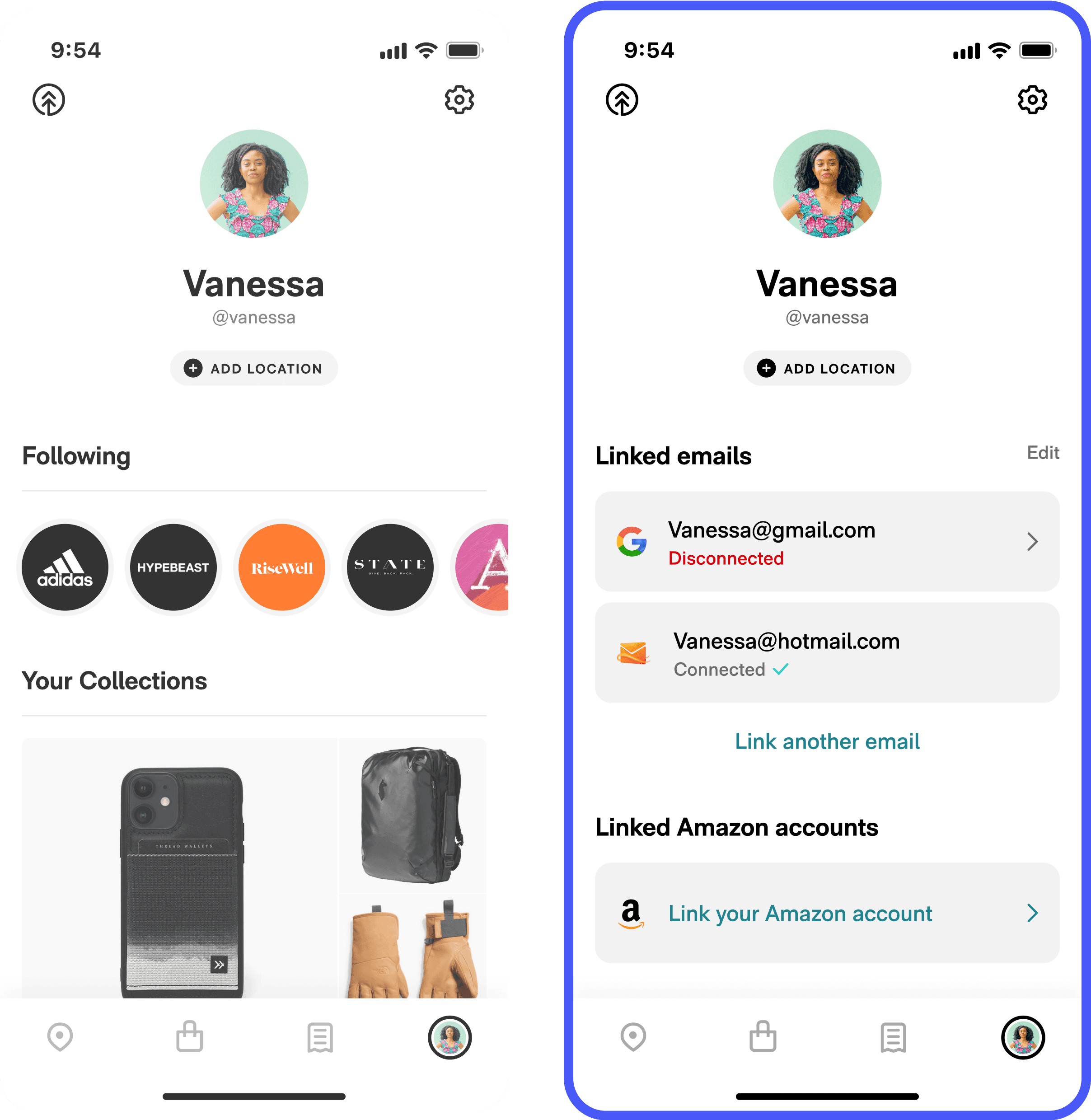
Users may procrastinate solving a problem like a disconnection. We must support delayed problem solving.
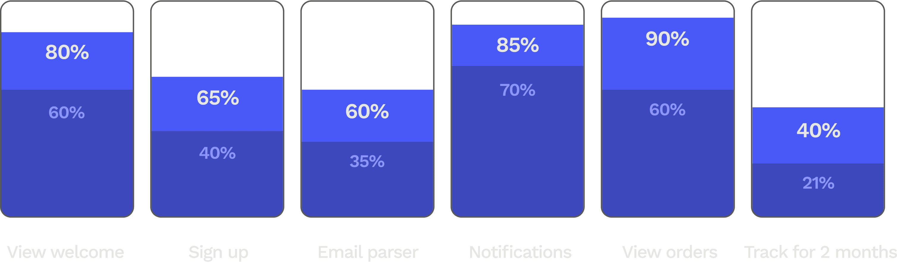
New user experience
Easing pressure points in the core experience to lift retention.

Sorting by arrival
We tested a variant that sorted packages by arrival against the control which sorted by last updated. This huge improvement to scannability made retention shoot up.
Week-2 retention
Month-2 retention
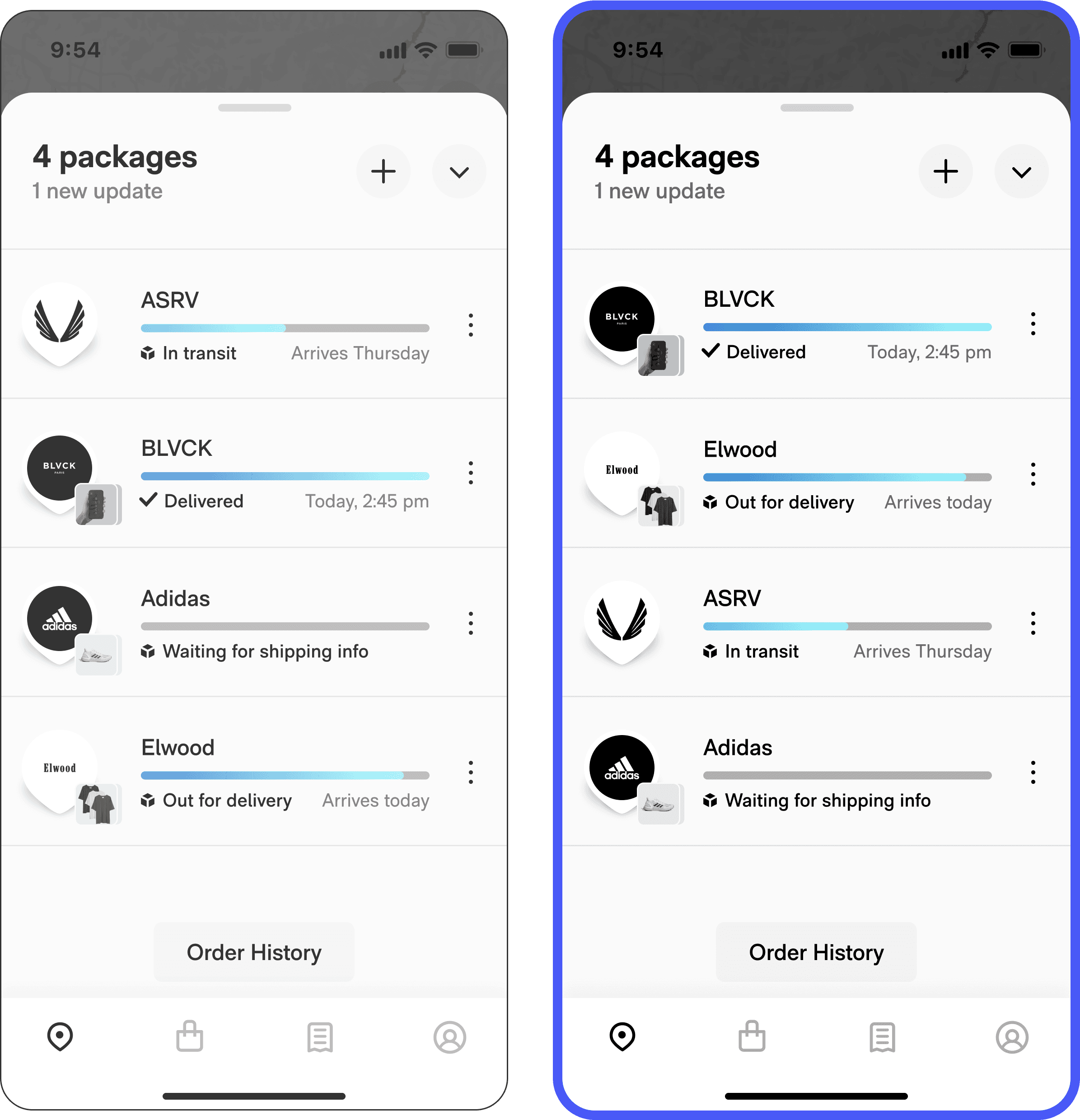
Scannability and orderliness reinforce habitual behavior. A usable but confusing design choice could tank retention.
Images & progress bars
We ran an additive test with larger item images and staged progress bars to improve scannabilty and habitual use.
Week-2 retention
Month-2 retention
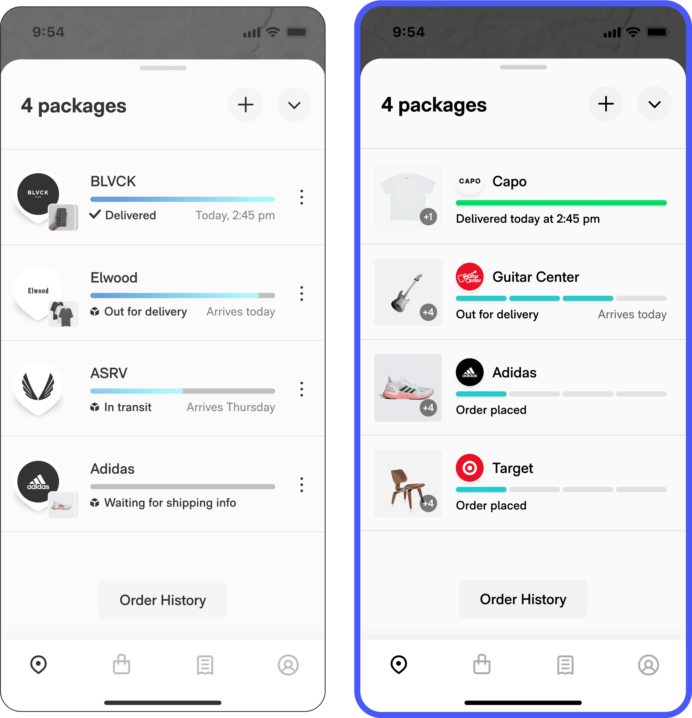
Every detail, if optimized, can promote or harm habitual use. Visual hierarchy and clarity are subtle but crucial differentiators between functionally similar apps.
Tracking links
Users were skeptical of Route’s tracking accuracy, so we hypothesized that there was a hidden need to verify tracking via the carrier. A treatment that surfaced clickable tracking links lifted session frequency and retention.
Session frequency
Month-2 retention

We were surprised that helping users view our competitors’ data helped us. Short term concessions can yield long term loyalty, as long as convenience is on your side.
Trust test
Users complained about Route’s unreliability, despite having industry-standard accuracy. We tested showing new users a prompt introducing Route’s estimated delivery day ML feature, and they responded by trusting the app more, with less sensitivity to parser error.
Love dialog response
Month-2 retention
Map viewed (guardian)
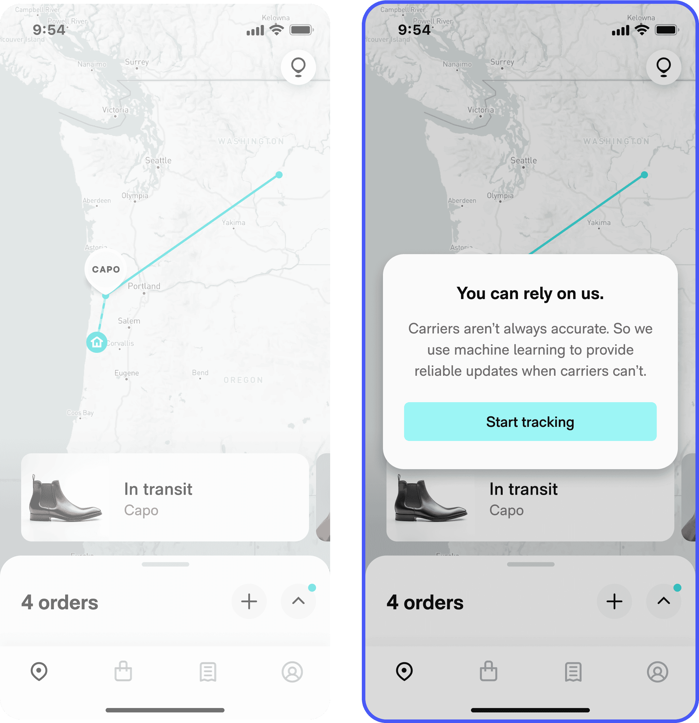
Being transparent about tracking accuracy showed awareness, even if it didn’t actually solve the issue. Users may have reconsidered turning to less-aware competitors.
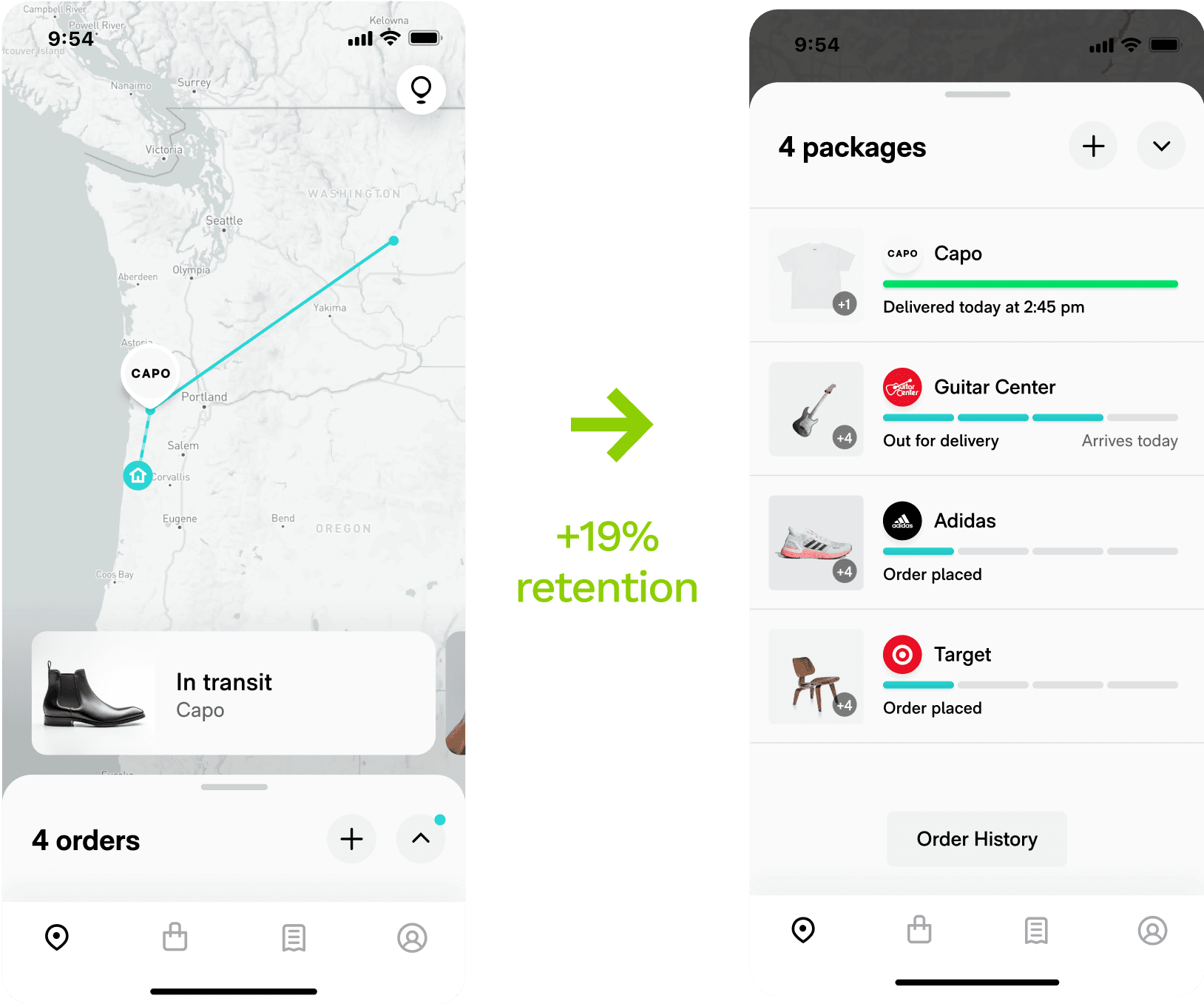
Tracking paradigm
We theorized that many users didn’t like – or didn’t understand – the unique way that Route tracked packages on a map. Data showed that barely any users interacted with the map, leading users to either drop off or open the deprecated tracking drawer. We hypothesized that showing a list as the default view would make it easier to track.
Month-2 retention
Session frequency
Session length (guardian)
Users with multiple packages have a much easier time digesting that information in a list than in a carousel.
Impact
Acquisition improved by 45%.
Activation by 30%.
Retention by 19%.
+45%
+19%
+30%
Reflections
You don’t know what you don’t know. That’s an asset.
I was lucky to have such kind and patient mentors on my team like Dylan (data), Jon (growth), and Matt & Nicole (engineering). It took guts for them to push our design org to set aside ego and become data driven from the ground up.
Like trying to anticipate the ups and downs of the market, product optimization can fool you into believing in patterns. And don’t get me wrong, there are observable patterns – clarity, simplicity, directness, value-forwardness, density. Users want to do something, and they want to do it fast.
But in practice, these patterns are not reliable predictors of behavior. Testing is essential in optimizing a flow like onboarding, where a single bad assumption will create compounding attrition.
In my experience, engineers and data and product already know this; it’s design that thinks we can predict the stock market because, after all, we’re supposed to have all the insights.
My time with the mobile experimentation crew at Route has shown me that these perspectives are compatible, and that a designer can exercise their vision and suspend certainty that they know what is going to happen.
Even a single screen with a handful of variables has a crazy amount of entropy, and the designer who is excited by that challenge has a definite advantage.