about me
work
Redesigning a tracking app to be best in class.
Challenge
Design a tracking experience that affords habitual use.
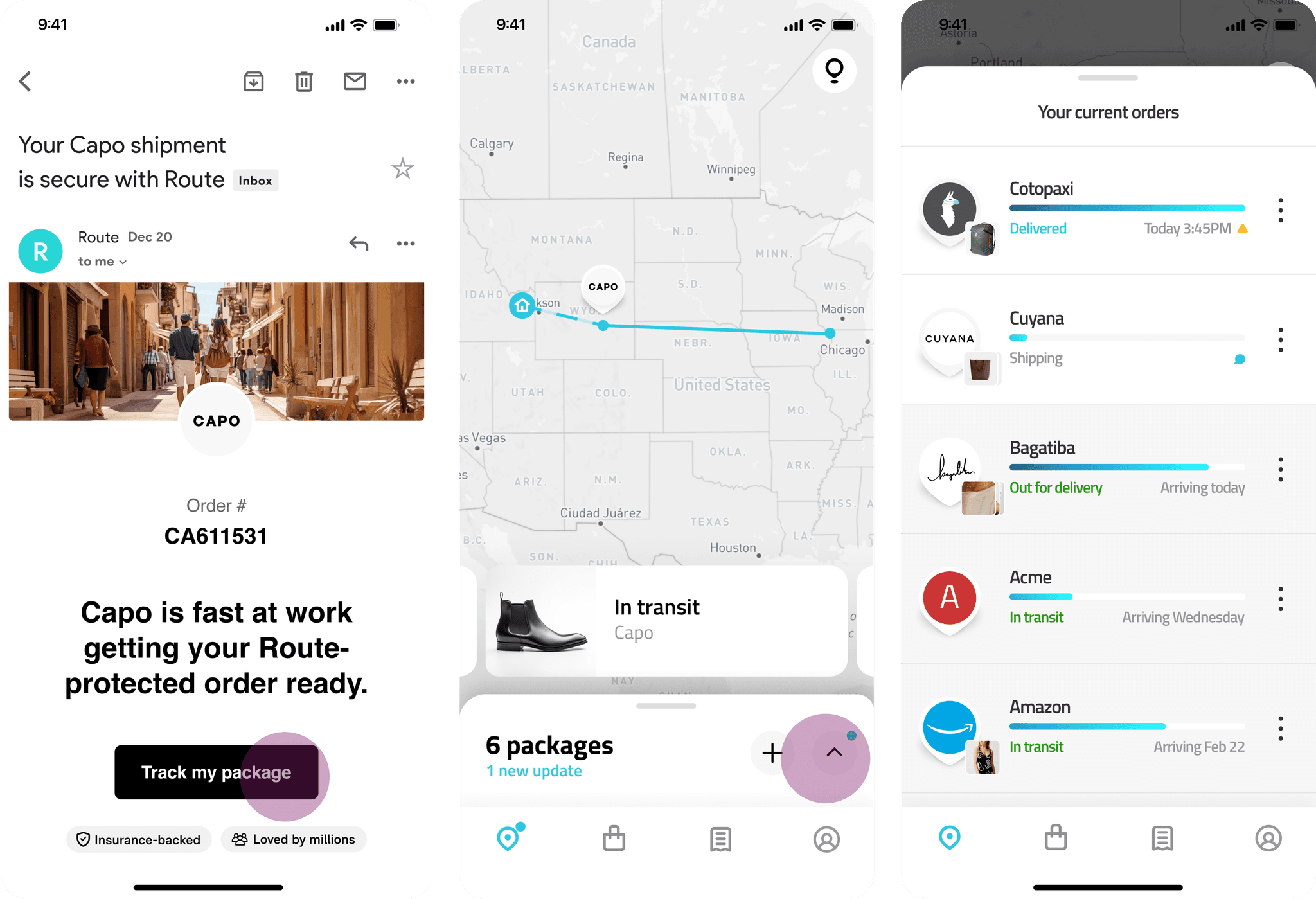
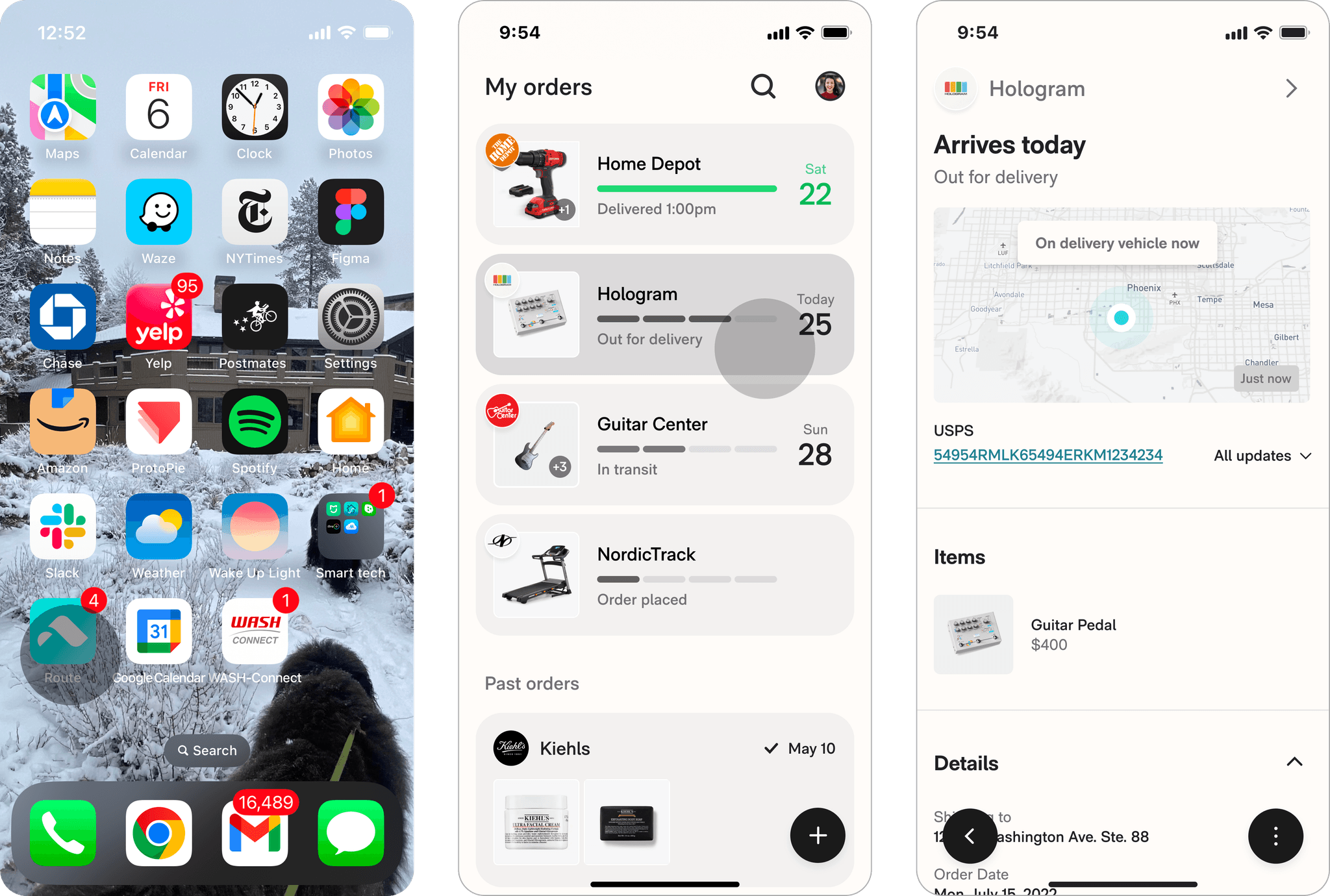
Route is a shipping insurance company with a free app that automatically tracks everything you buy.
When I was hired to lead Route's mobile team, new user attrition was around 80%. My priority was redesigning the app to improve retention and grow the user base.
I led the redesign over 6 months, working alongside a product manager, data analyst, and 4 engineers to ship core improvements and experiments weekly.
APPROACH
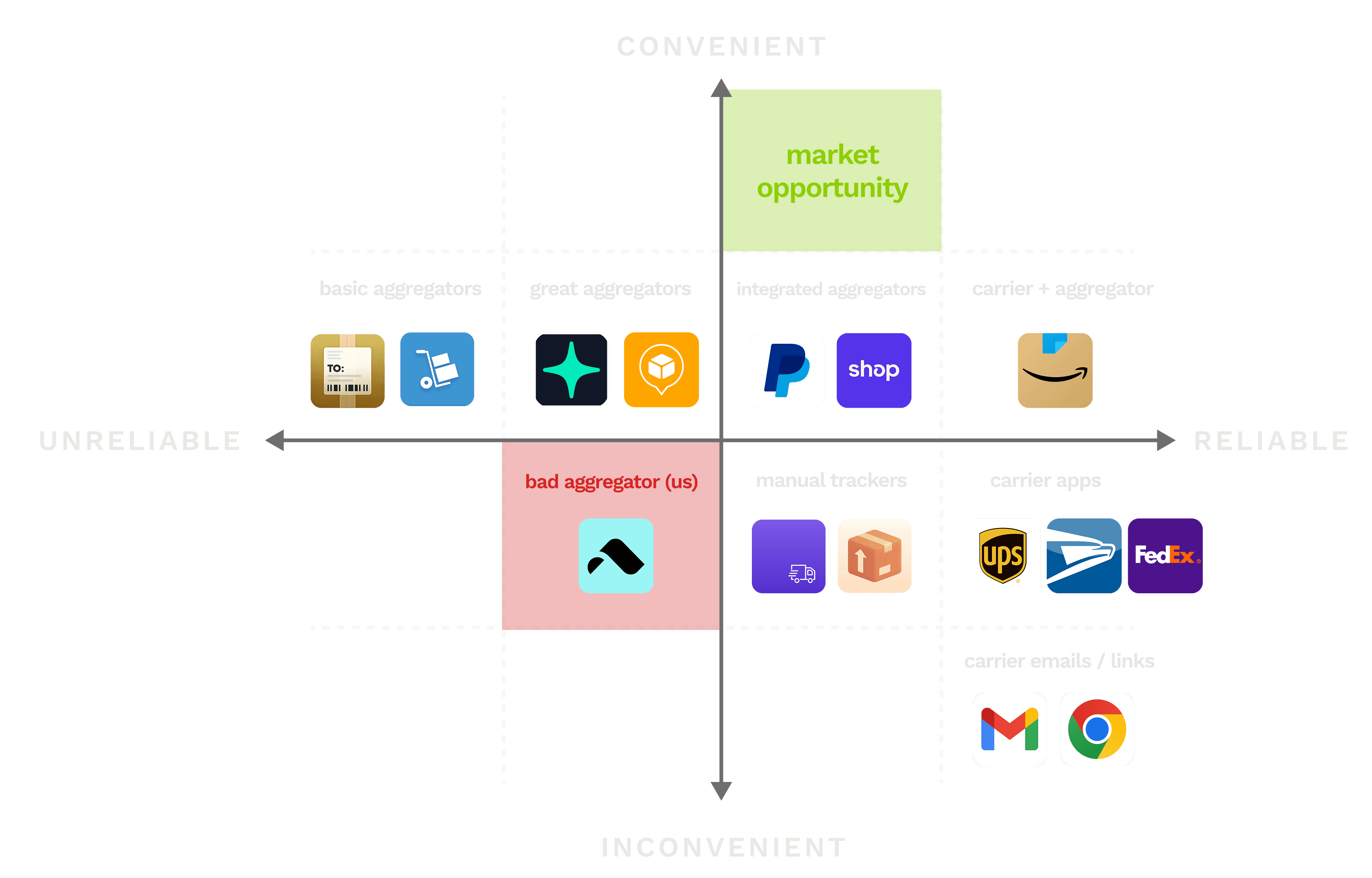
Study power trackers to find product fit and retention levers, then validate.
I partnered with Dylan, my data analyst, to break out personas using consumer profiling. We discovered that users who purchased 6+ orders in the past 28 days ("Power Trackers") were 4X more likely to retain.
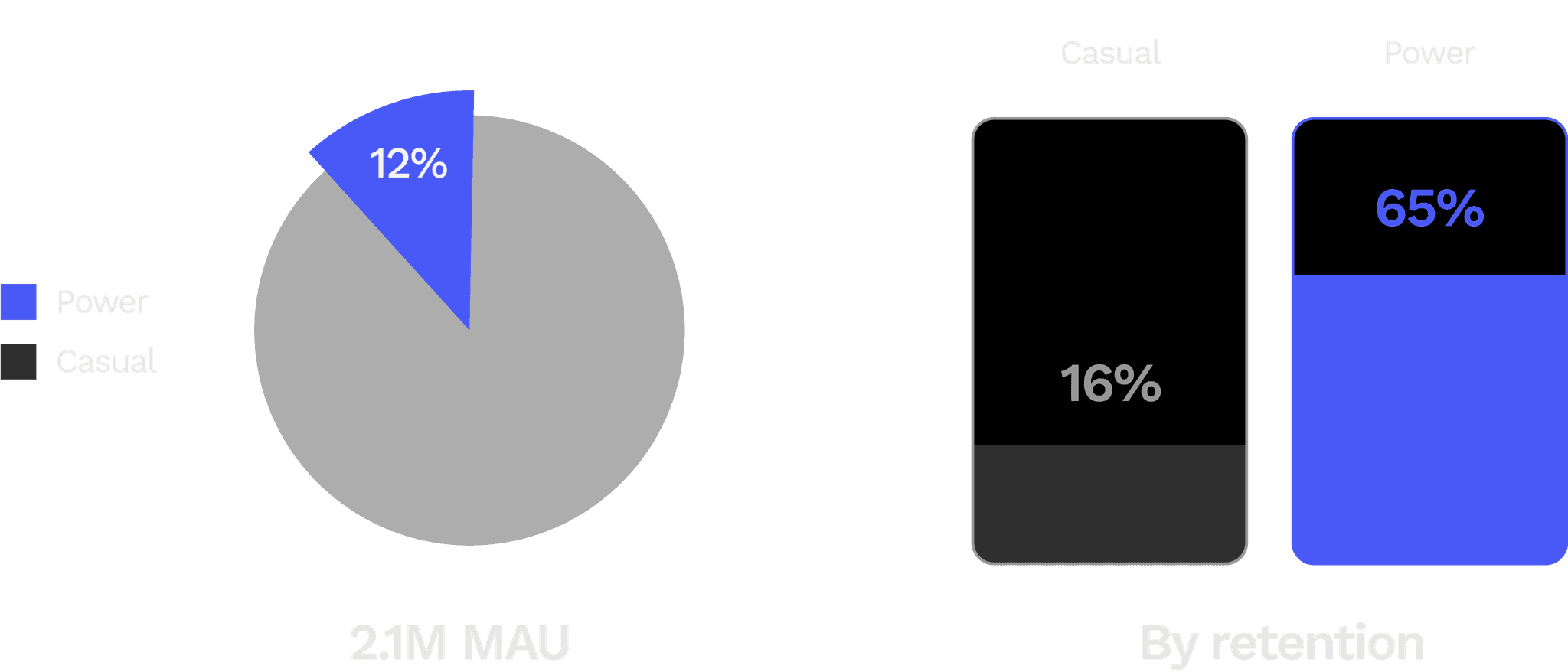
In interviews, Power Trackers told me that Route was by far the most convenient tracking app for tracking lots of orders at once. We decided to focus on this high-LTV-potential cohort and optimize multiple package tracking.
INSIGHTS
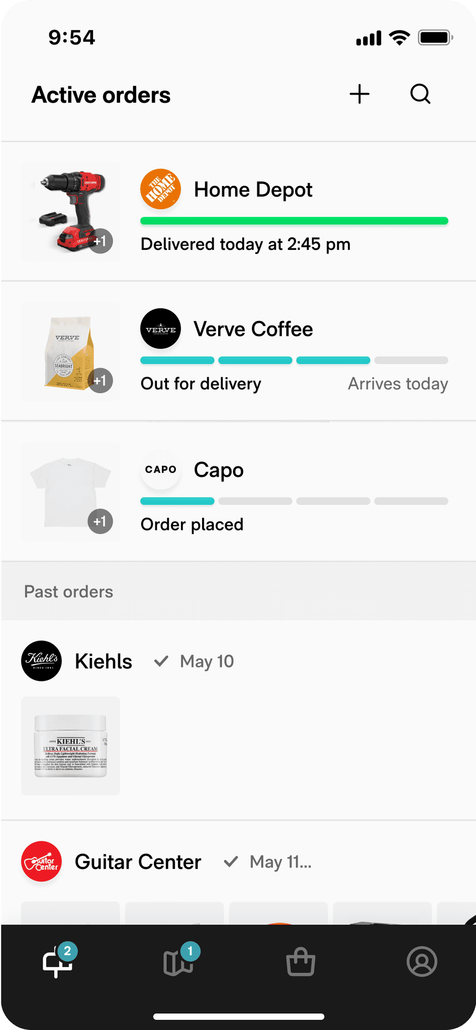
Contextual inquiry pointed out 3 inflection points in the Power Tracker user journey.
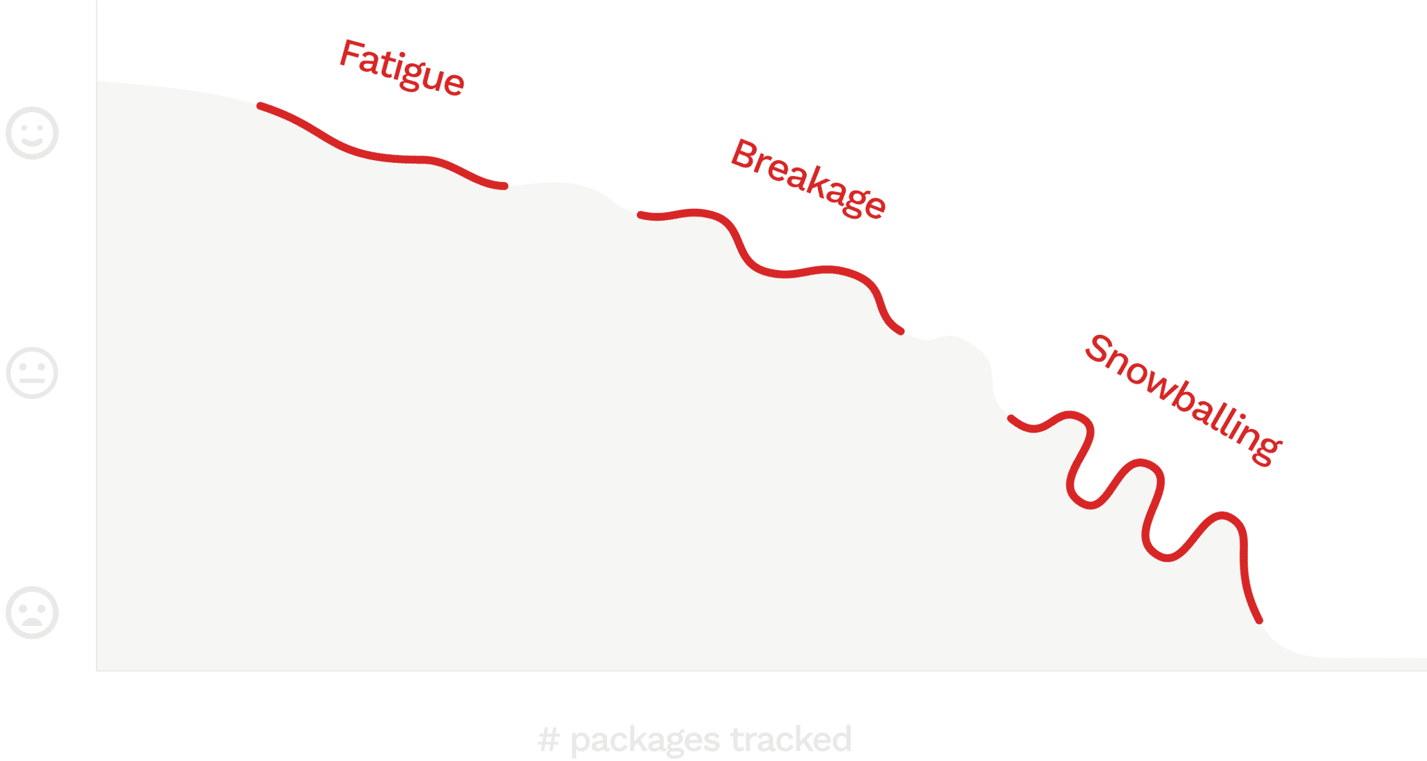
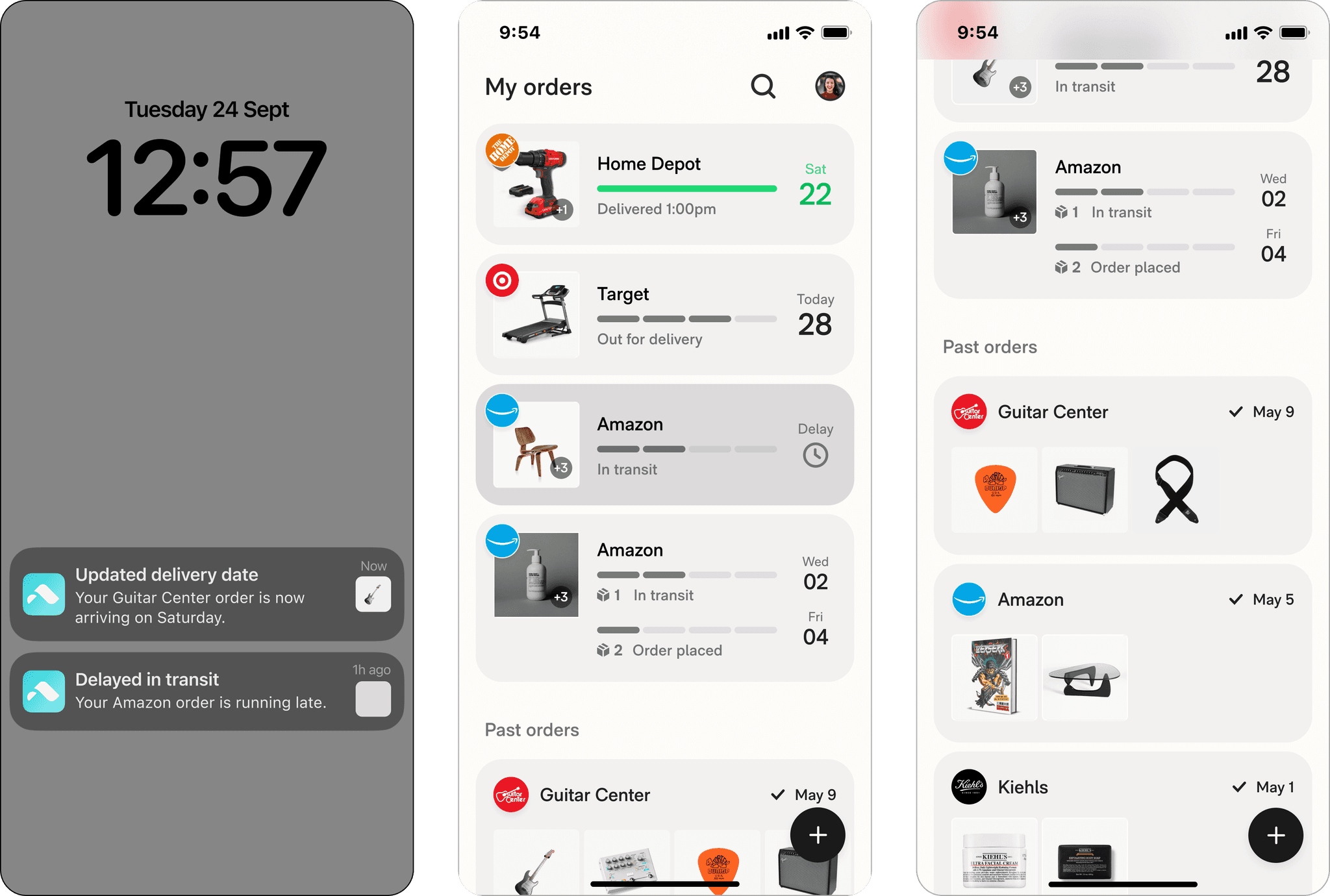
Fatigue
Only about half of a user's shipments at any time actually have a location, leading to nearly all new users complaining about packages missing.
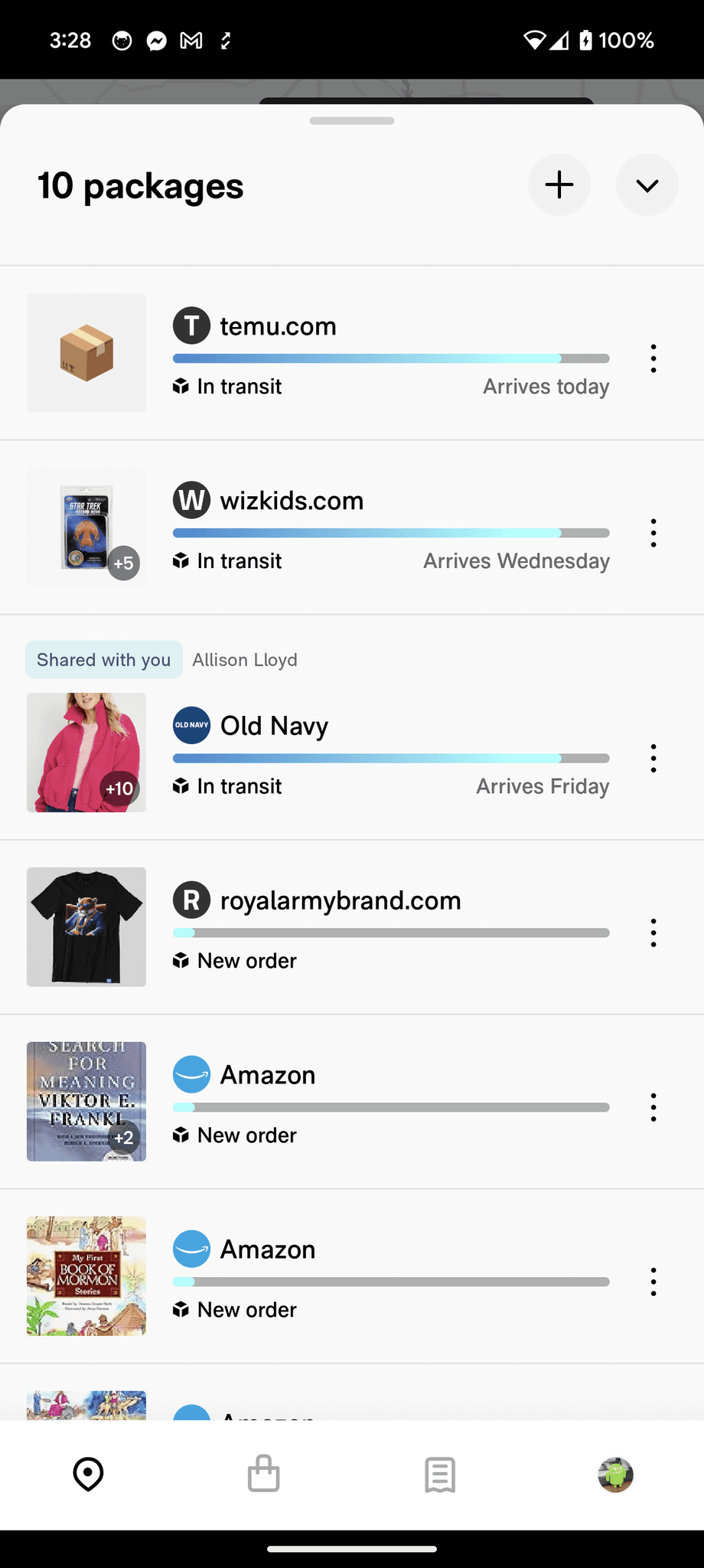
We asked 100 Power Trackers which of the 3 screens is the most useful for tracking packages – pushes, the map, or the list. 90 said the list.
Being able to view all packages at once was prerequisite for multiple package tracking. This list needed to be more discoverable.
Breakage
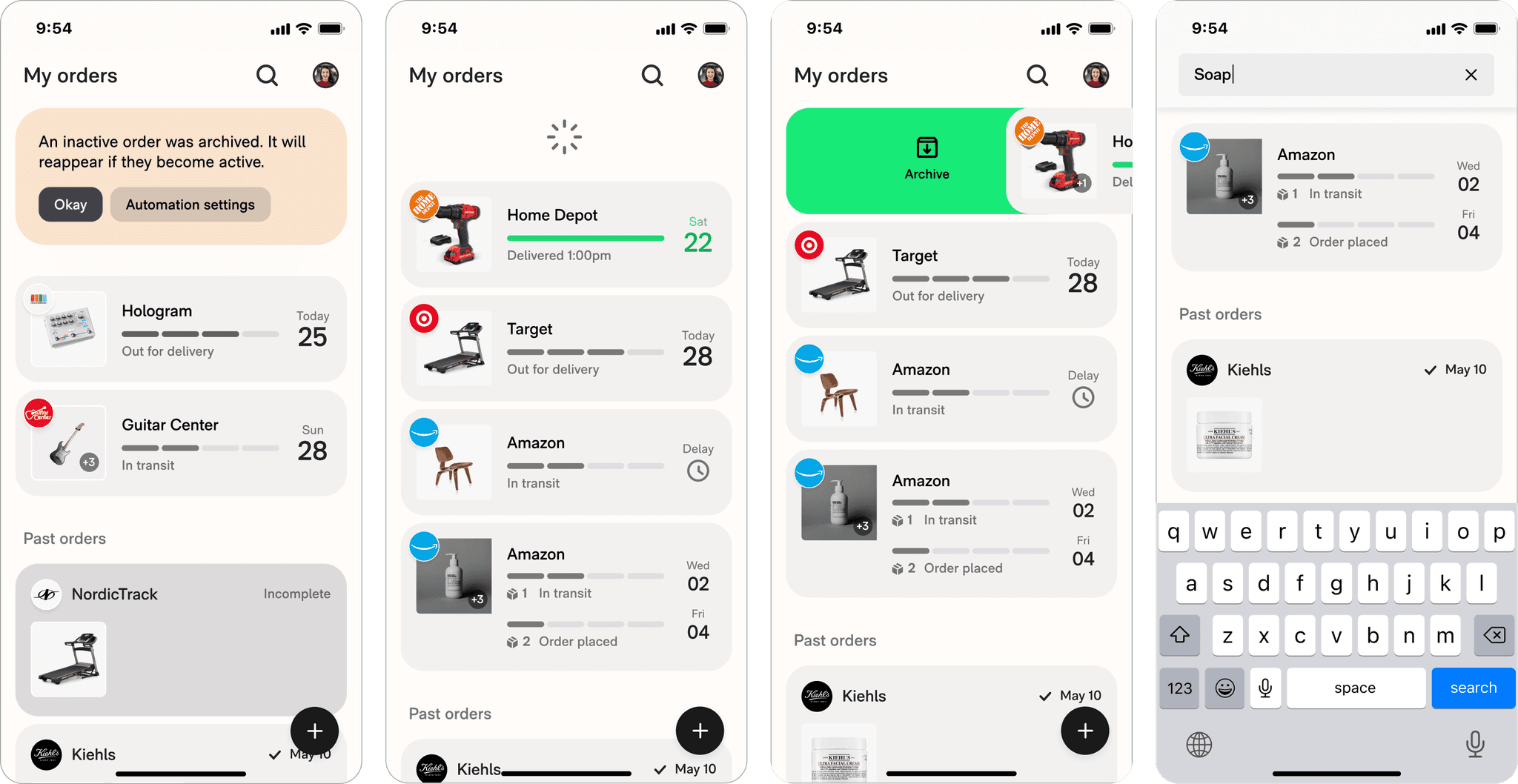
I observed user sessions and found that the design began to strain around 4 orders. Users were confused by sorting criteria, progress bars, misleading statuses, and text/image accessibility.
At scale, I also noticed Route's brittle design patterns broke around common edge cases like delays and parser errors.
"Snowballing"
Parser errors and delayed orders accumulate between sessions, leading to an avalanche of outdated junk when a user next opens the app.
This was the most common reason behind attrition I heard from motivated users who had tried out various tracking apps.
PROTOTYPING & USER TESTING
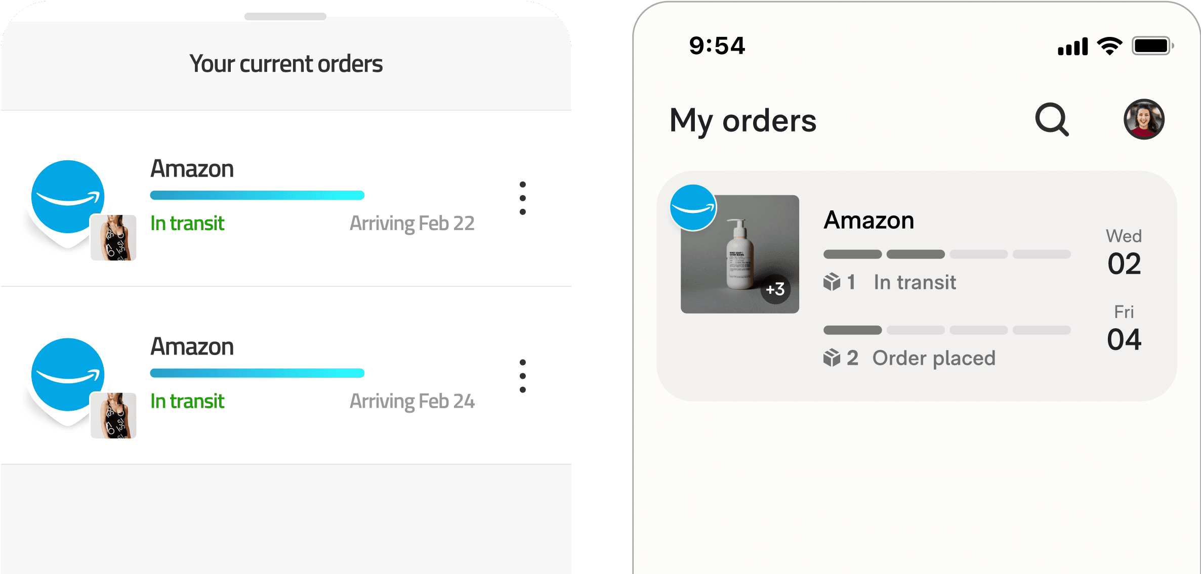
We redesigned the tracker list for easily scanned "passive" tracking.
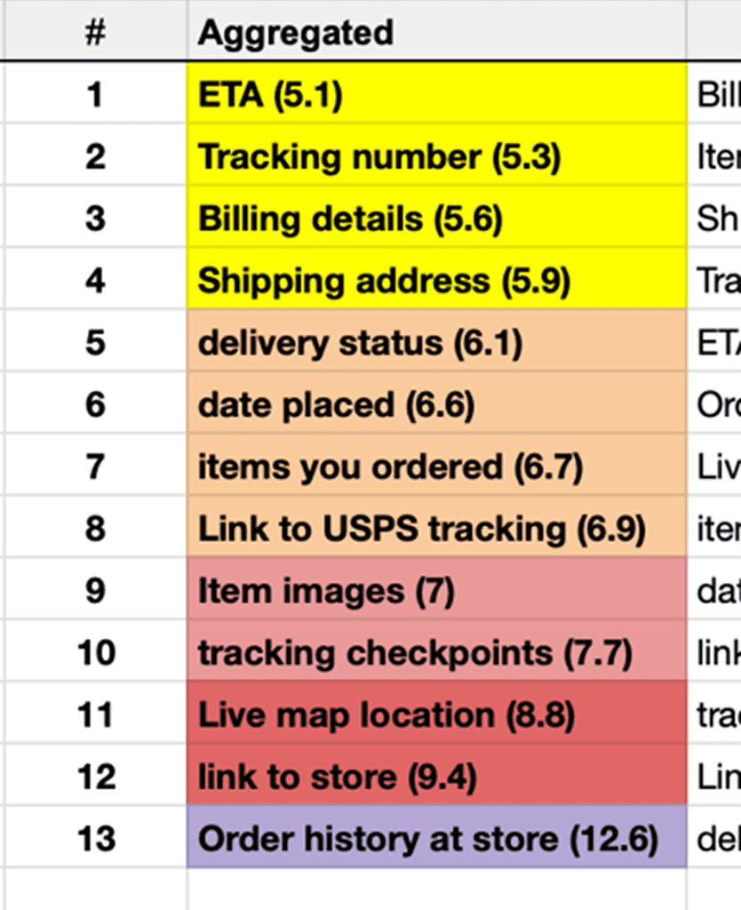
Element hierarchy
Card sorting showed that users prioritize leading markers, like ETAs, tracking numbers, and statuses, over lagging markers like last location.
Accessible patterns
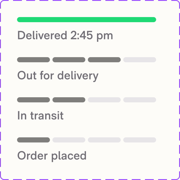
Open card sorts helped us find 4 universally-understood statuses.
Comparative user testing showed that segmented bars were much more intuitive than gradual progress bars or no progress bars.
Time-to-scan
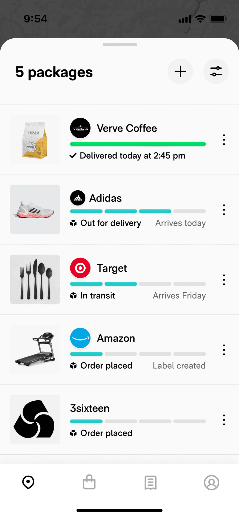
I redesigned the interface by prioritizing ETAs, statuses, and clear item images.
For quick validation, I ran a team workshop where each member was timed memorizing a list of 5 packages. The new design 40% faster and easier to recall.
Inbox-zero gamification
Update animations allow a user to absorb updates rather than exert cognitive effort.
A major learning from user testing was that an "inbox-zero" impulse increased session frequency through reward reinforcement.
Design pattern flexibility
Delayed orders were a major source of breakage and anxiety, so we tested labelling orders when we detected 7 days of inactivity.
We also added fallbacks for item images and introduced custom order renaming functionality.

Adding reassurance
Tracking links were a popular feature request. I worked with an engineer to quickly build a trackling link POC that we tested in the app and saw a 2% increase in retention.
This was a valuable learning to capitalize on: users were highly motivated to find reassuring information.
ITERATING
Less fatigue and breakage was great. Snowballing continued to haunt us.
To help users easily get rid of inactive orders, we released an "archiving" swipe function. It got some traction but users were still overwhelmed by an avalanche of inactive orders after just a few days.
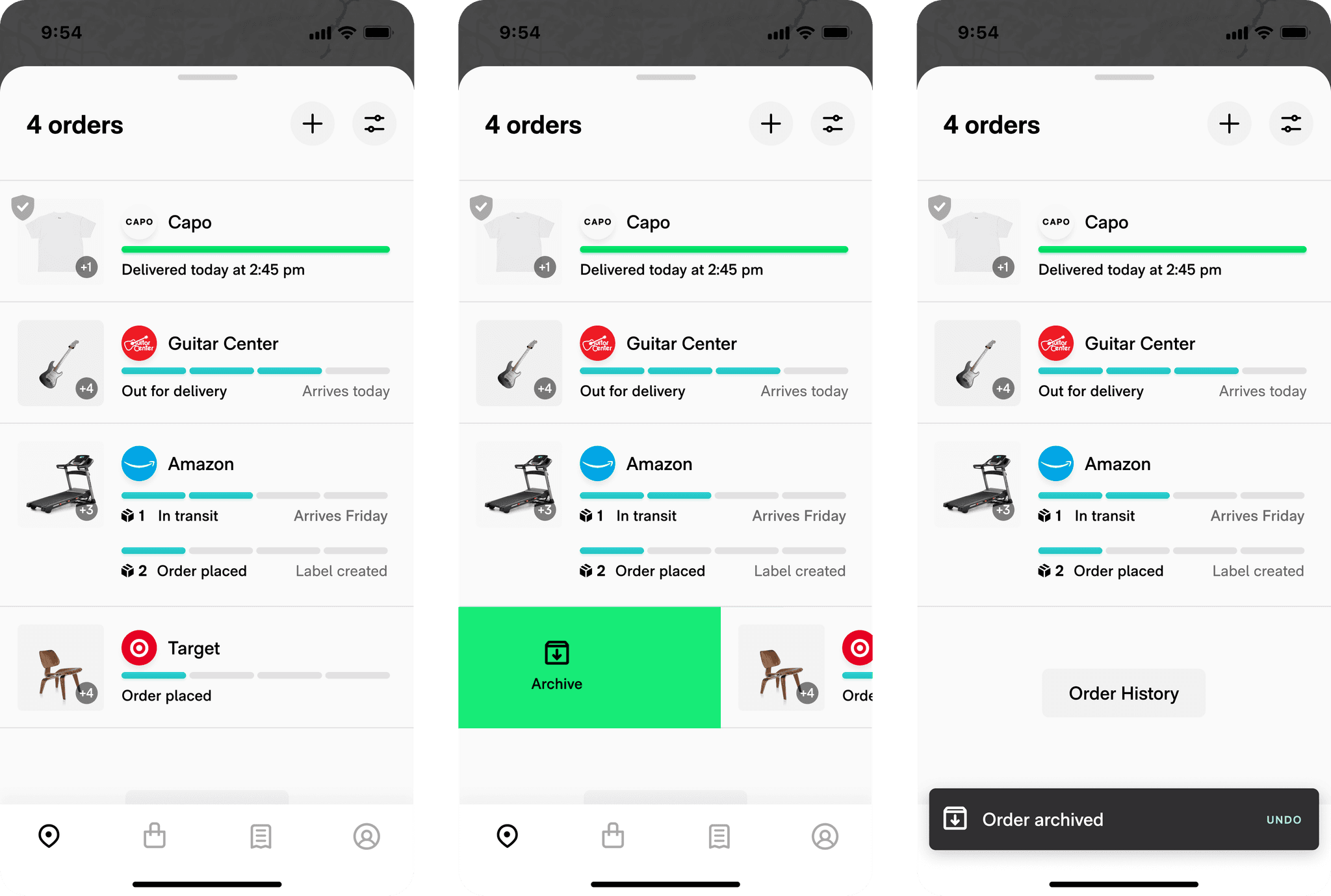
I worked with our engineering manager to explore alternate patterns like order-level tracking, which improved tracker organization.
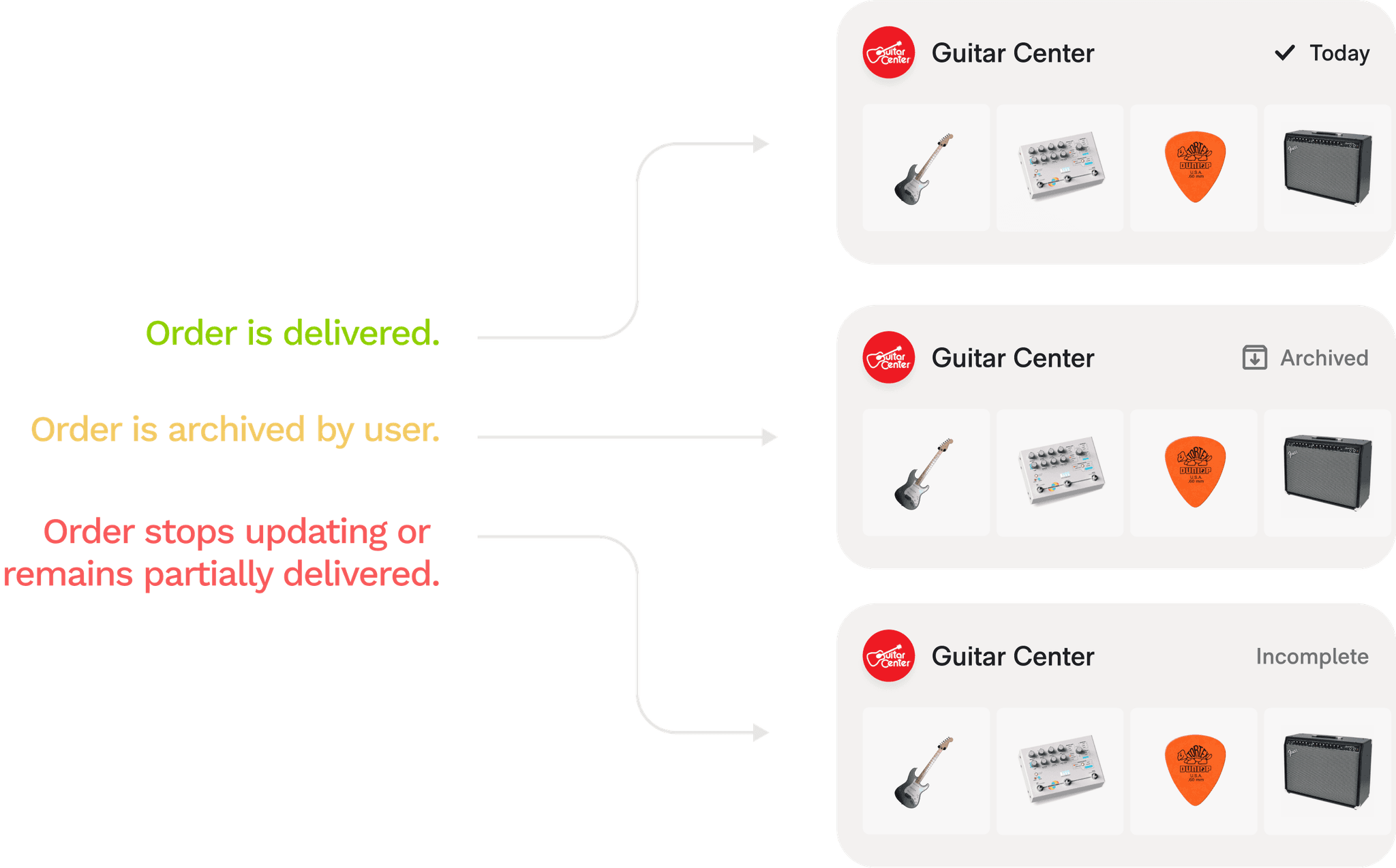
While reading user feedback, a review gave me the idea to test out an all-in-one delivery list.
We could automatically clean up inactive orders by just dropping them into a past order bucket and naming them "incomplete". Once they move, they jump back into active orders.
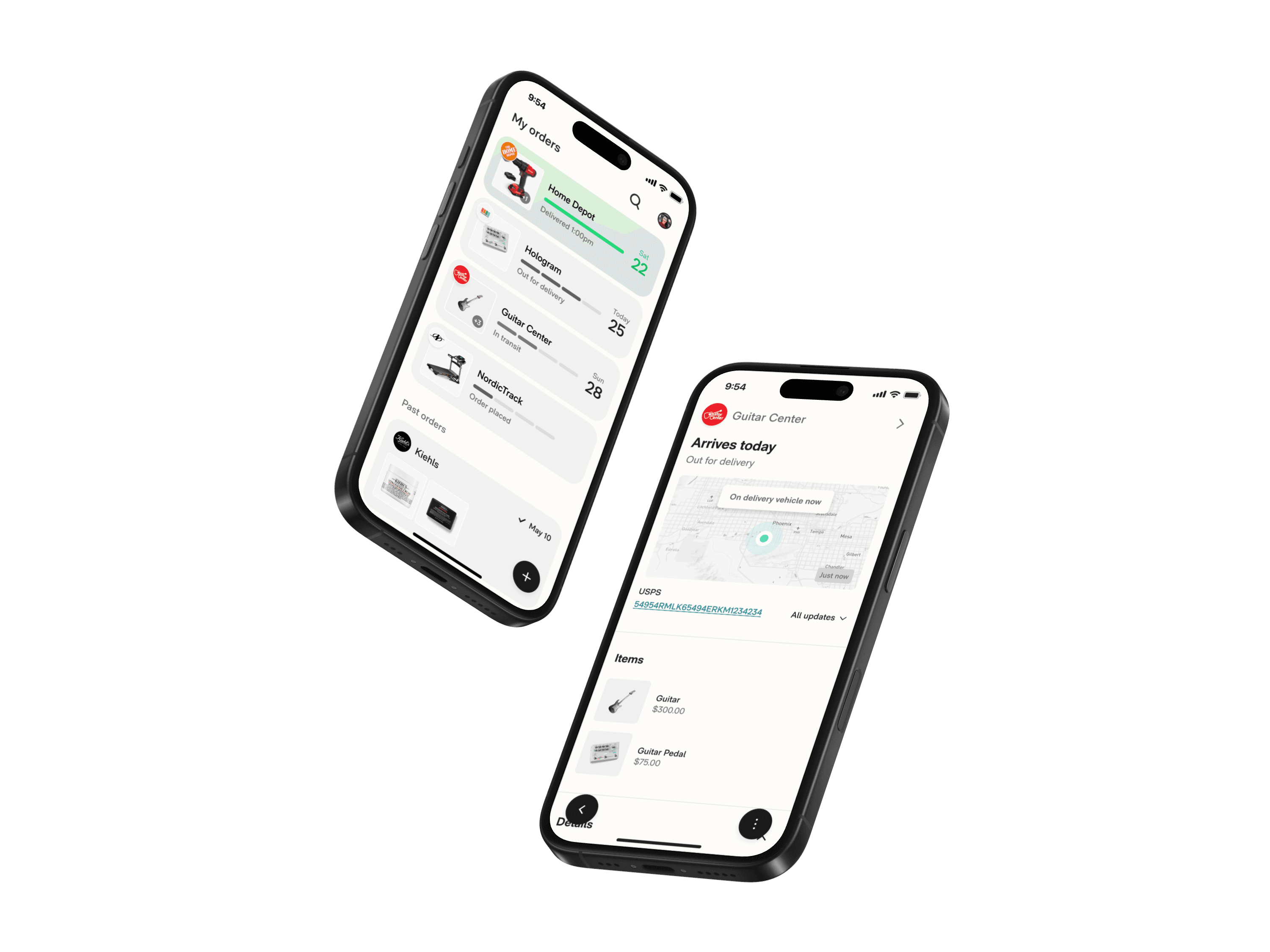
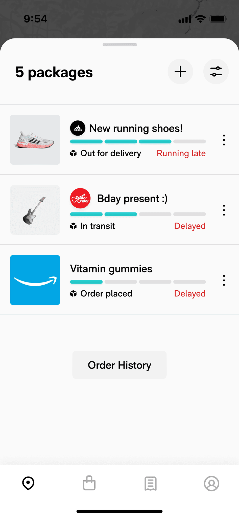
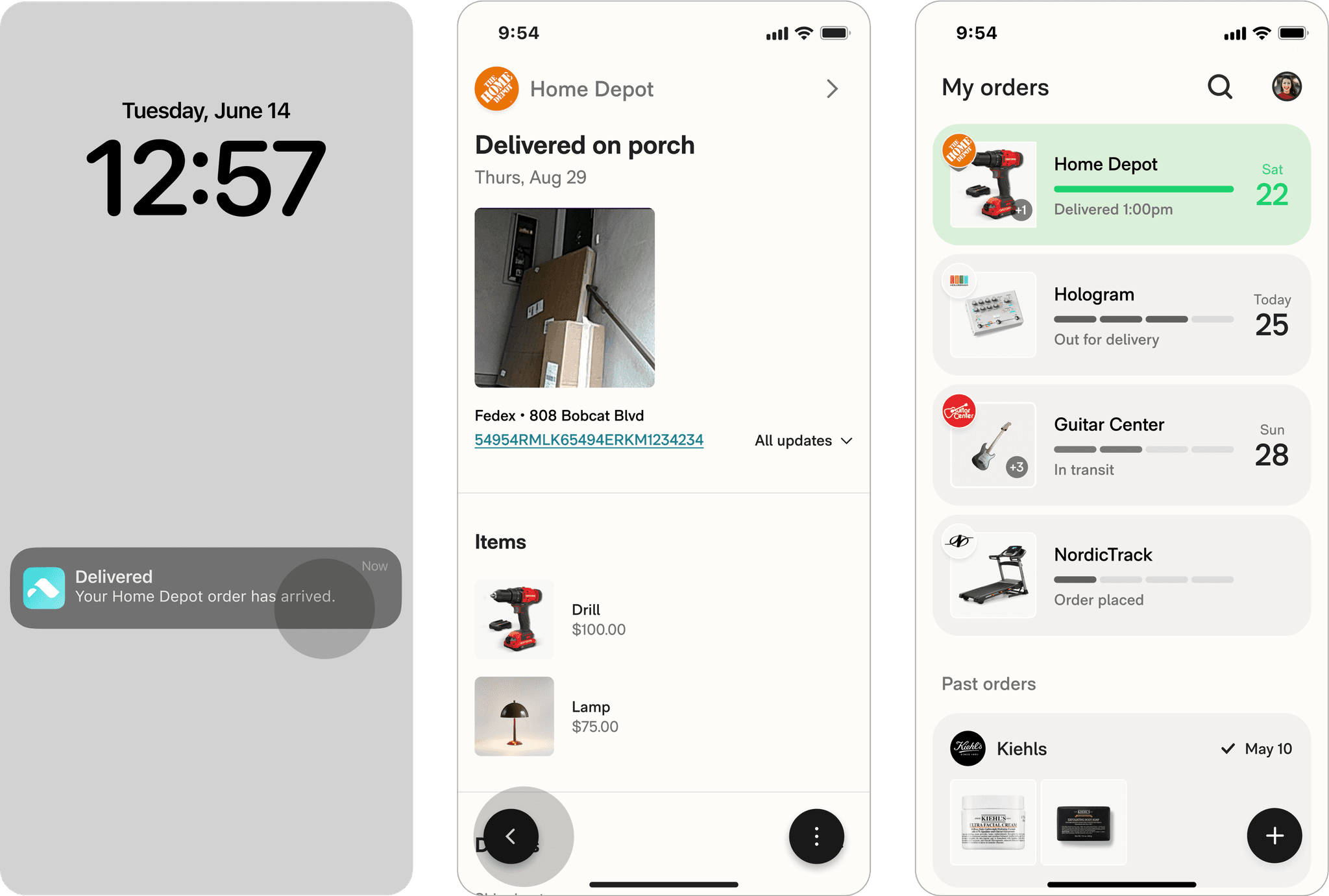
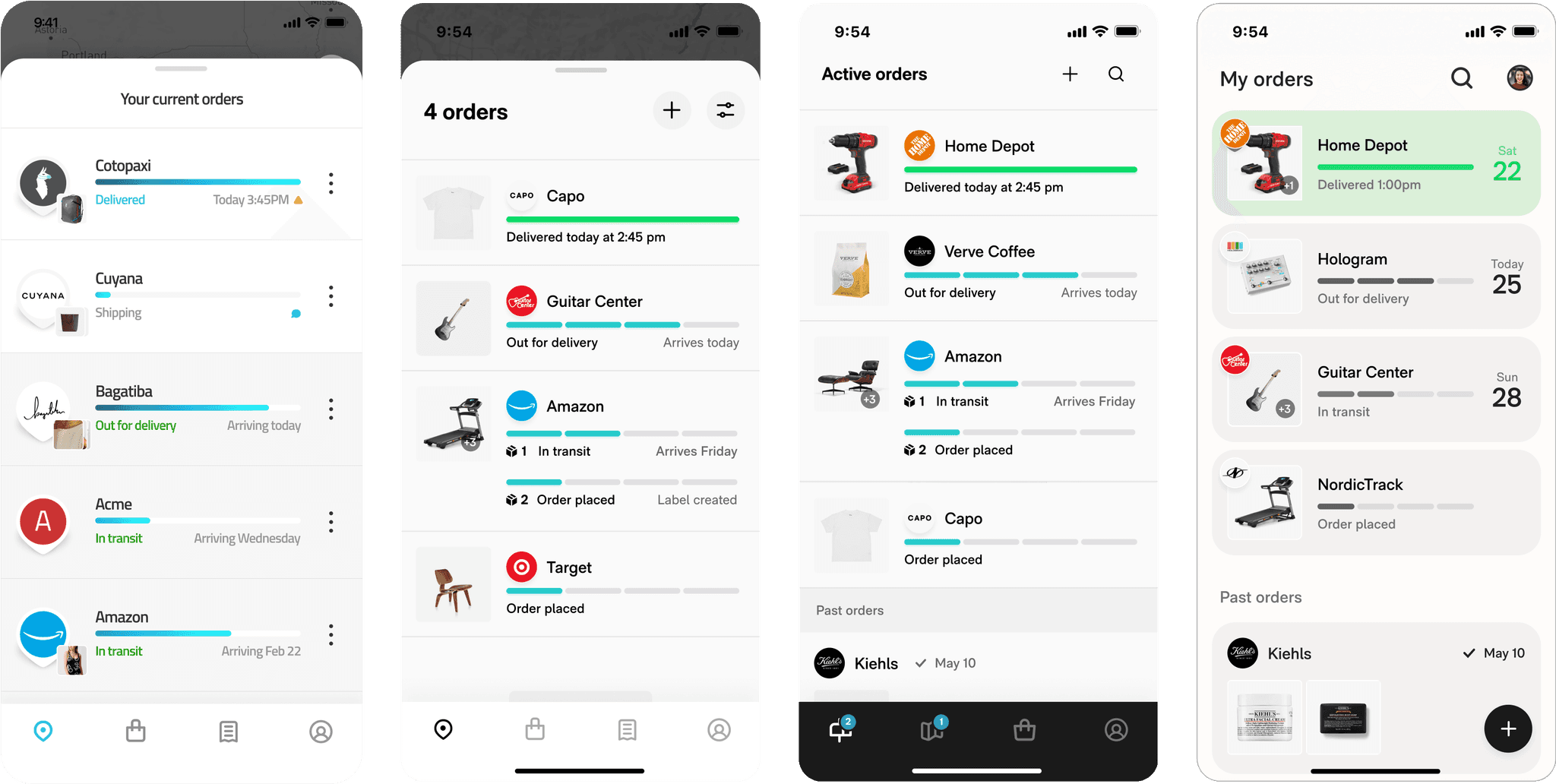
ROUTE REDESIGNED
An all-in-one delivery inbox.
Our vision streamlined the user experience into just two touchpoints: a delivery list and an order summary page.
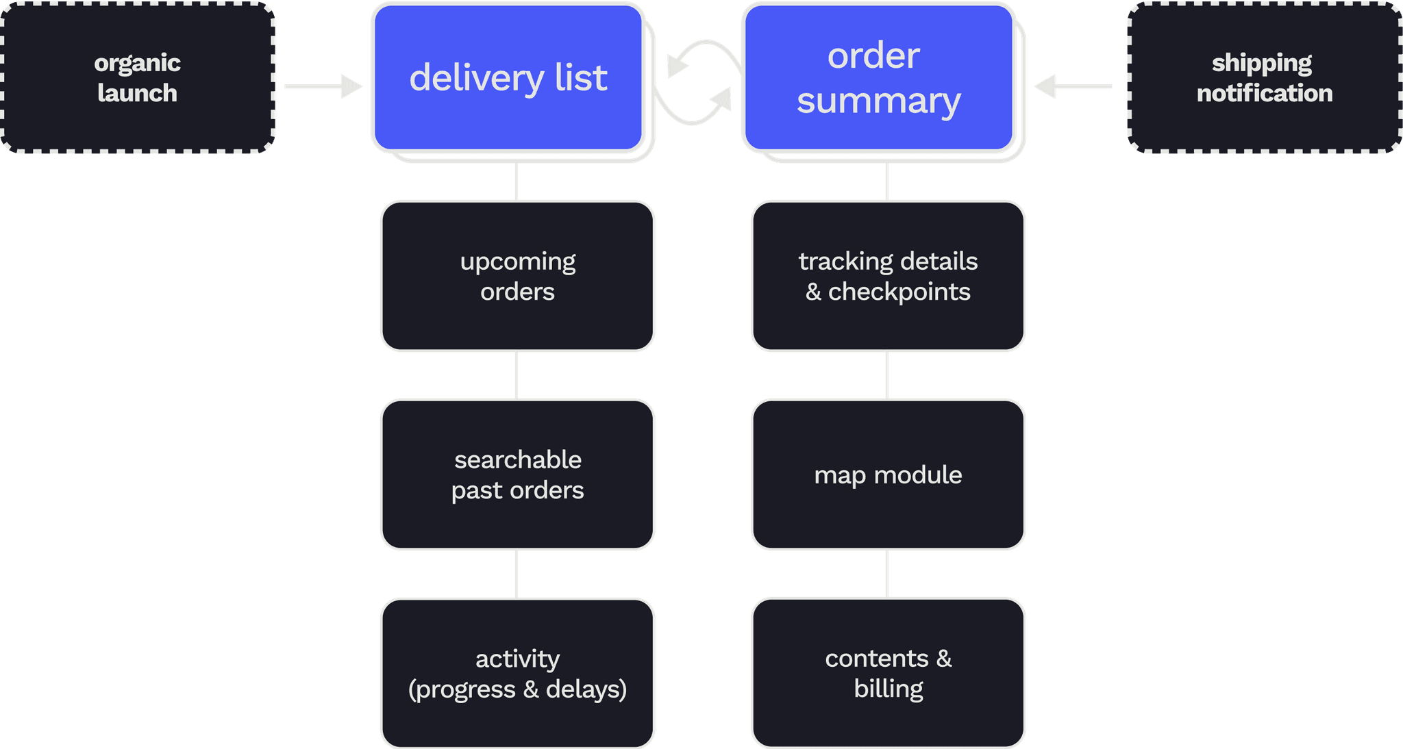
The redesign improved list scannability by emphasizing ETAs and creating visually distinct, interactive order organisms while trimming all visual excess like the tab bar and kebab menus.
This singular inbox facilitates habitual checking, reinforced by aggregating elements like delivered photos and tracking numbers that reassure users.
Route takes on the burden of automatiaclly organizing a live inventory of everything you buy so users don't have to think.
Automatic order cleanup virtually eliminated snowballing, and gestural controls to easily refresh, archive, and search made high volume order management much easier.
After 6 months, we'd doubled retention and grew our proportion of high LTV-potential users.
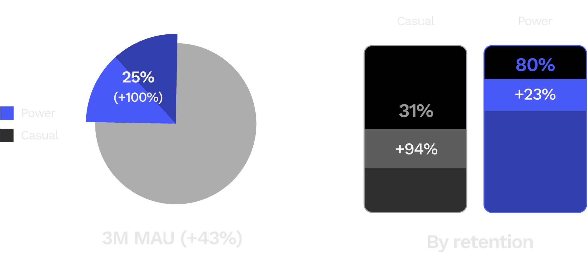
Avg retention
+77%
Power users (%)
+100%
MAU
+43%