Creating a logo for an apparel brand.
THE CHALLENGE
Create a funky, original logo for a brand with attitude.
Wear Your Dish is an apparel company started by three friends with a love of east coast diner fare and comfy clothing. They sell classic leisurewear with a “menu” of food items printed with pride across the product.
Our approach was to design a logo that would shine across web, print, and on the product. With a goal of building an identity that would double as passive crowd marketing, we used a top down identity framework to create a mark that represented the core fantasy of WYD.
My role
Market research
Comparative research
Brand identity
Logo
Prototyping
User testing
X
X
X
X
X
X
X
X
2x
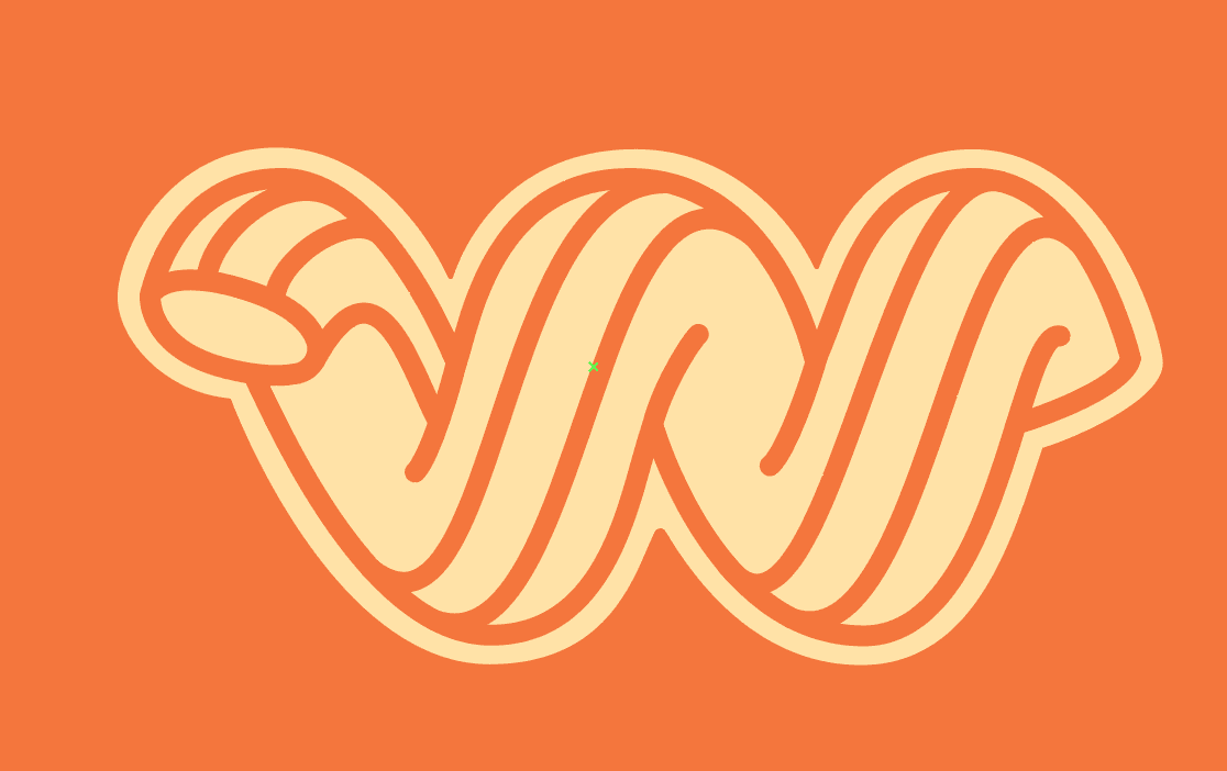
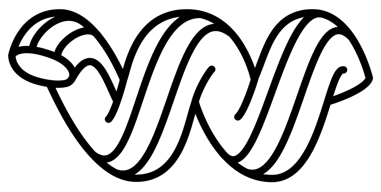
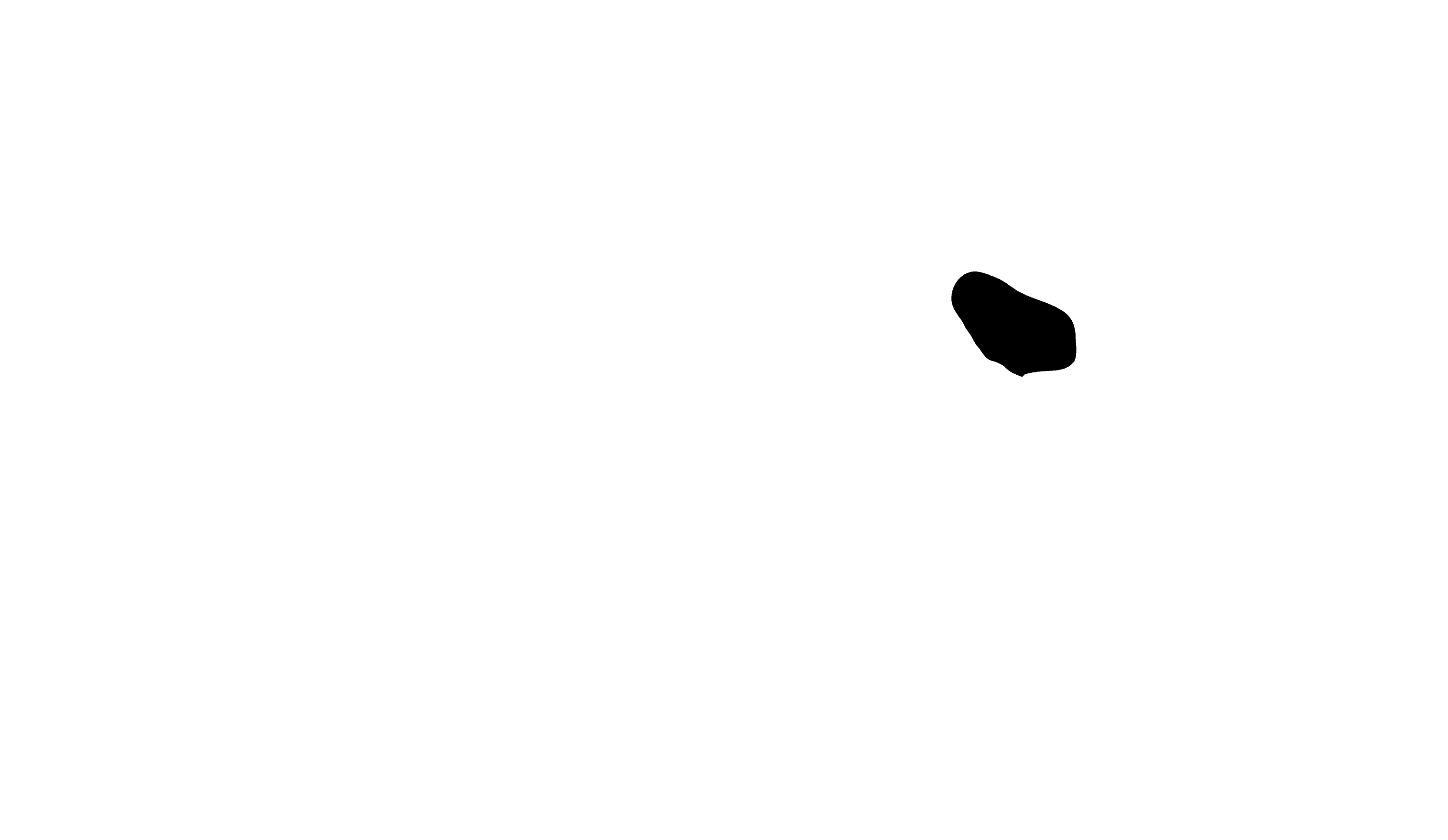
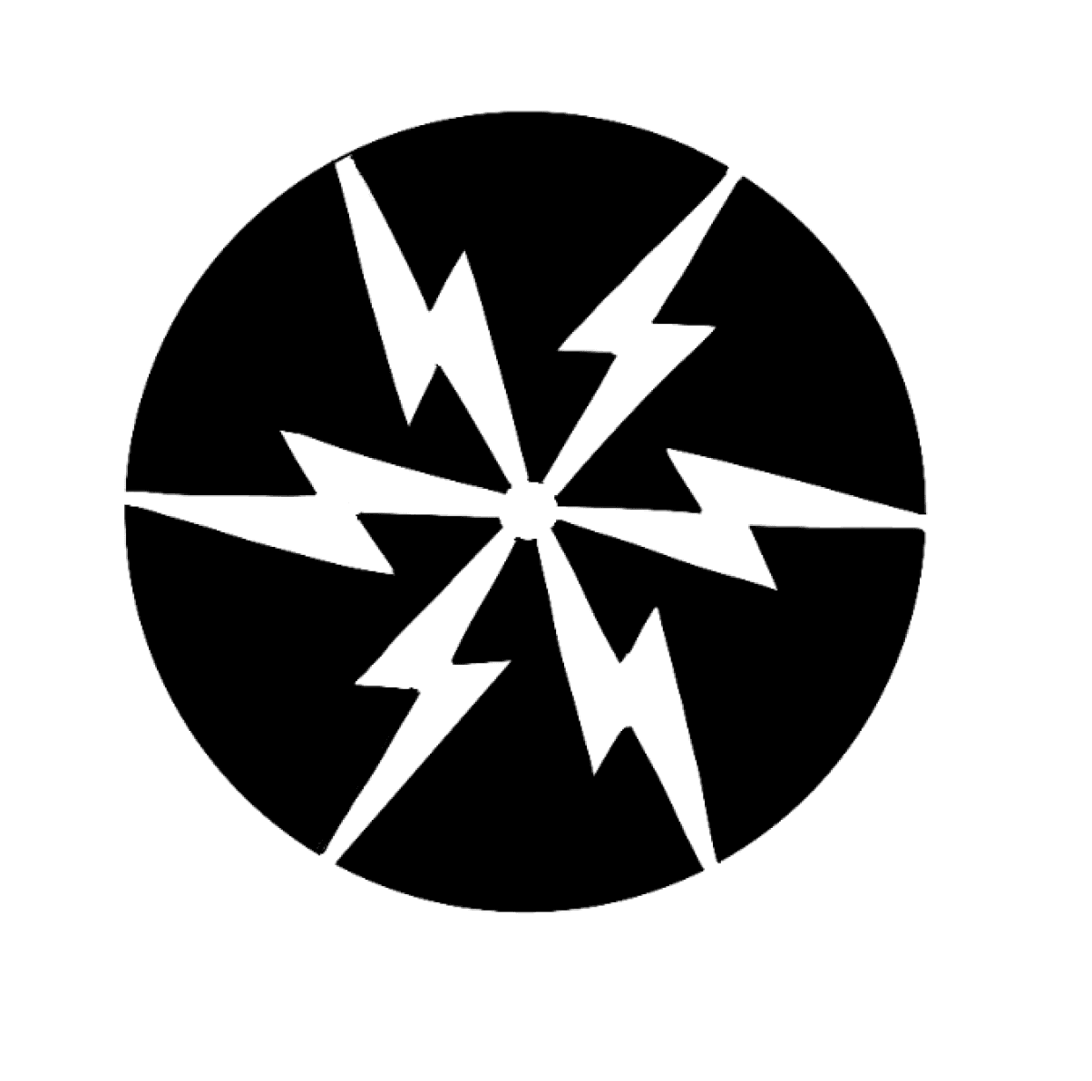
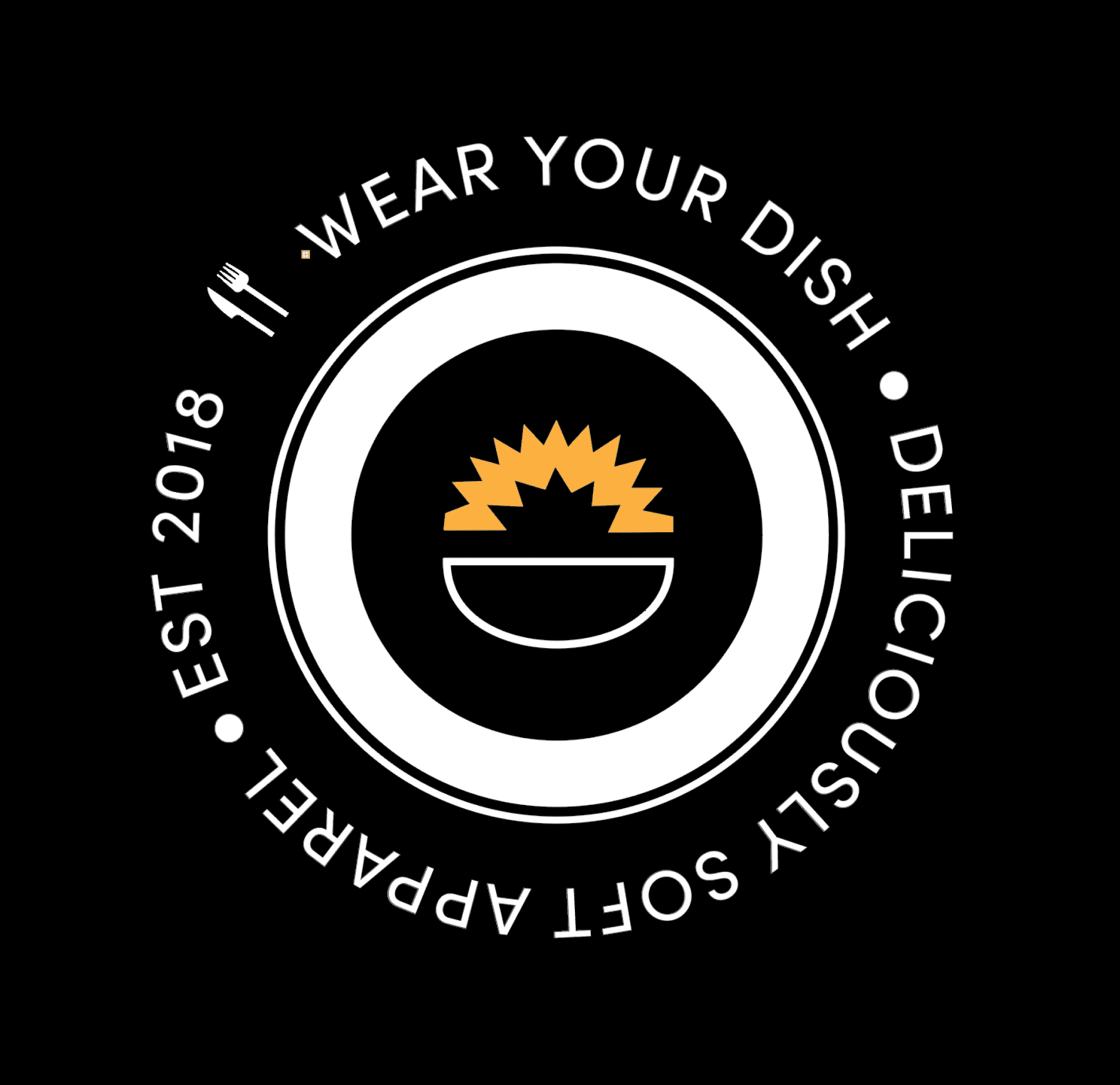
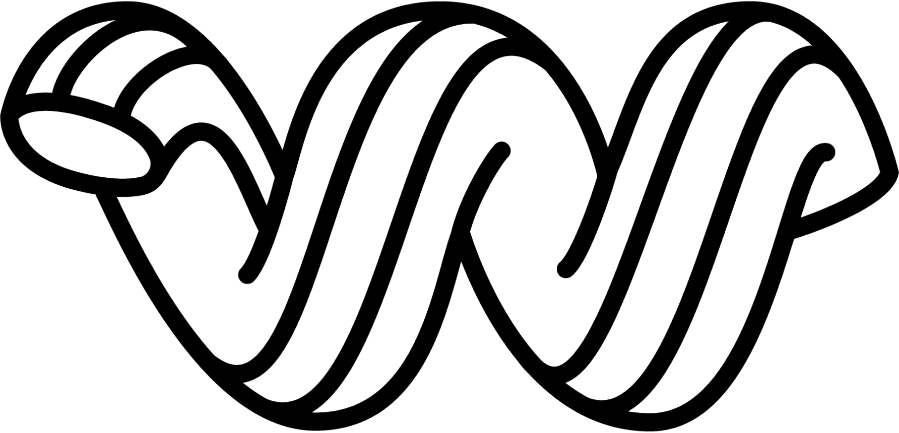
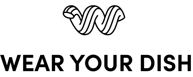
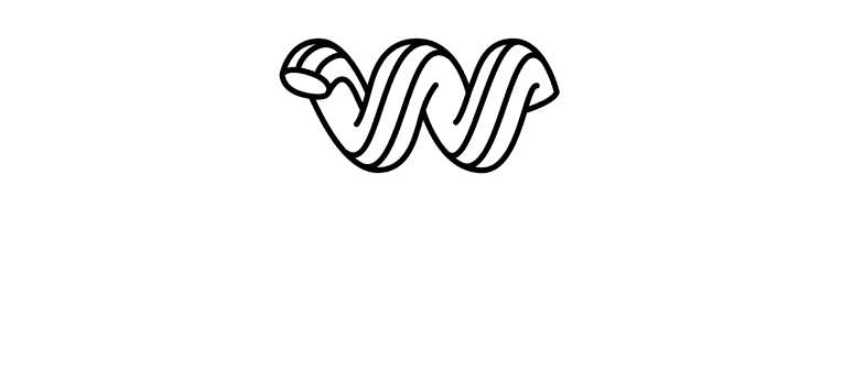
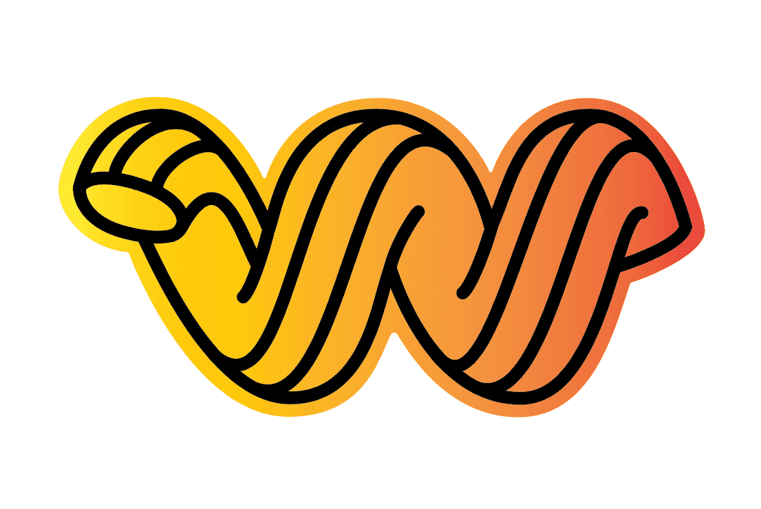
The Noodle is inspired by the helical pasta Cavatappi, a nostalgic favorite of the owners. It evokes the delight and whimsy of old school comfort foods depicted on WYD clothing.

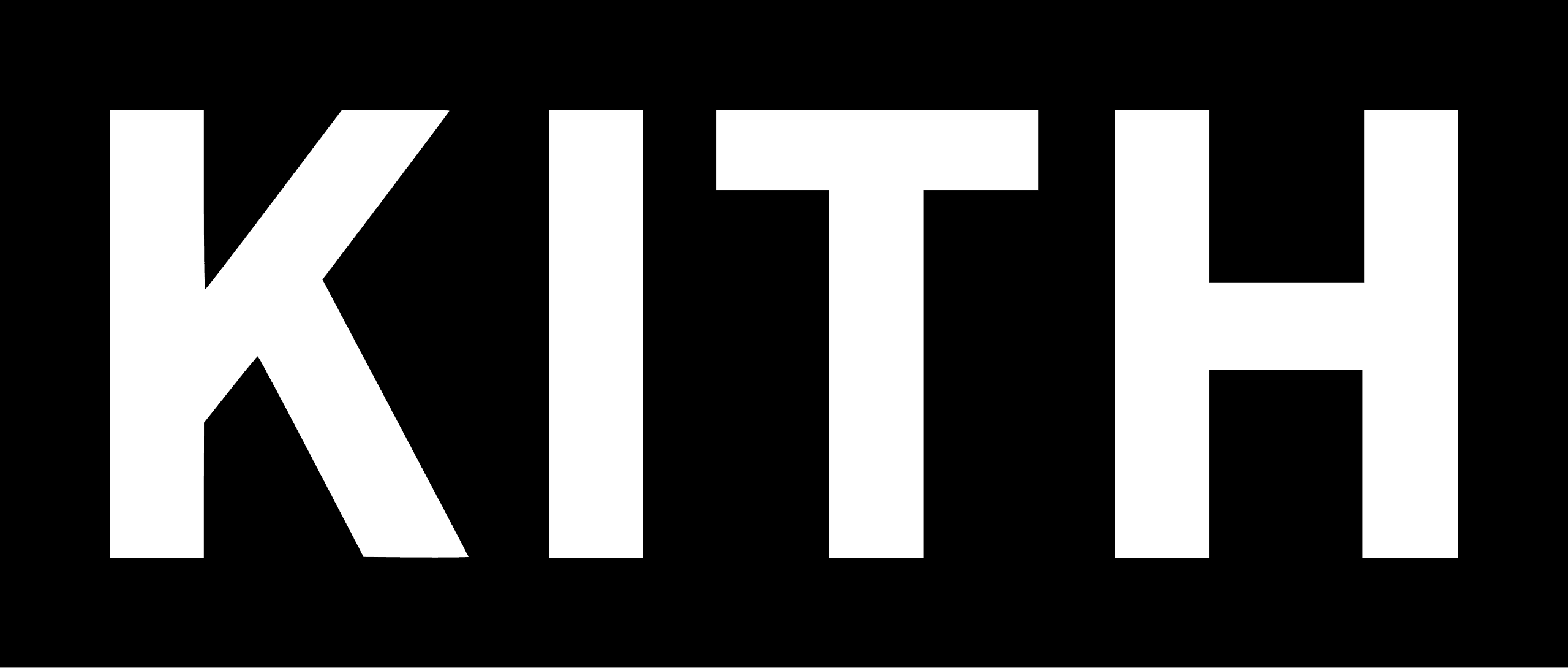
Matt, Mike, and Alex had a vision of a wordmark-based logo that mashed together an old school east coast vibe with a funky streetwear sensibility. They deeply admired KITH.
Researching vintage American typefaces was fascinating and fruitful. I was drawn to the curving tails and flourishes in vintage magazine type, and the organic ink bleeds from old stationary.
In our first concept review, I presented 3 straightforward letterform-based concepts.
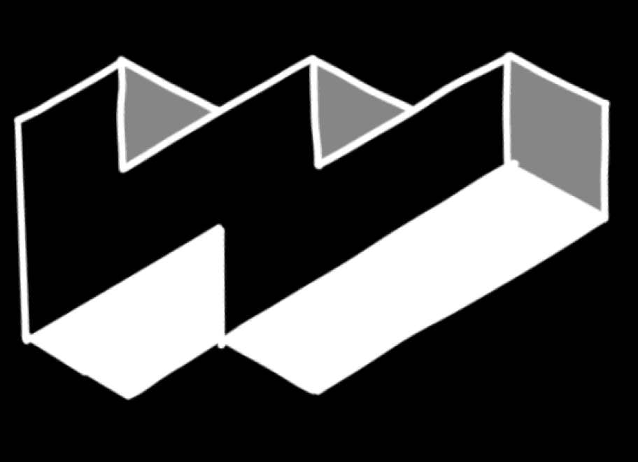
They were more excited by a few abstract concepts I presented just to round out the presentation, rough by-products of forcing the 3 letters into a single form (they refused to cooperate).

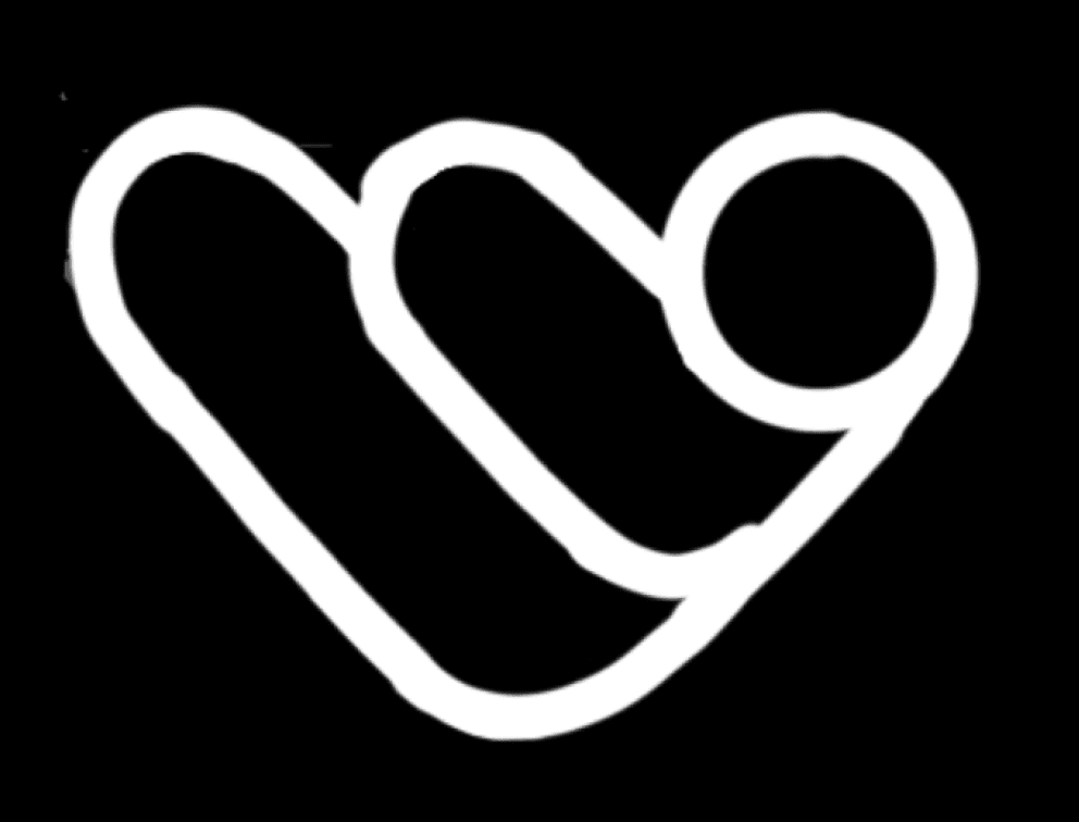
Seeing a pictorial logo – especially the one on the right, which reminded them of a noodle – gave way to quick realignment. We decided to pivot to a representational logomark.
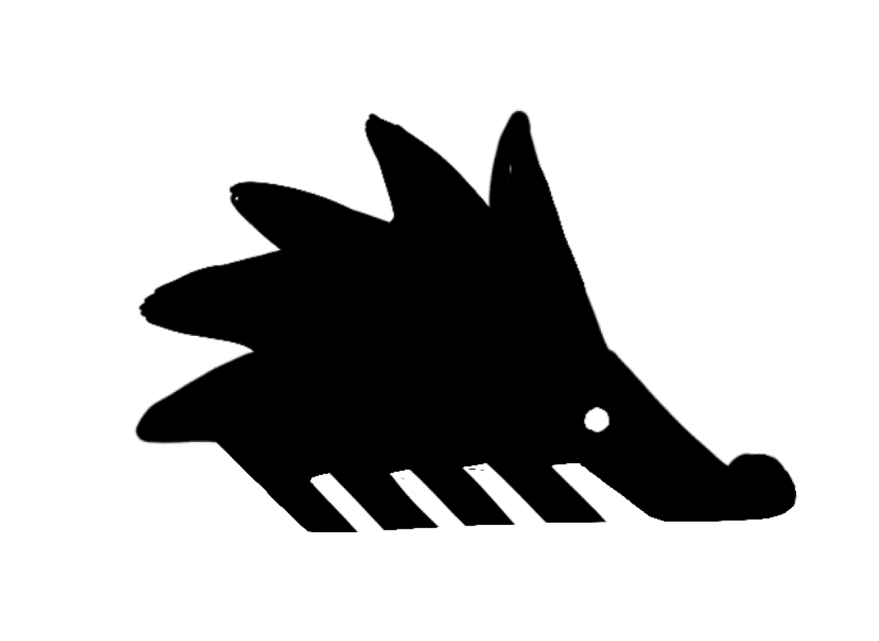
I had the guys spend a few days generating a 15 nouns list that I mashed together to create a new round of concepts.
Chicken/Pork/Beef
Plate
Sweatshirt
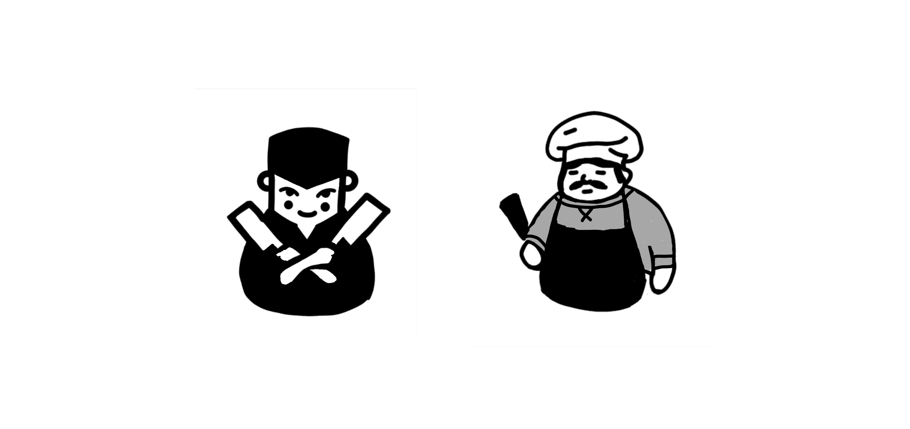
Chef
Kitchen
Menu
Globe/World
Cheese
Pasta
Napkin
Condiment
Dessert
Mascot
Swagger
Comfort
Style
Cuisine + Comfort
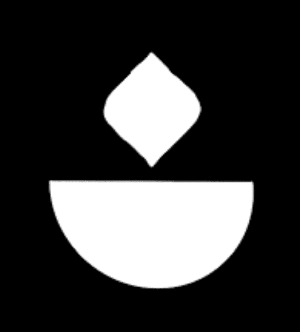
Plate + Swagger

“W” + Swagger
Chef + Mascot
Chicken/Pork/Beef + Mascot
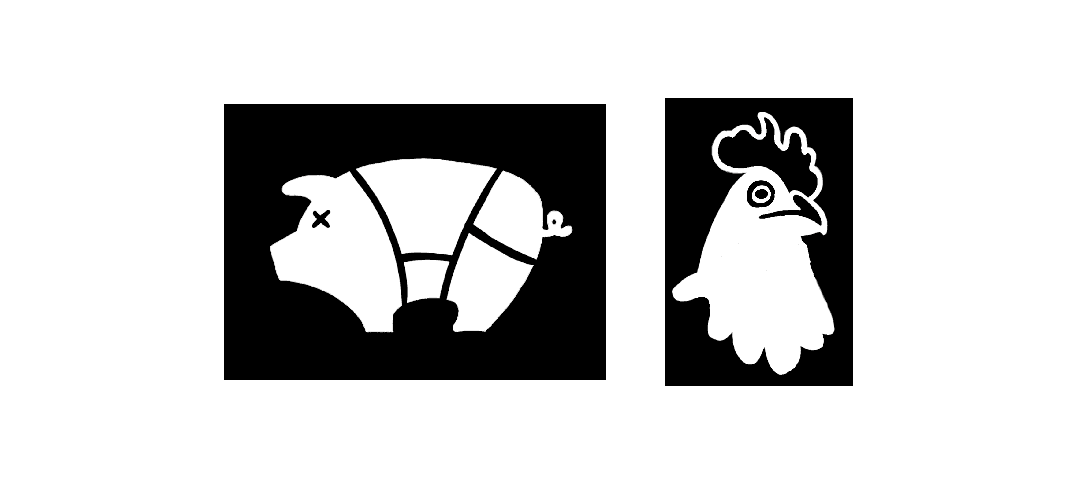
Plate + Mascot
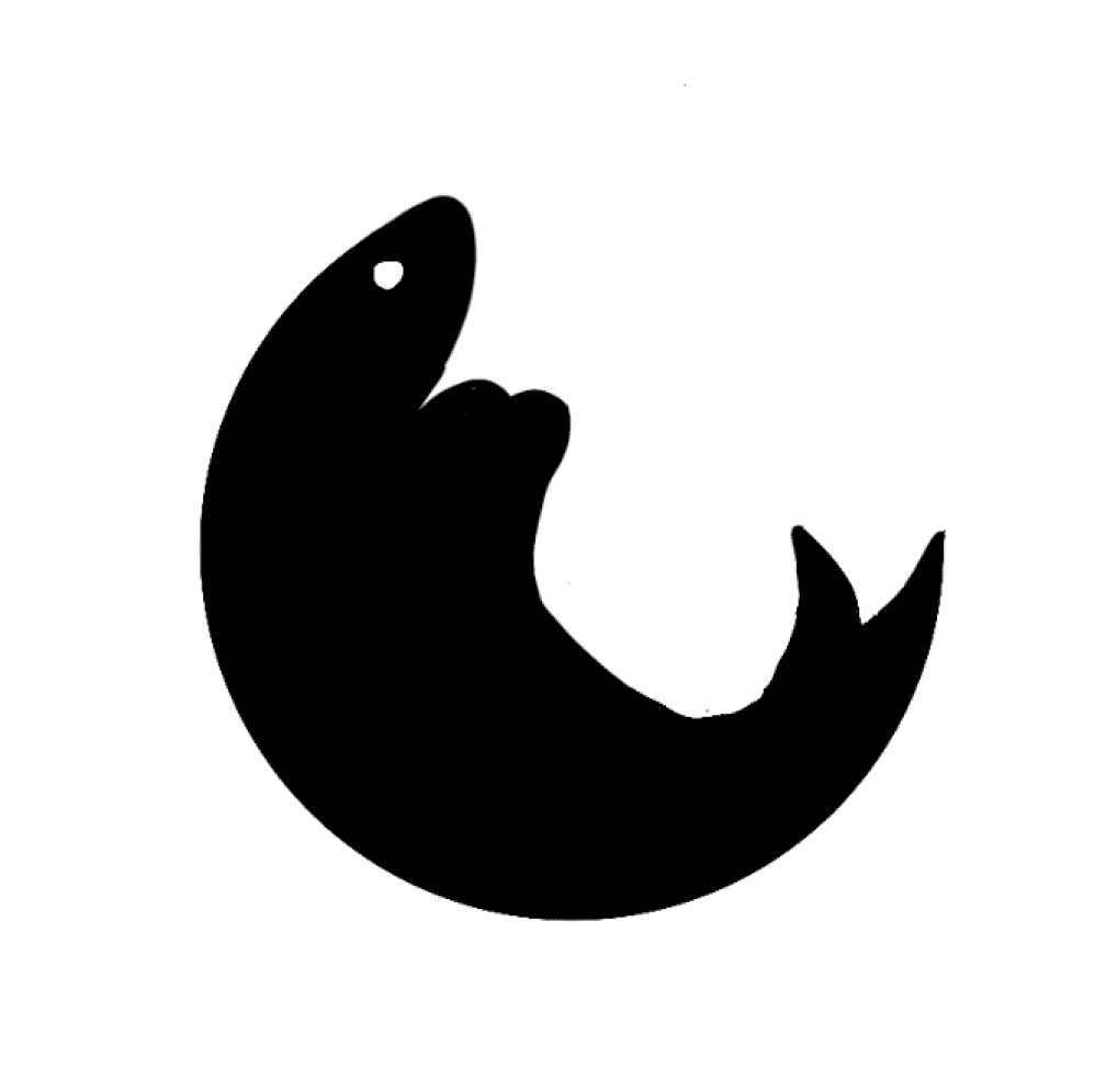
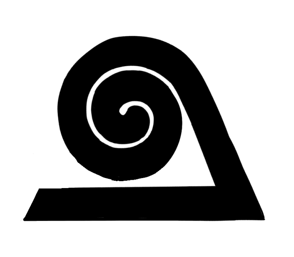
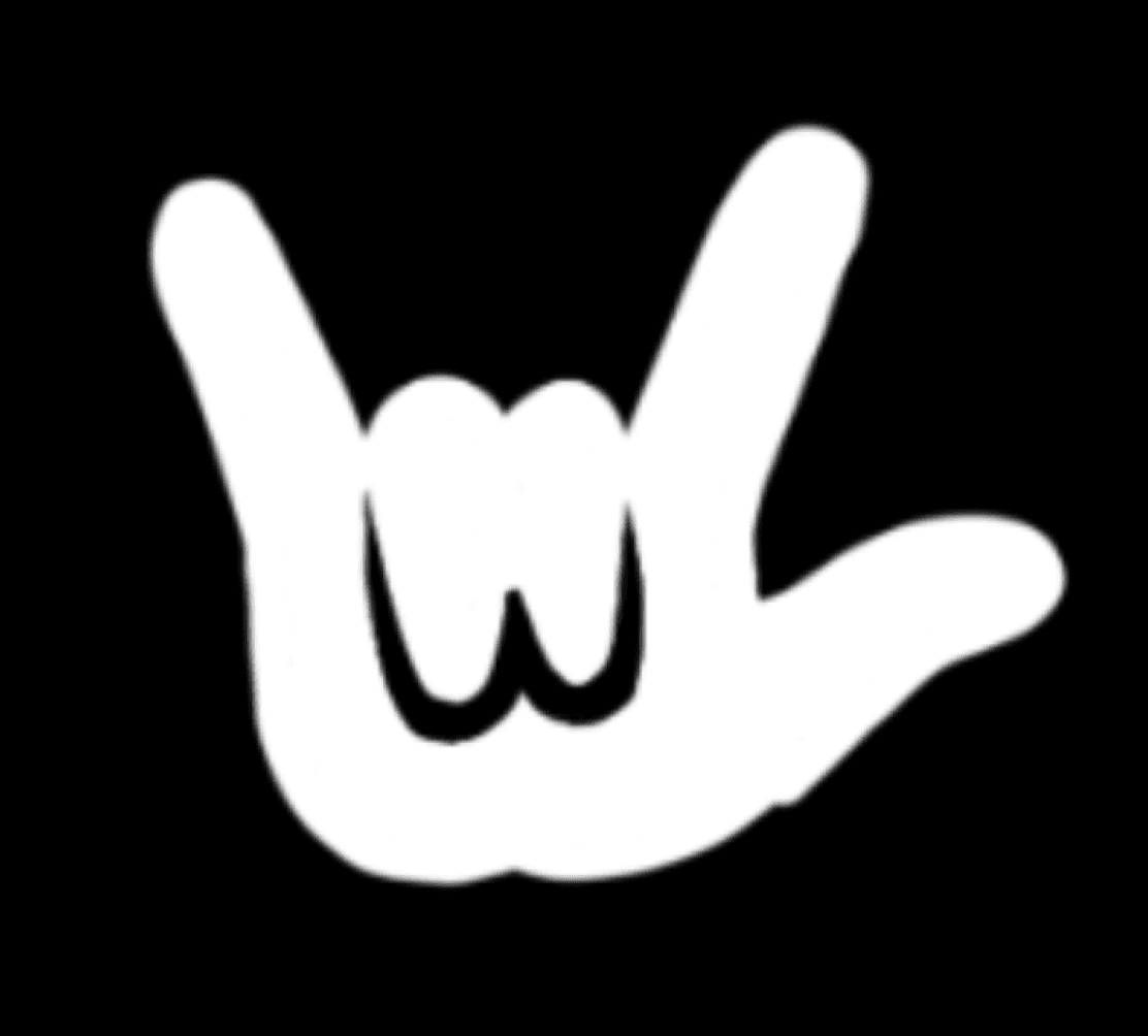
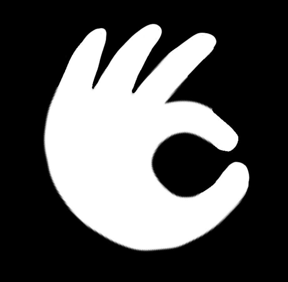
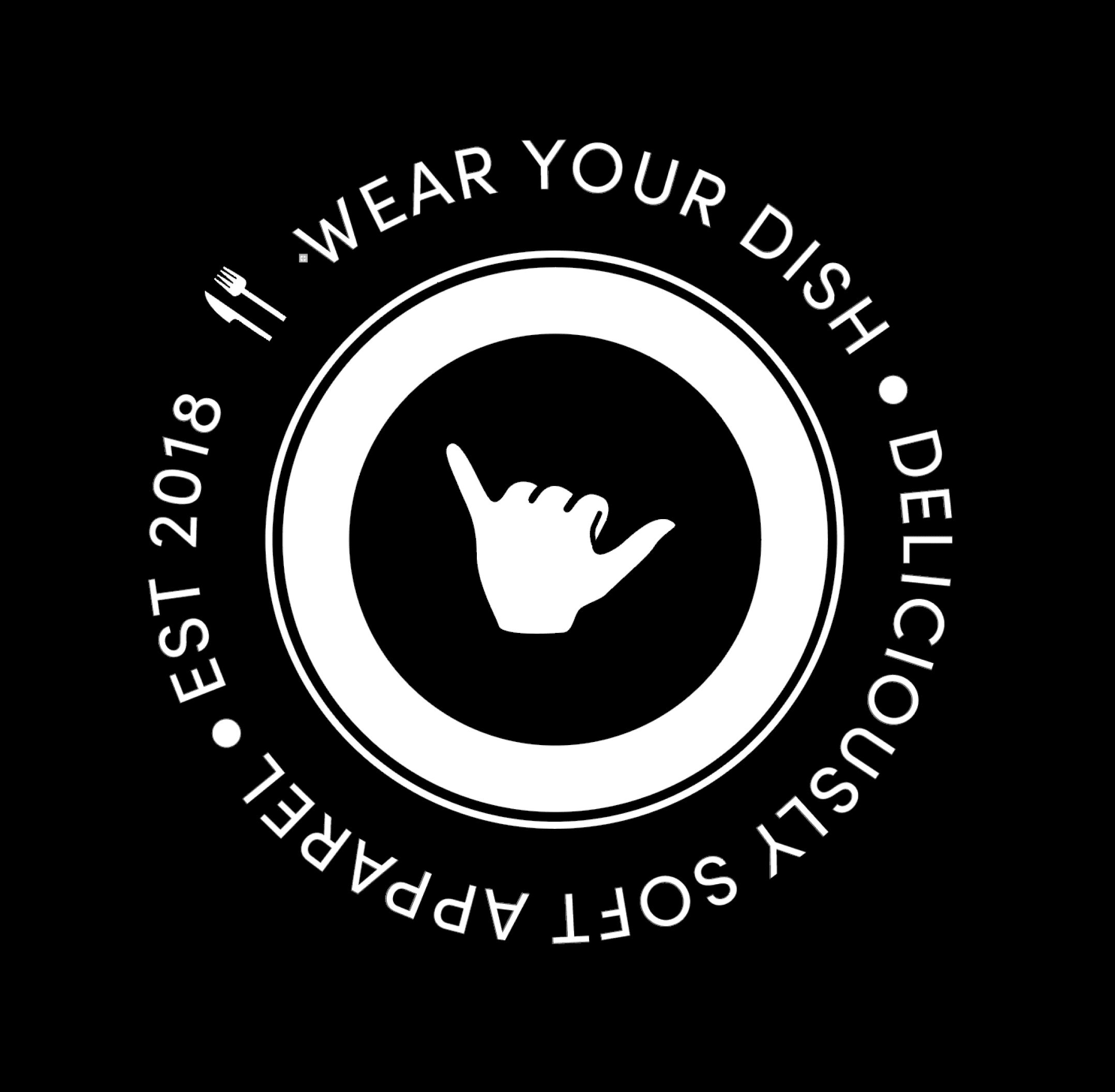
Three favorite concepts emerged: the flaming bowl, the groovy hand gesture, and the twisted “W” pasta. Armed with notes and pictures of pasta, I revised the concepts.
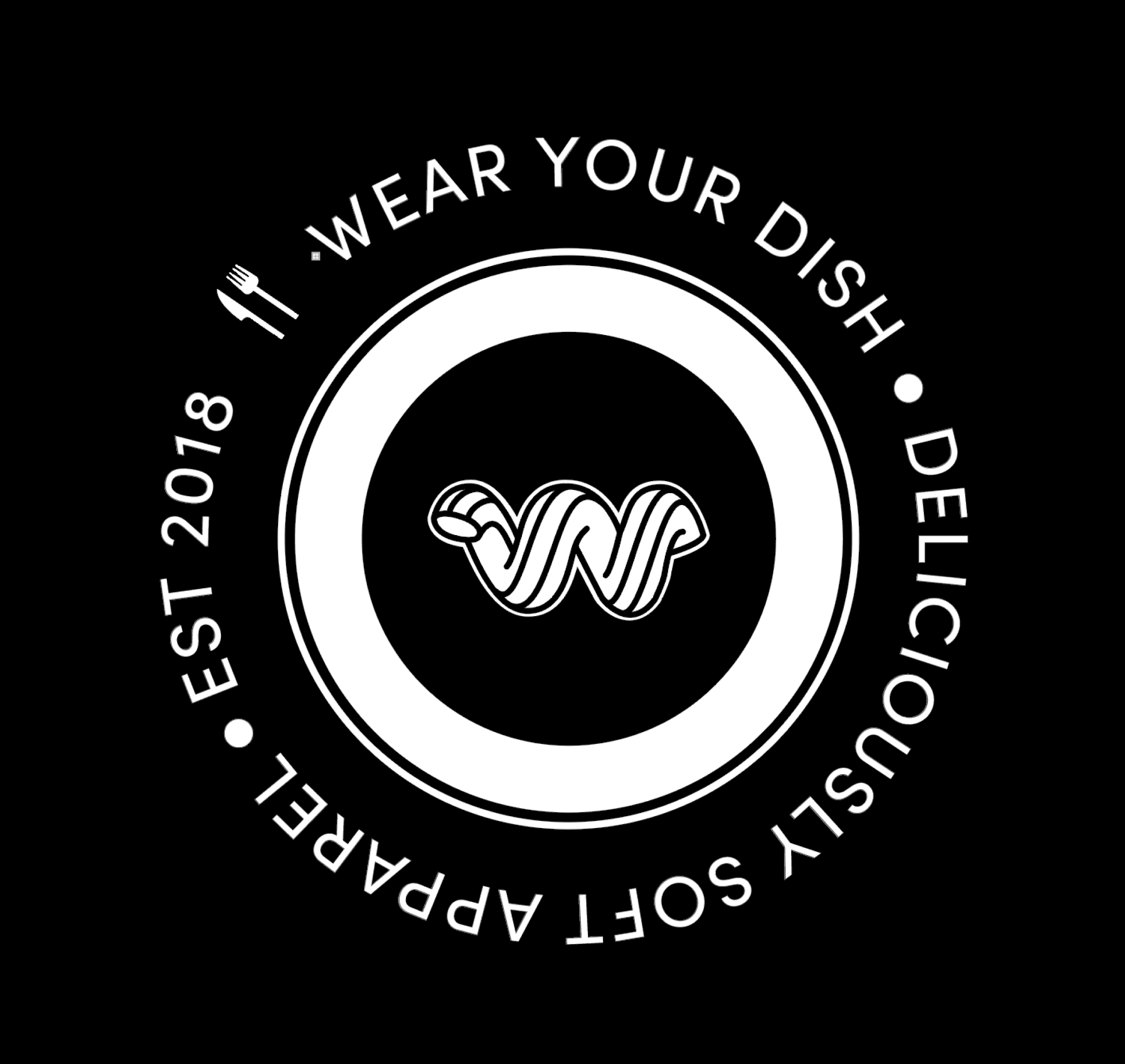
The clear favorite for all three owners was the Noodle. We decided that in its final version, the Noodle should have a more obvious “W” shape.
Creating a Noodle with the negative space to connote the W letterform while still retaining a roundedness posed a fun challenge.
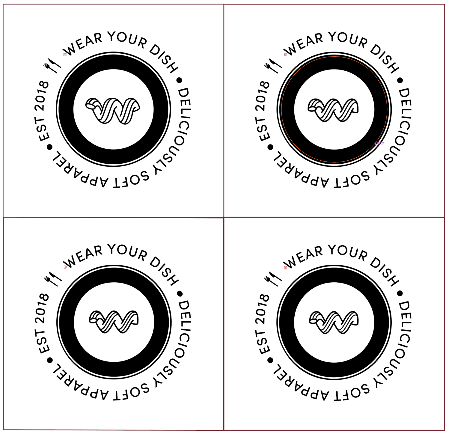
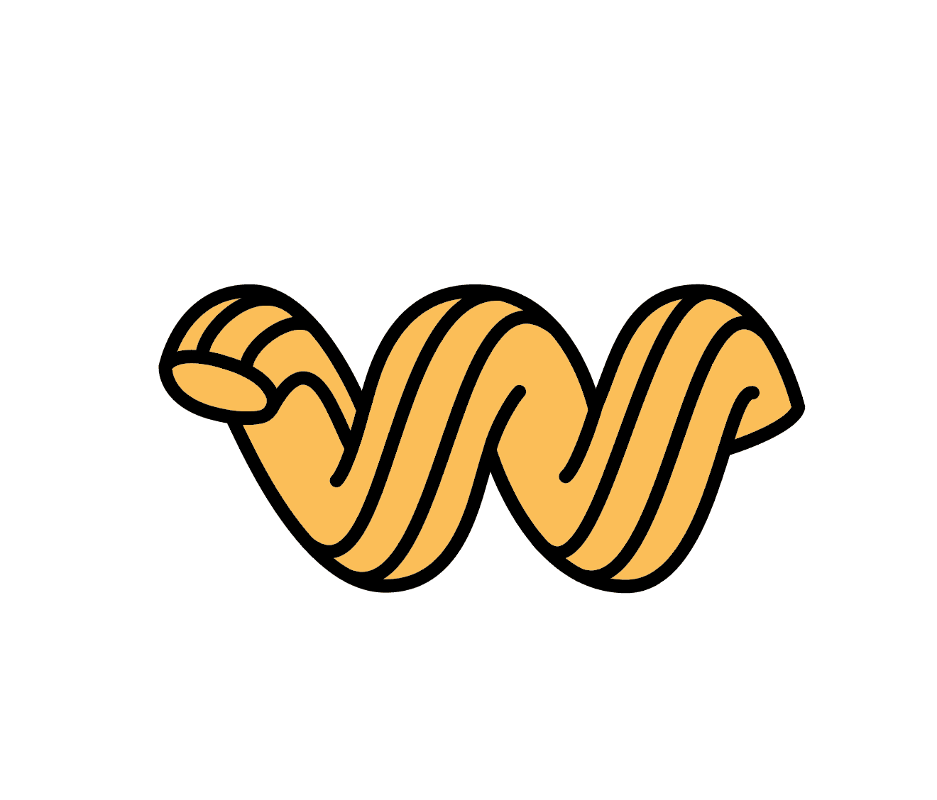
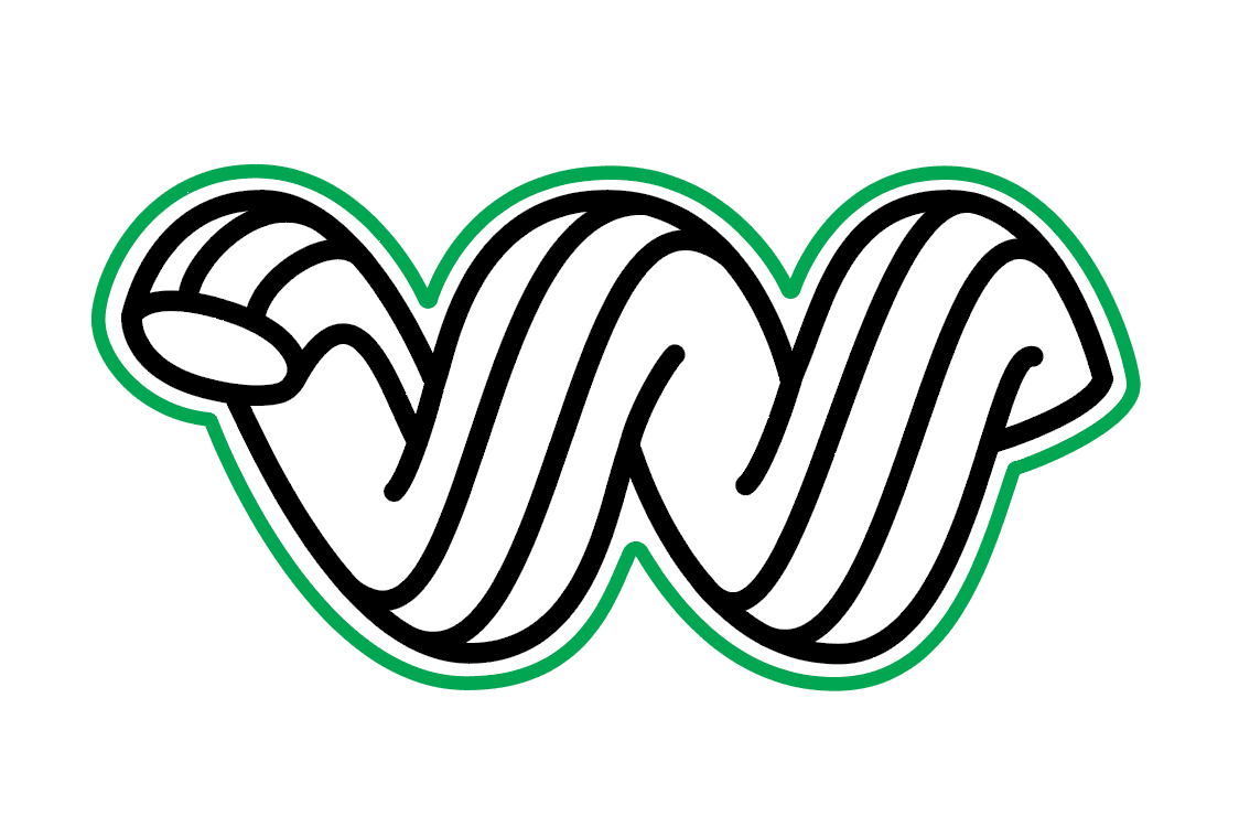
After a few rounds of revisions, we landed on a final design with a stronger helical form and obvious “W” form, with consistent angles and curves.
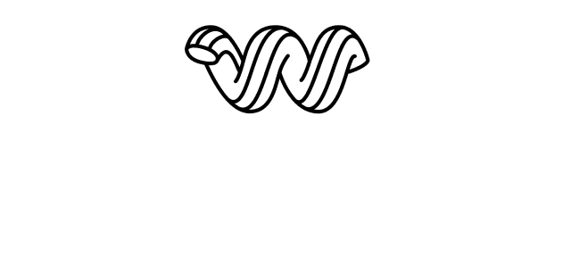
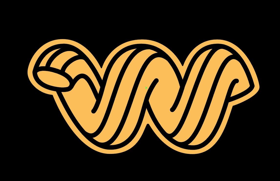
For dark backgrounds, the logo is outlined rather than inverted to preserve its bright noodle qualities.

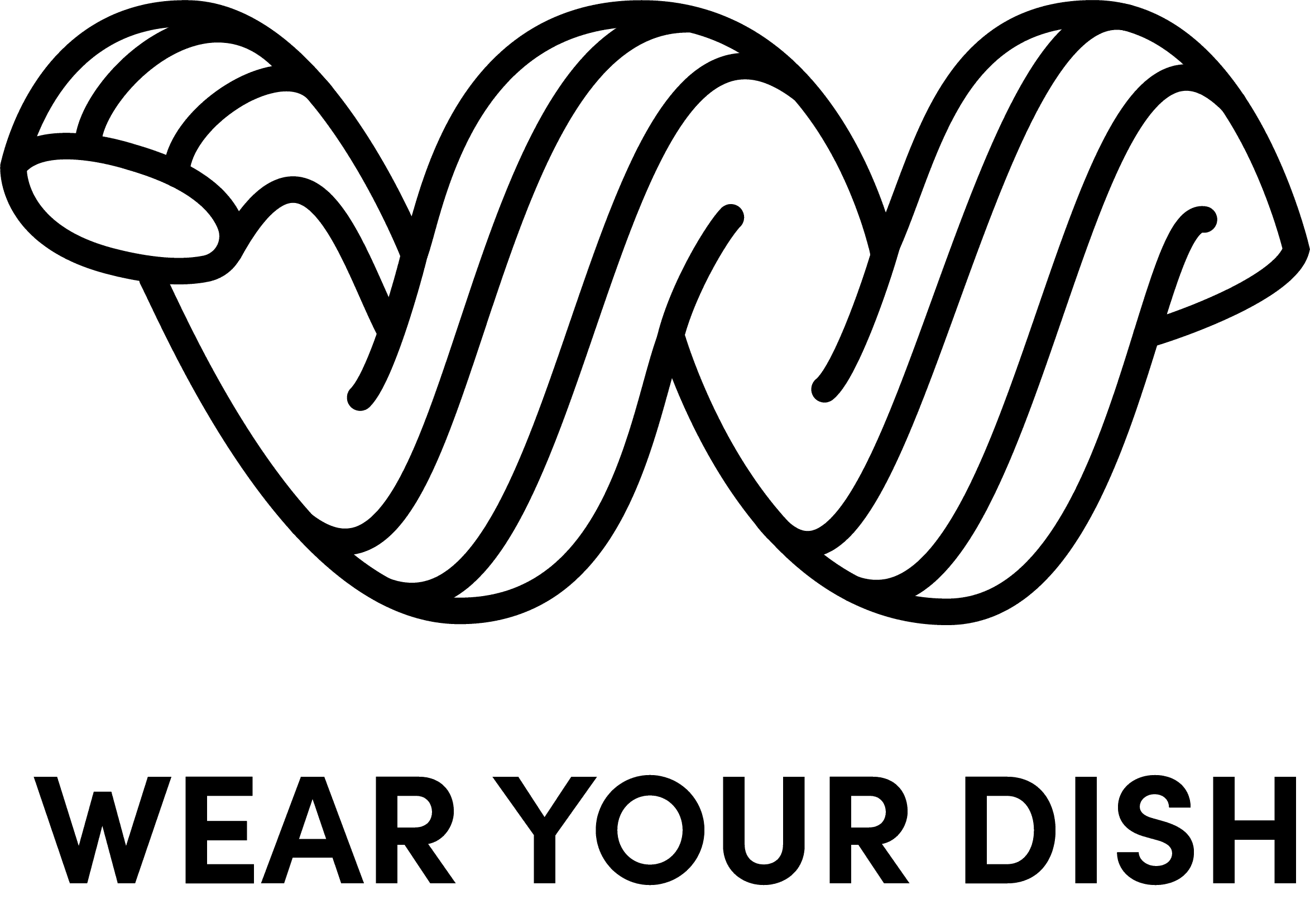
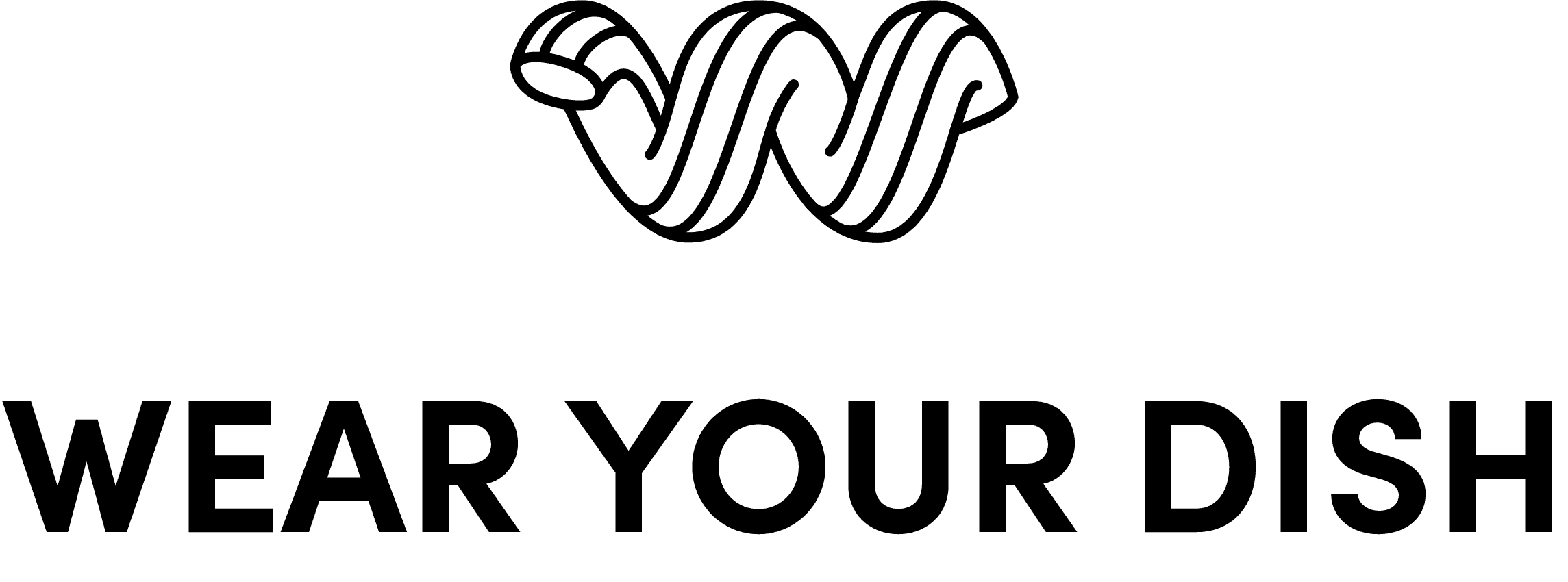
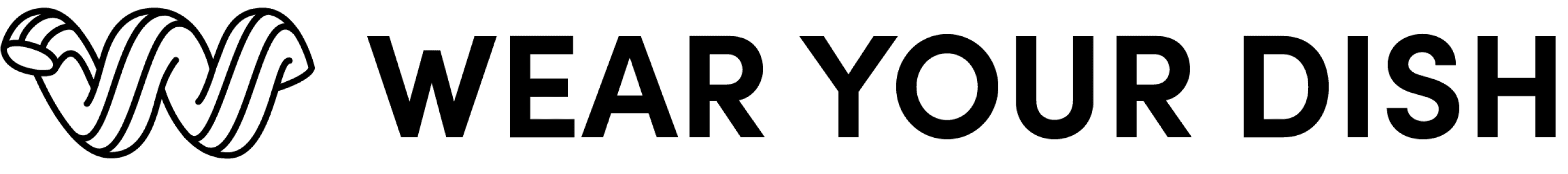
The full logo lockup pairs the Noodle with Sofia Pro type in all caps.
The luxe wordmark, inspired by minimalist fragrance houses, complements the absurdity of the logomark, balancing premium and funky vibes.
2x
X
X
3x
X
X
X
X
.5x
3x
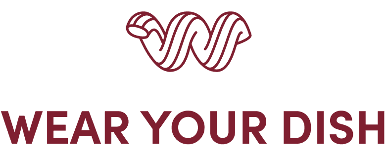
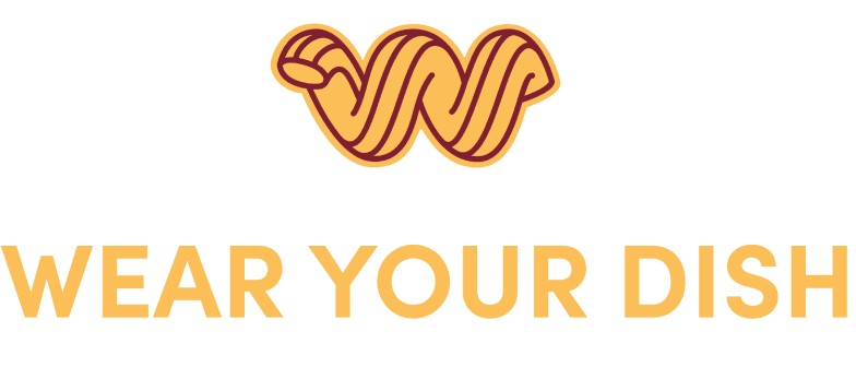
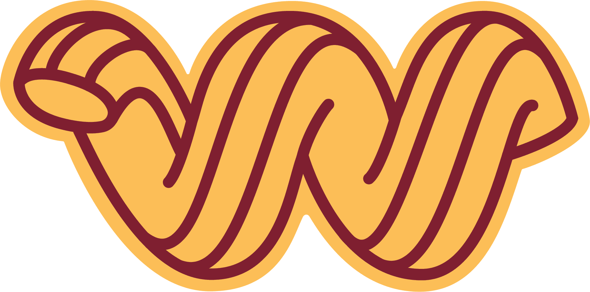
I created the colors American and Bolognese to round out the WYD color palette.
black on white
white on black
White
Hex #FFFFFF
Black
Bolognese
Hex #000000
Hex #FCBE57
Hex #7F1F30
red on yellow
yellow on red
pair
pair
American
I fleshed out the brand guidelines for web handoff and merch implementation, discouraging common implementation problems with color contrast and inverted logos.

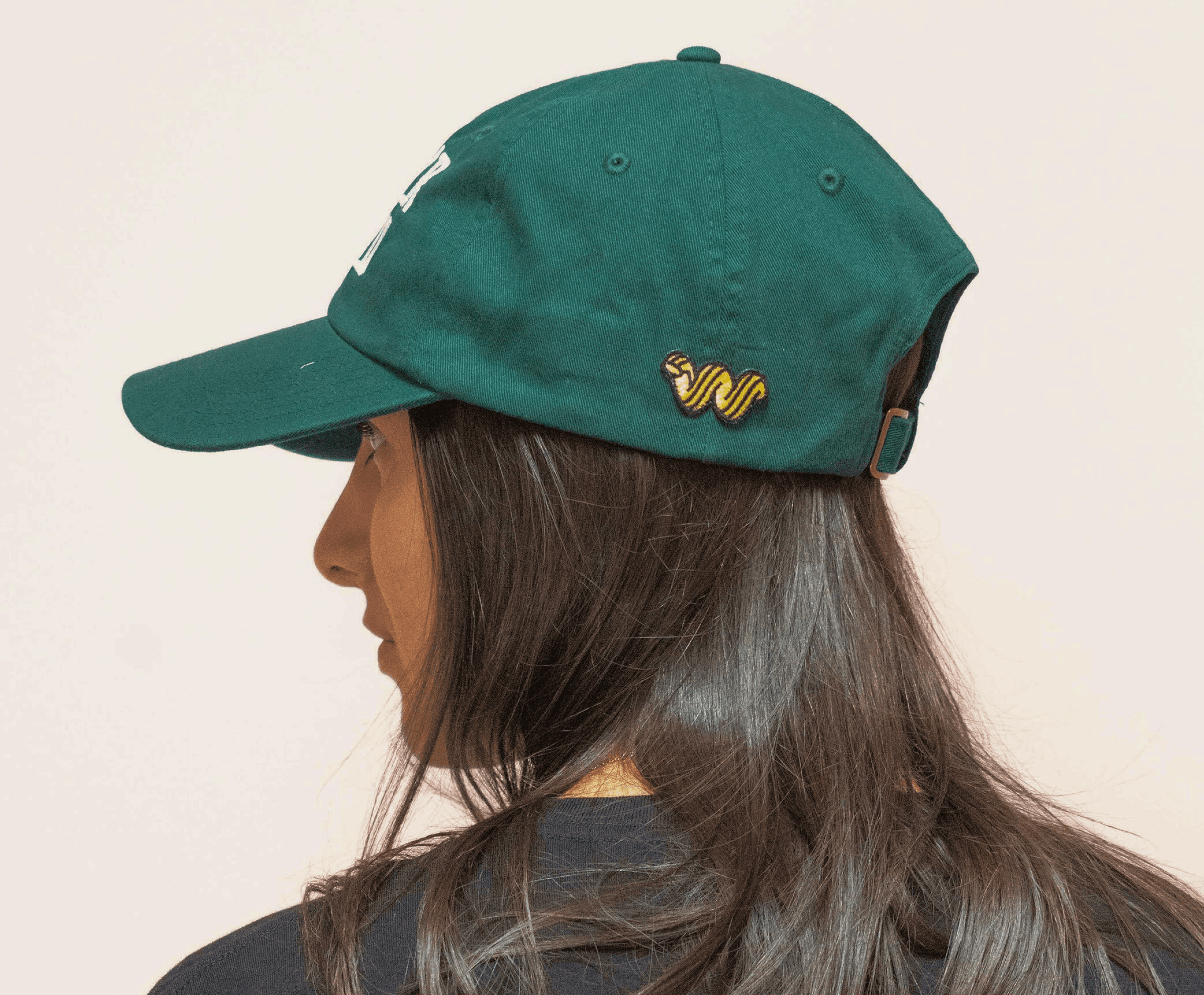
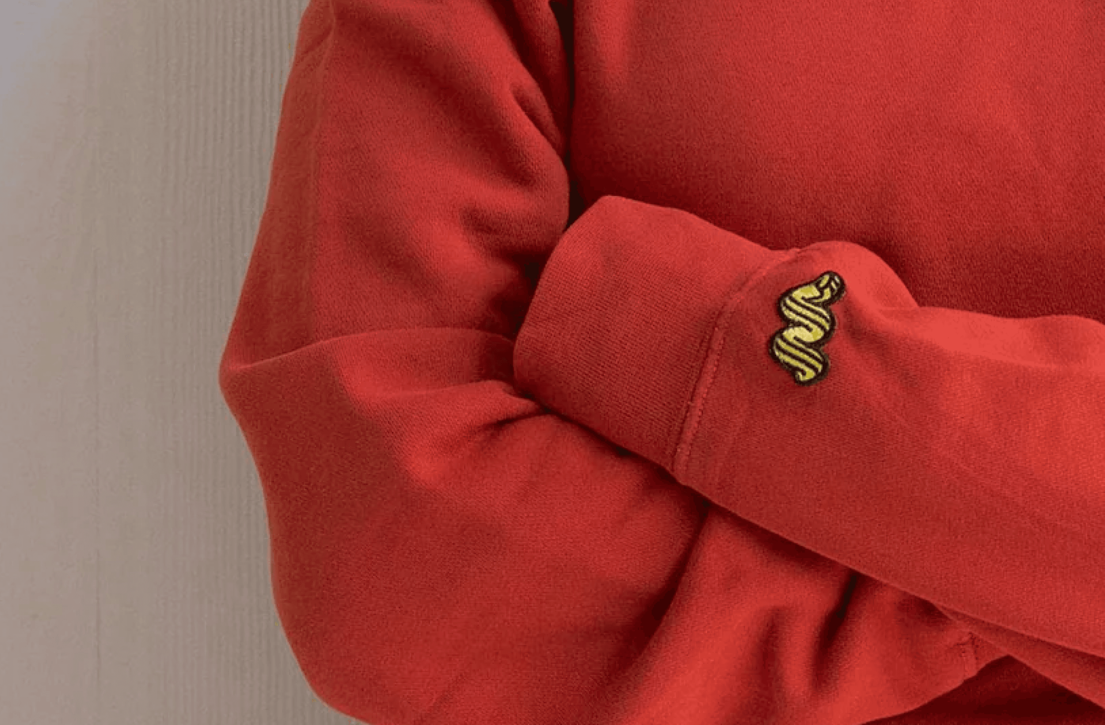
I encouraged the guys to experiment with color on plain backgrounds. They gravitated toward an American Noodle, which you can find on sweatshirts, hats, and tees.