Launching a tracking app of our own.
THE CHALLENGE
Design a best in class tracking app that two engineers can build quickly and inexpensively.
Context
Route’s mobile team was laid off at the beginning of 2025. Finding it difficult to say goodbye to our dream of creating the best tracking app, we decided to team up to launch an app of our own.
Strategy
Most tracking apps fail at their basic mission: making it easy to organize upcoming and recently delivered orders. We would position Zephyr as a simpler, more pared down tracker.
My role
Research
Strategy
Brand identity
Design system
UI/UX/Motion
Design
Prototyping
Design
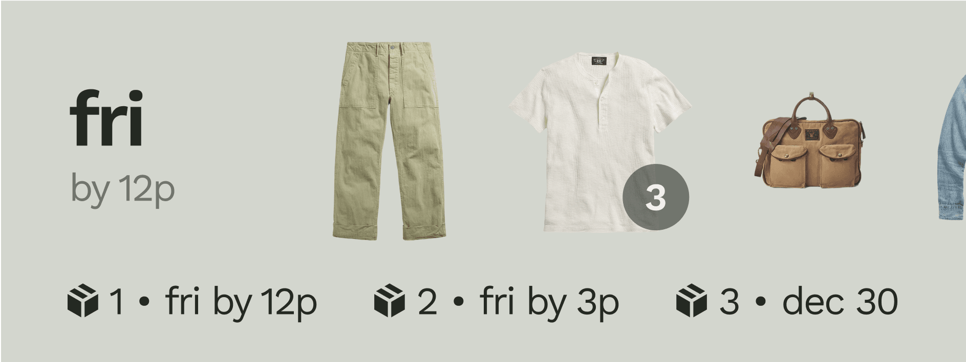
Powerful tracking that organizes and anticipates.
Delightfully automatic.
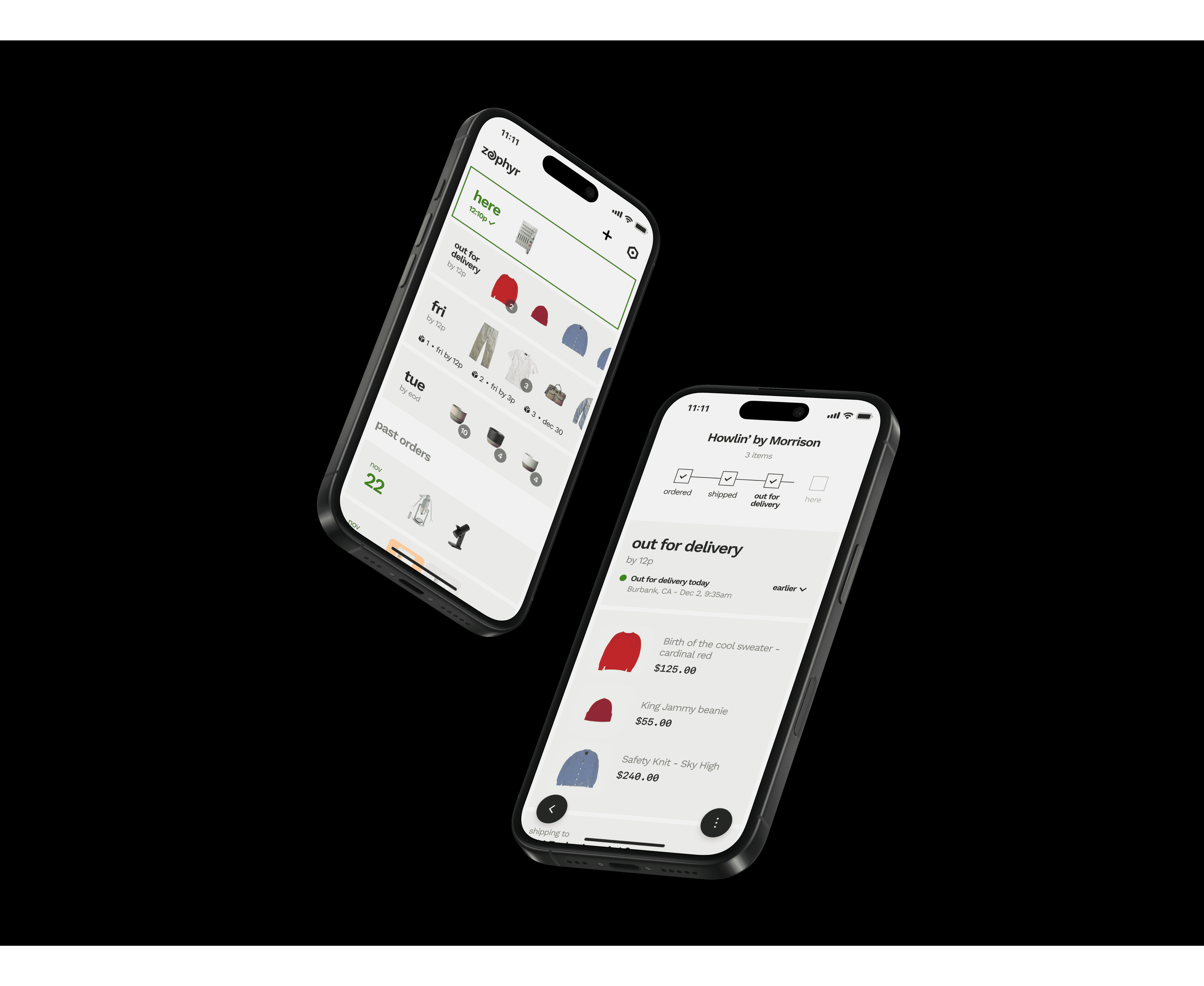
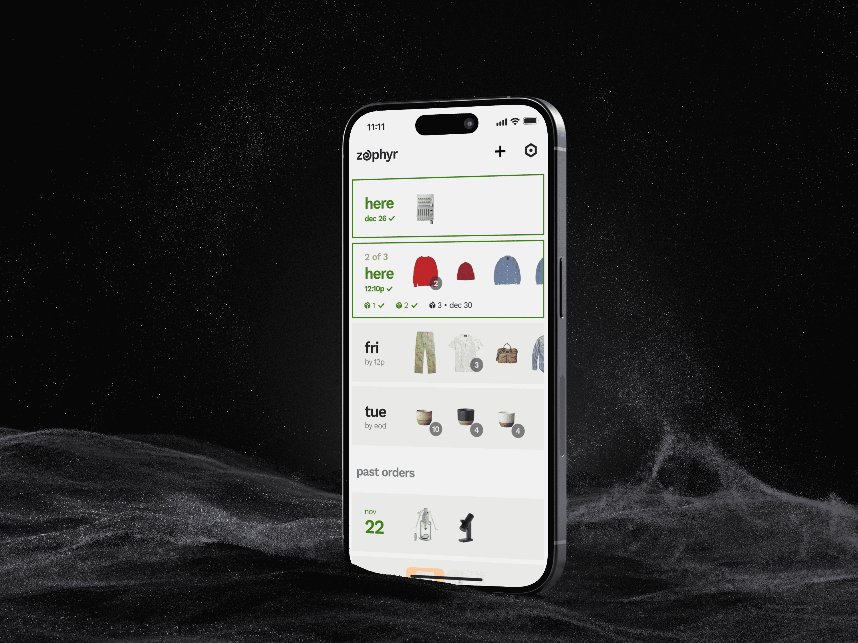
Zephyr creates a real time delivery list automatically, showing delivery dates and order contents without extra clutter.
Simple and convenient.
Zephyr shows a comprehensive tracking history and order contents, with floating buttons to jump back and forth to your list.
BRANDING
Zephyr is a divine wind that brings good fortune (and fast deliveries).
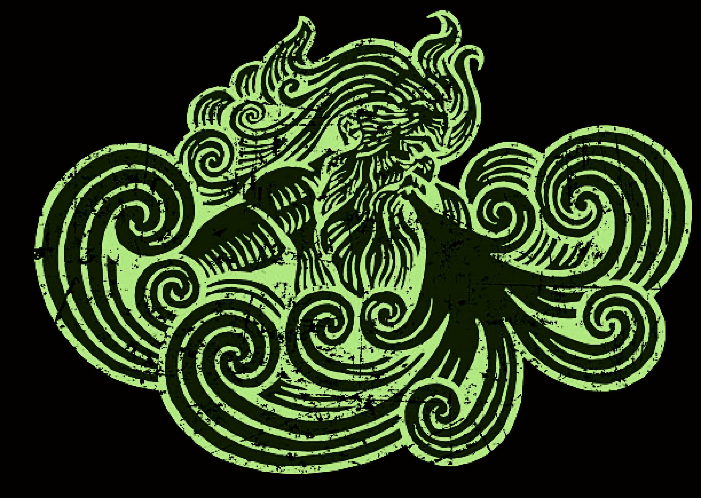
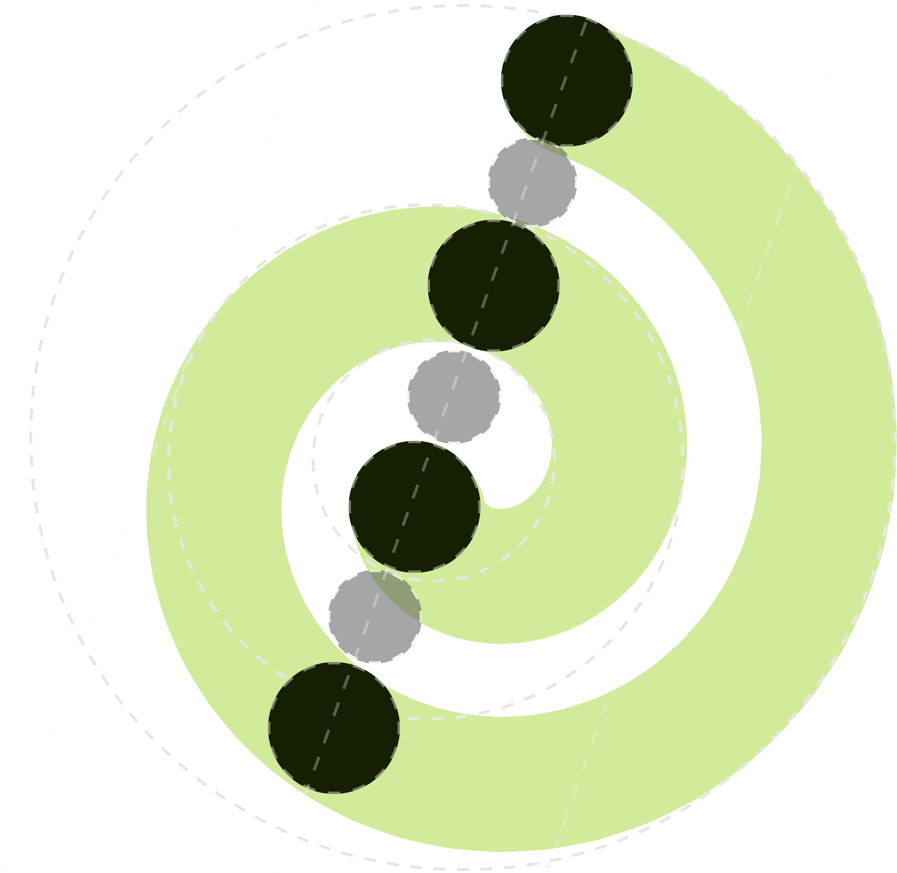
Zephyr’s logomark is a coiling spiral, evoking the swirling motif associated with the mythical Zephyr.
The spiral is created by overlapping concentric circles multiplied by the golden ratio, tiled along a 23.5 degree axis, mirroring the Earth’s alignment.
The full logo replaces the “e” of the wordmark with the zephyr logomark, suggesting a casual but transformative experience.
THE DETAILS
Creating the simplest tracker in the game.
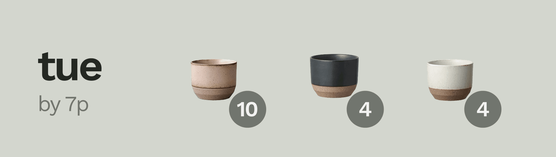
What’s in an order, anyway?
After much research and prototyping, we aggressively pared down the contents of an order in the list view. Controversially, we removed brand, logo, status, and progress bar - leaving only an ETA and all item contents, in a swipable carousel.
No other tracking apps show you all the items in your order on your tracking list. Instead, they indicate the order by showing one item image or a mosaic of tiny images. This is pretty frustrating, since users rarely remember the full contents of an order. And it’s a missed opportunity, since we all get enormous delight out of seeing pictures of everything arriving soon.
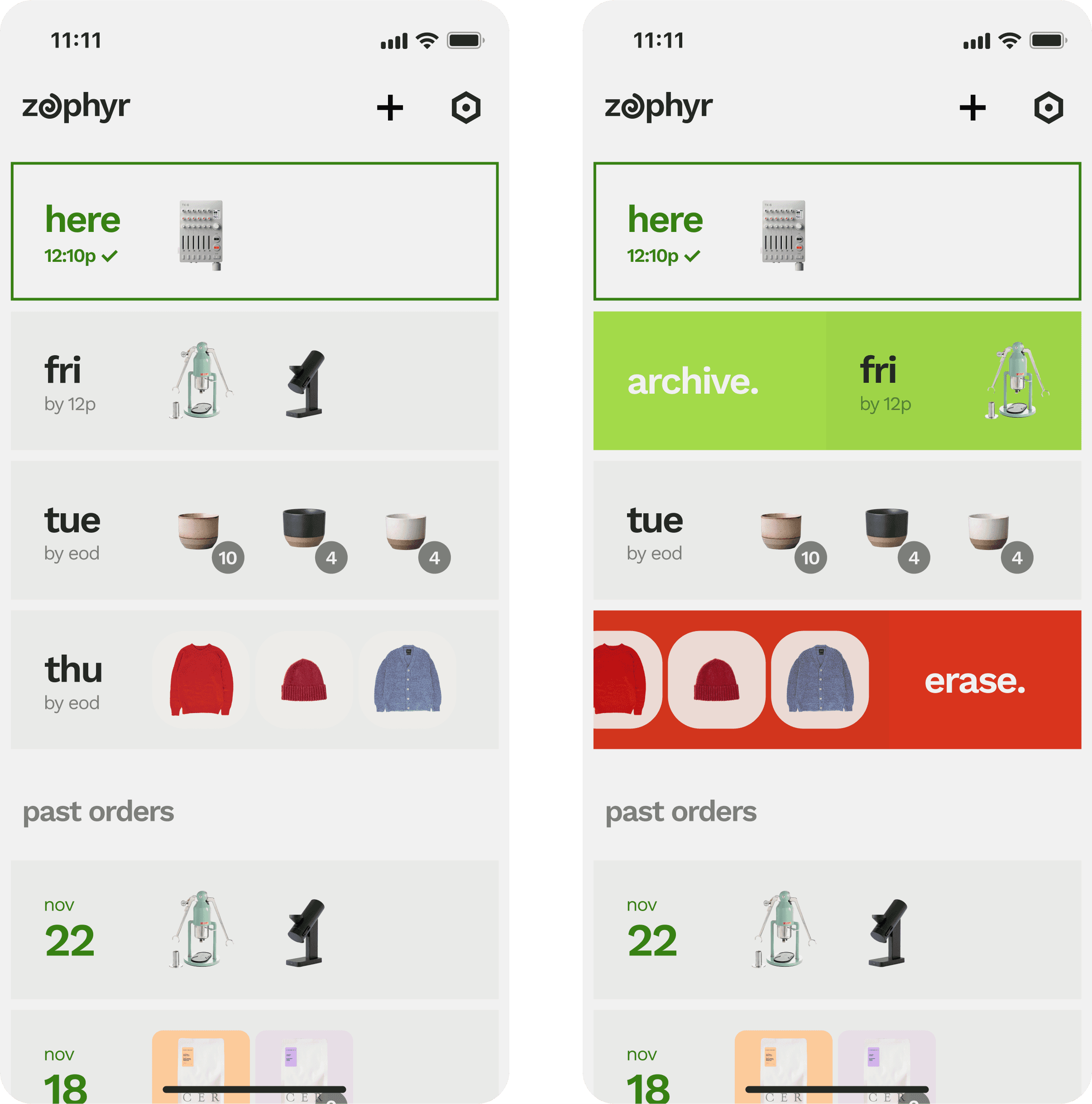
Cleaning up messy tracking
We avoid clogged tracking lists with a fluid evolution for problematic orders, which are archived automatically when inactive for extended periods of time, and then shuffled right back into the tracker when they update again.
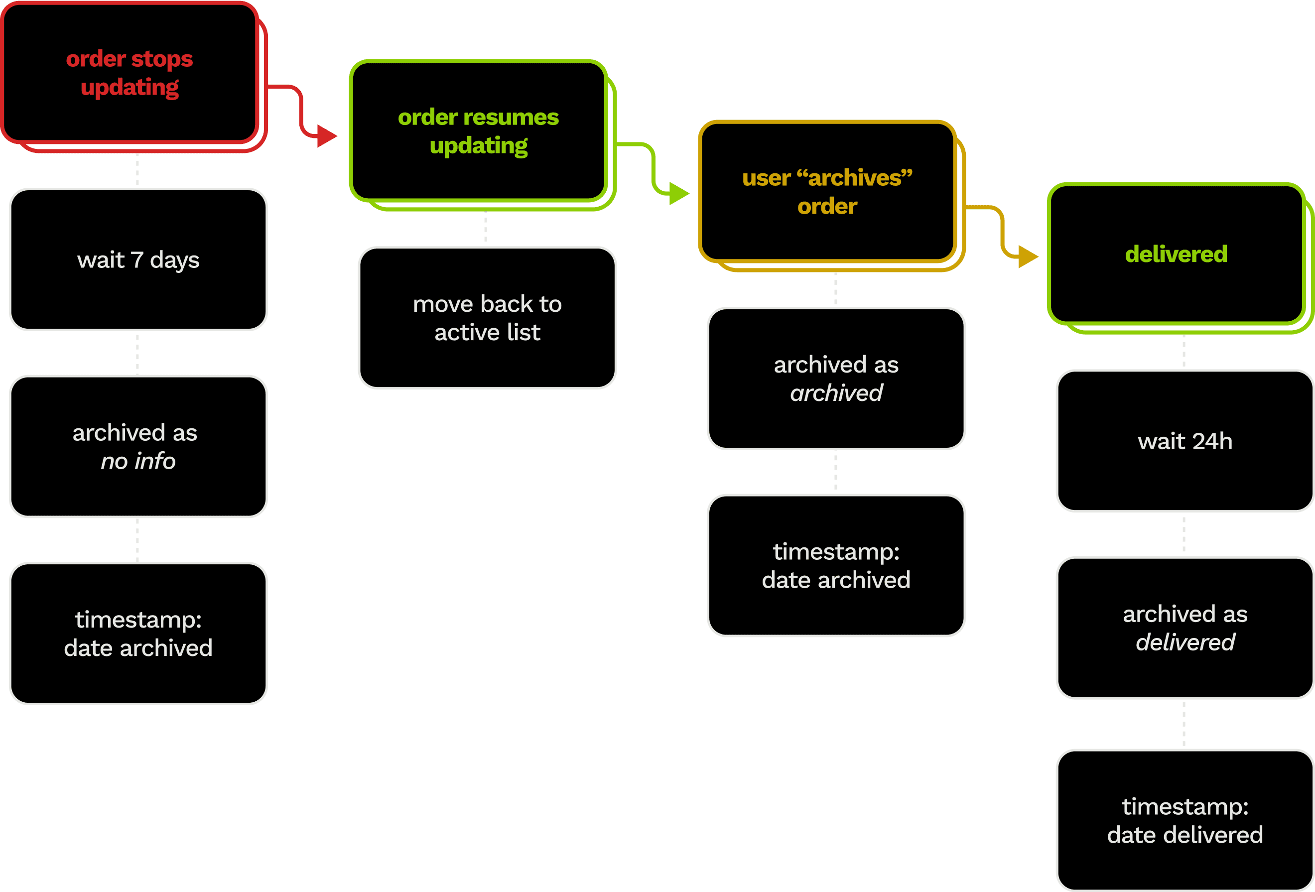
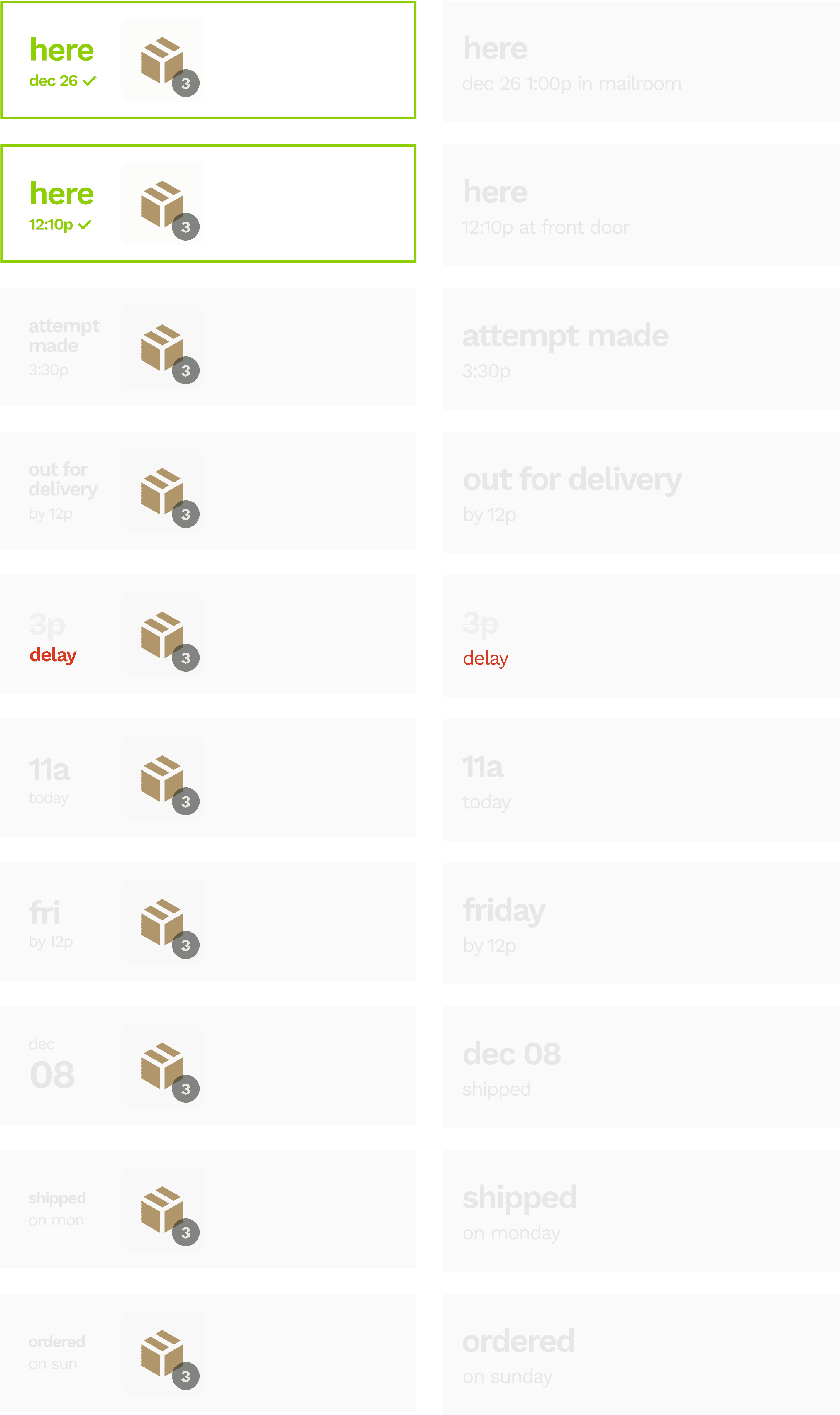
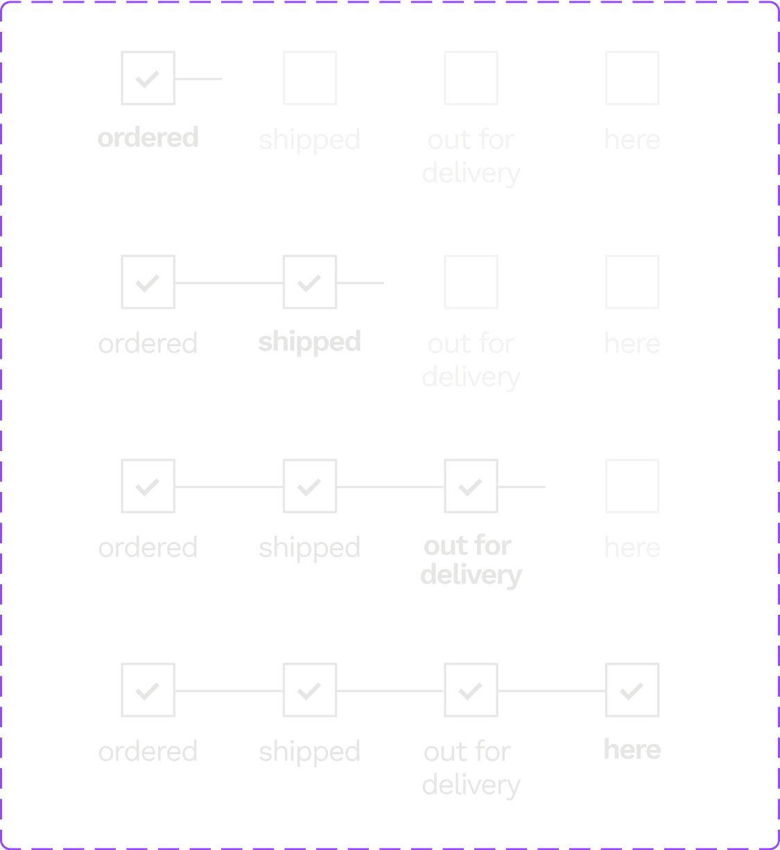
Fluid statuses
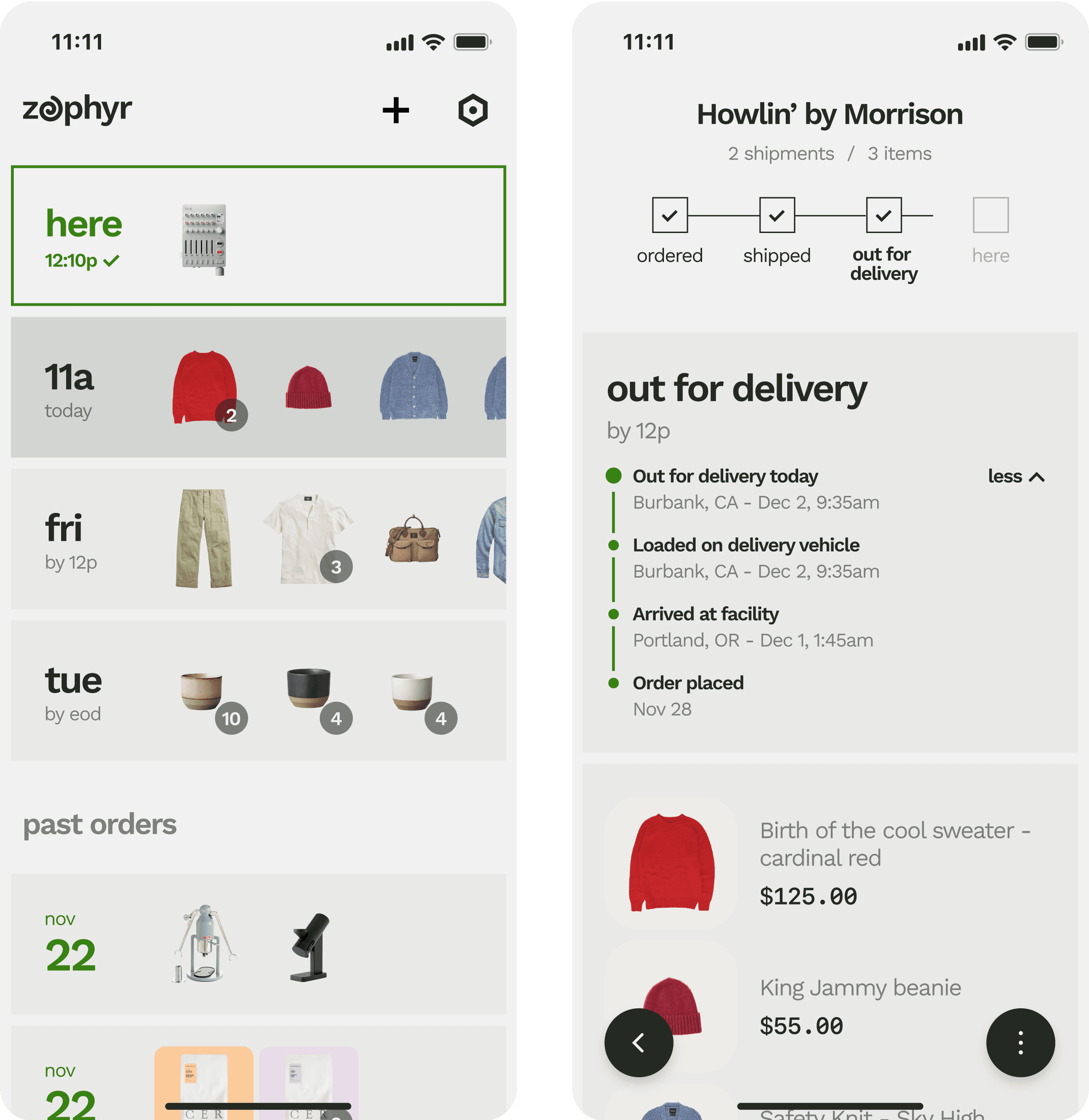
Zephyr accommodates the messy complexity of deliveries - especially deliveries with multiple shipments.
Complex statuses
We built a status system that would accommodate plenty of complexity without feeling complicated. On the left are statuses as seen on the tracking list, compressed to fit item images; on the right is the same status on the order summary page.
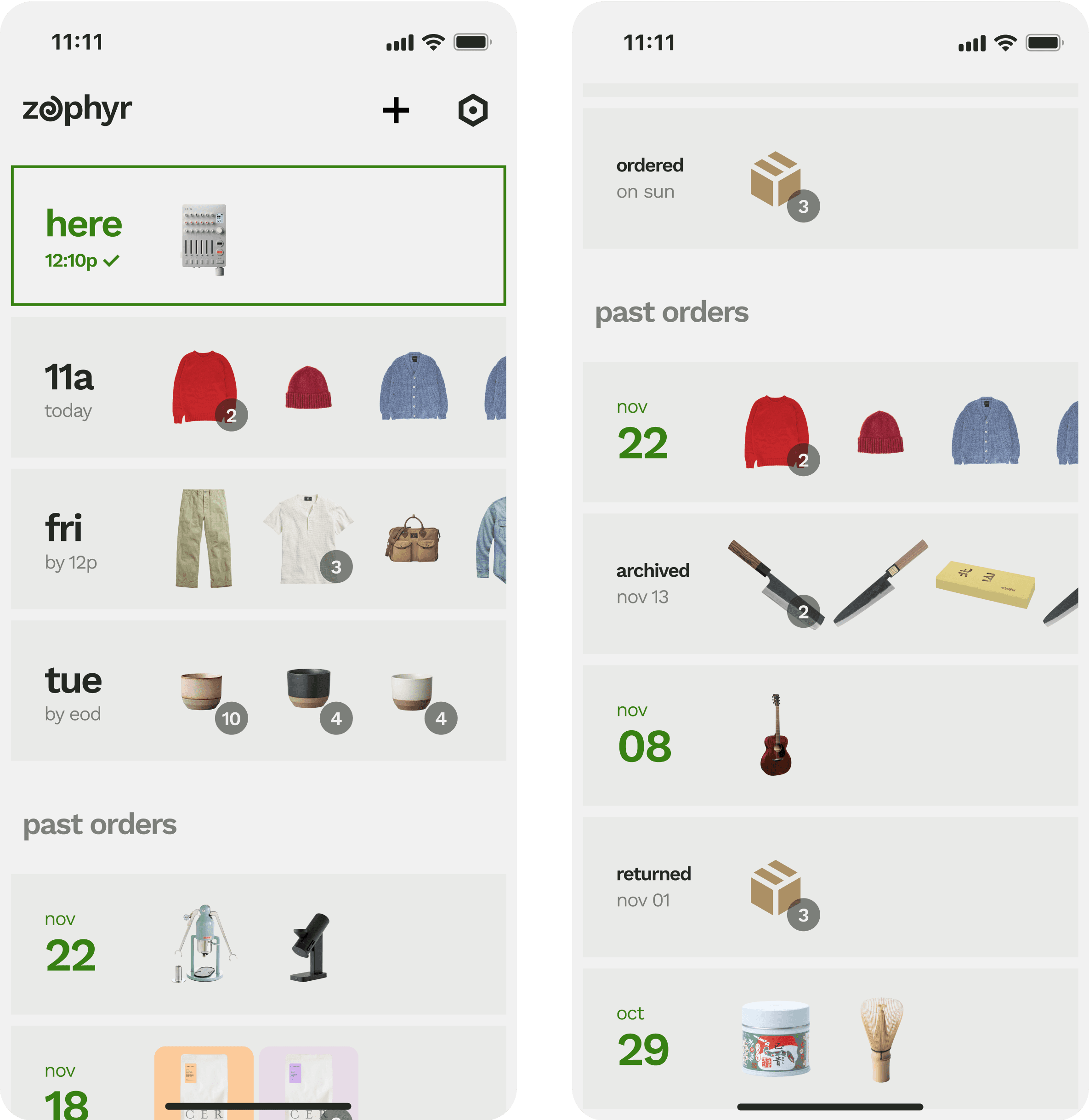
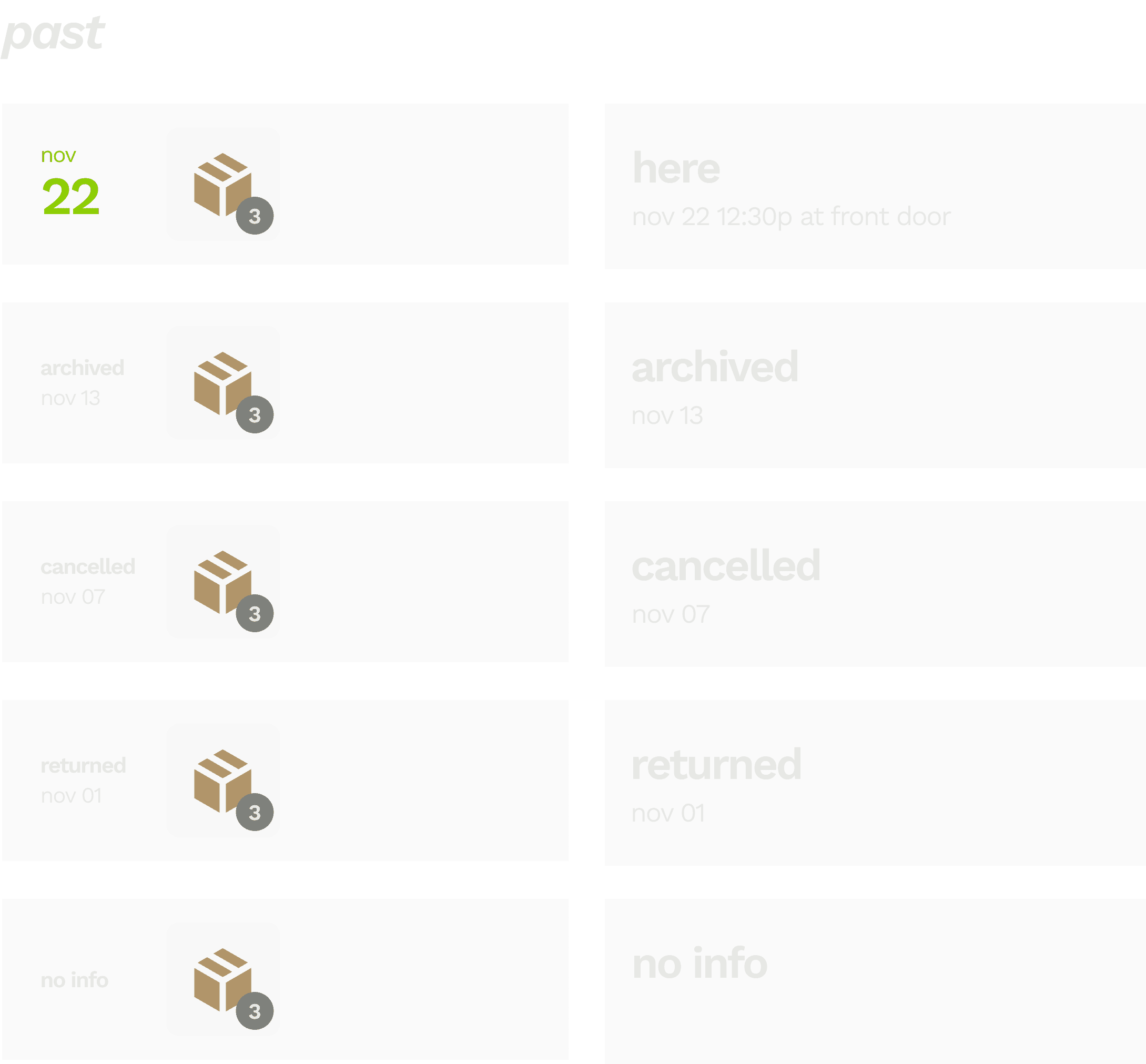
Past order ecosystem
We wanted to assign past orders a single status that users could scan to inform actions, like looking to see if an order was successfully returned, or if a backordered item that the user chose to archive ever finally arrived.
REVISITING OLD CHALLENGES
Two problems plagued us at Route. We finally knew how to solve them.
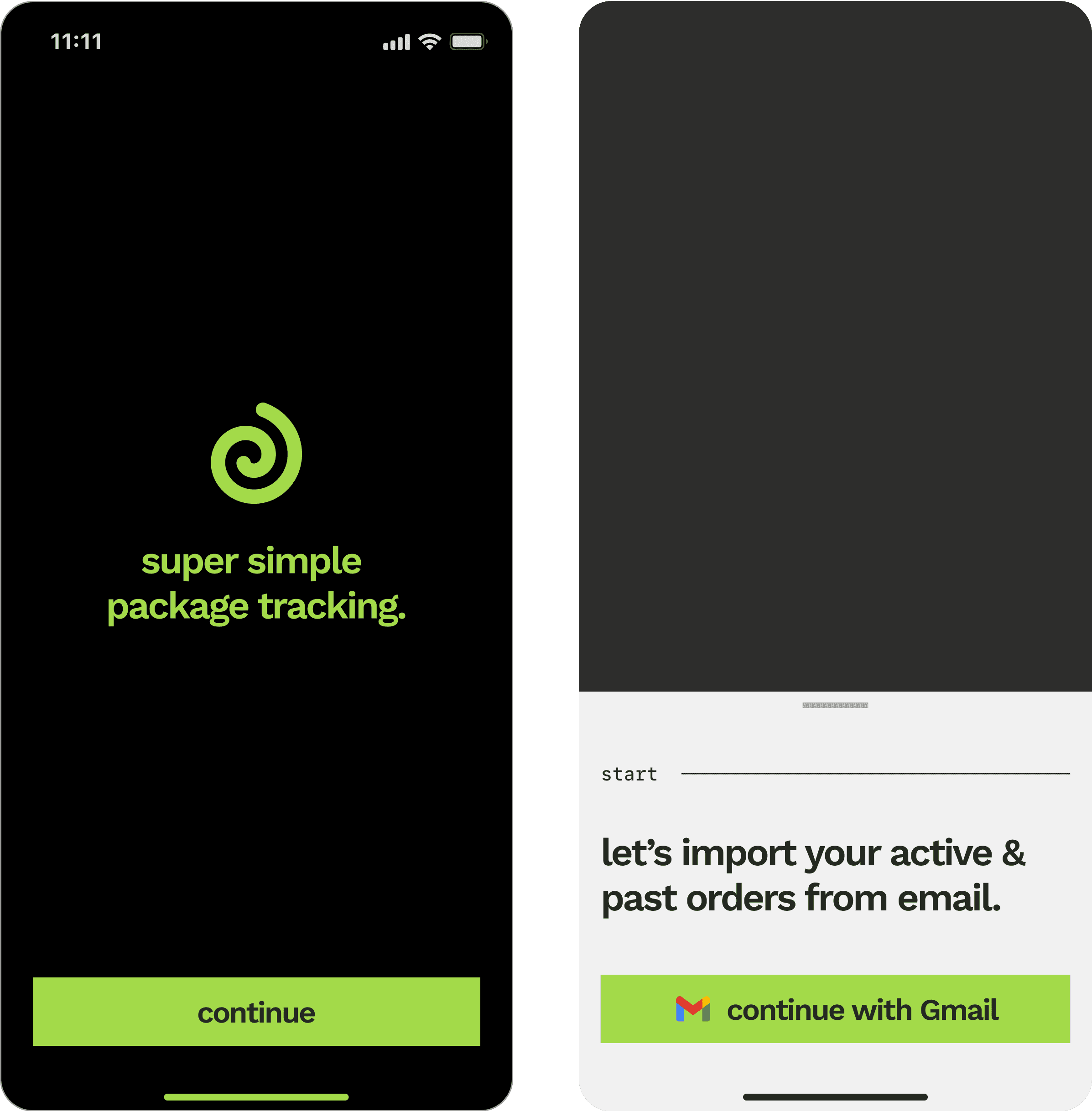
Fixing an onboarding problem
A user is required to connect an email to begin using the app, which cues up an aha moment when orders automatically import. Most apps are afraid to make parsing a requirement, which leads users to skipping it and then getting confused why the app isn’t detecting their packages.
Fixing multi-shipment orders
Orders with more than 1 shipment make up 10-15% of a user’s orders, but it’s surprisingly challenging to cohesively group this information. After much exploration I found a satisfying paradigm in a secondary carousel summarizing each of the numbered shipments.
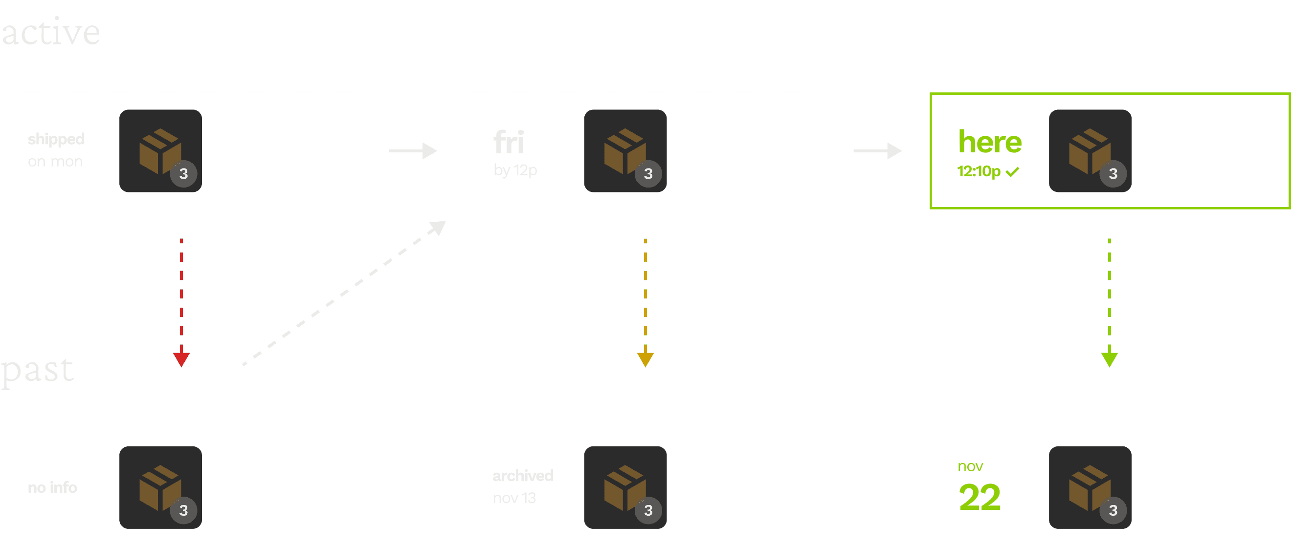
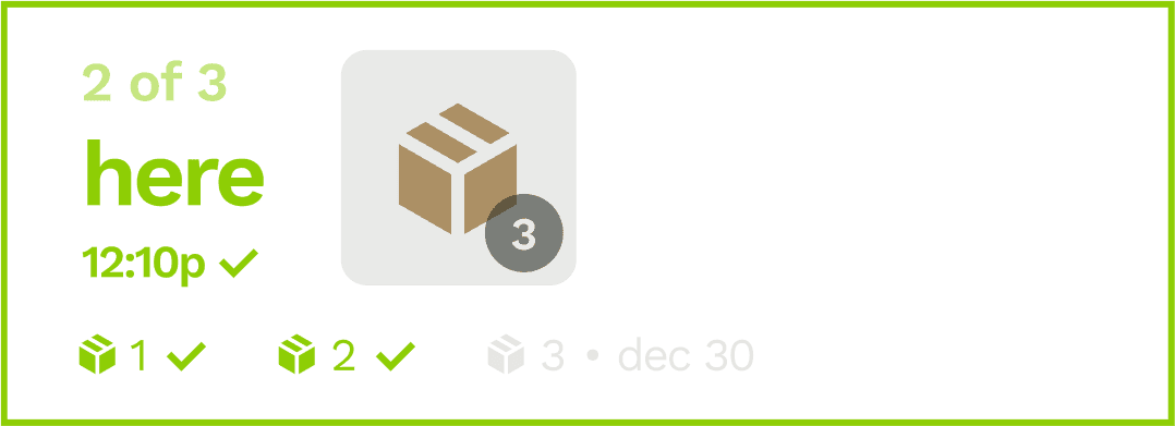
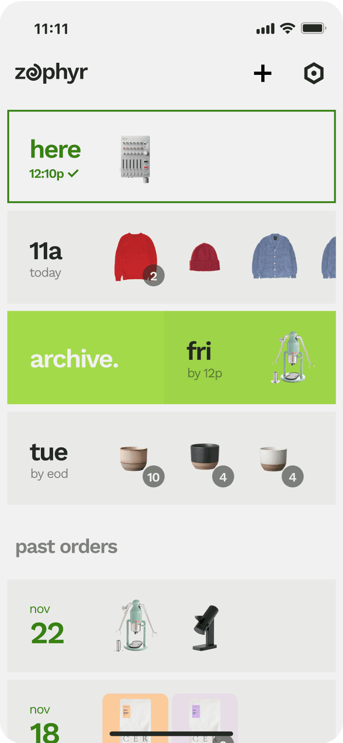
Partially delivered orders
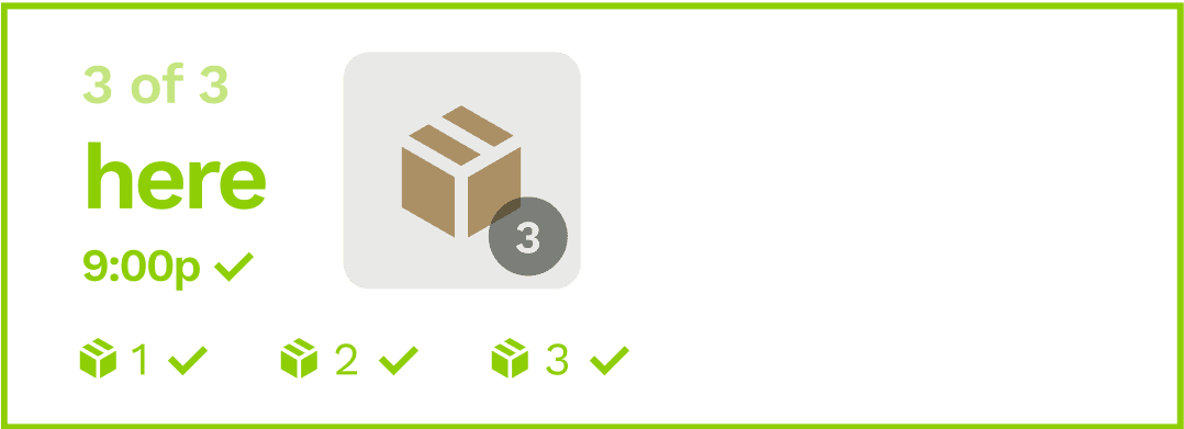
It was important to us to make delivered orders really stand out, so we could properly celebrate each “delivery day”. That created a challenge to build a mini-ecosystem of these multi-shipment orders across stages of completeness.
an order arrives (“partial delivery”)
the status “here - 12:10p” shows the timing of the most recent delivery.
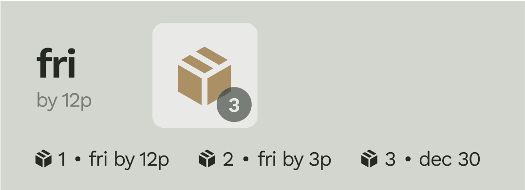
shipments are in transit and none have arrived.
the status e.g. “out for delivery” corresponds to the shipment arriving first (shipment #1)
the bottom thumbnails are sorted left to right by arrival. the assigned numbers (shipment #1, e.g.) can change constantly
24h later the order is archived to past orders, showing the date the first shipment arrived.

if there are no new updates for 7d, the order is archived to past orders as a delivered order (date = 1st arrival)
all orders arrive (“complete delivery”)
FACILITATING INTERACTIVITY
A great utility is pleasing to touch. Interactivity was an opportunity.
Modals & menus
Modals and menus are the heart of interactivity, but they can often feel like an imposition on the user. Zephyr uses huge type and sharp, funky lines to encourage touch and playfulness.
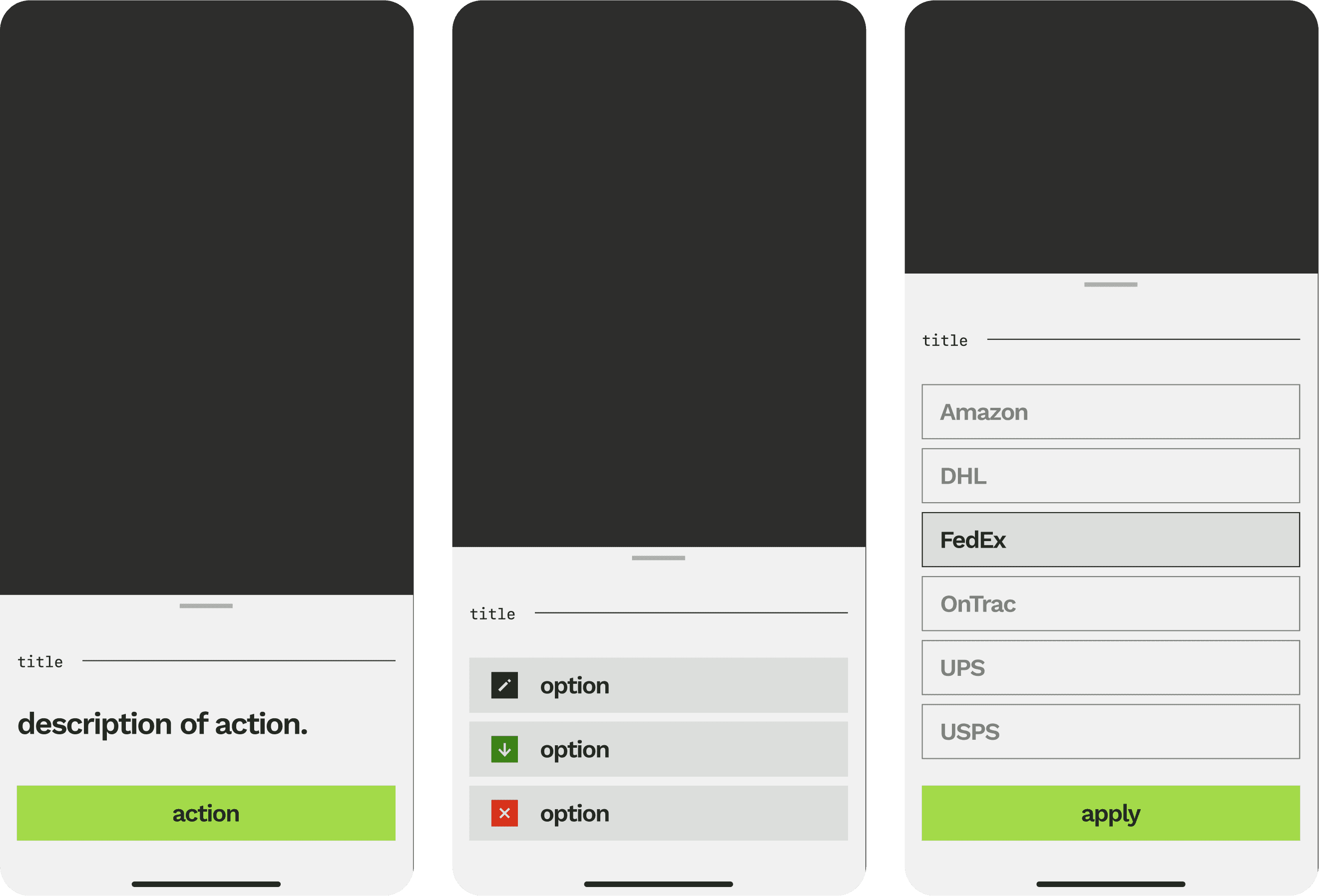
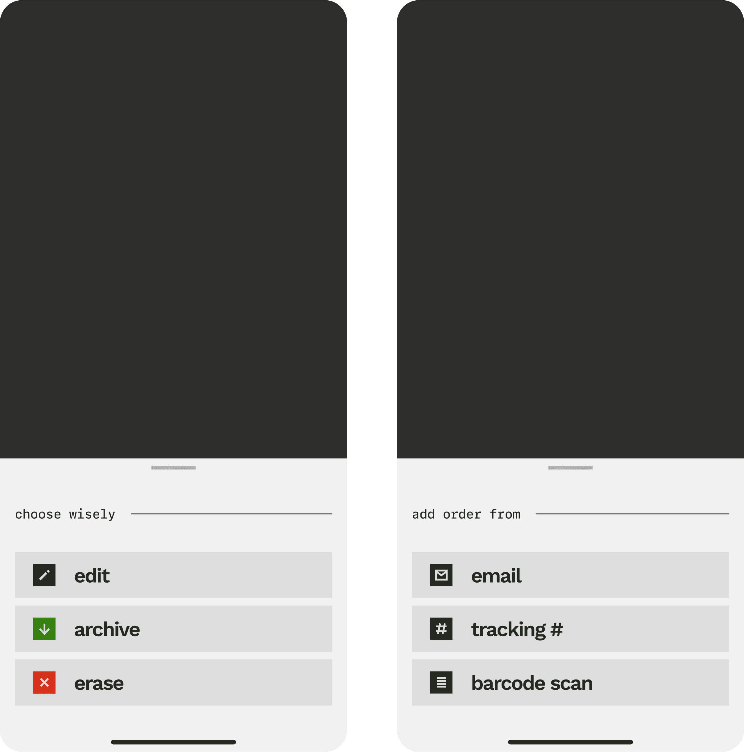
Archiving & erasing
I wanted swipe actions to be fluid and bold, borderline aggressive. Archiving allows users to hide unimportant or backordered orders in past orders, while erasing orders eliminates them.
IDENTITY & DESIGN SYSTEM
An edgy, silly identity for an utilitarian app.
grease
#242922
haze
#C5C6C5
chalk
#F1F1F1
lime
#A3DA49
seaweed
#378113
Hazy grays, crazy greens.
I was inspired by Dieter Rams, whose iconic objects paired aggressive accents with dull, to create a primarily low-contrast palette of creamy grays and beiges that evokes the feeling of old analog interfaces. Green is the color of delivered statuses and had practical benefits; an electric green felt appropriate but also surprising on the muted, brutalist vibe I was going for.
Brutalism, or something like it.
After a few years as a designer, I tend to like designs that showcase the qualities of the digital medium rather than hide behind skeumorphic disguises. If our goal is to foster tangible interactivity, I have a feeling that our users yearn for a return away from luxury toward the brutal and original digital existence found in classic type and hard lines.
Cafelat robot
$385.00
Birth of the cool sweater
$125.00
light
tertiary
#F1F1F1, 33%
button
#F1F1F1, 15%
secondary
#F1F1F1, 56%
primary
#F1F1F1
dark
secondary
#242922, 56%
tertiary
#242922, 30%
button
#242922, 10%
primary
#242922
card
#294716, 4%
accents
lime
#A3DA49
seaweed
#378113
blue
#1E93FF
light gray
#E9EAE8
red
#D61A00
medium gray
#C5C6C5
Retro icons
Zephyr’s icon design system is inspired by old telephone buttons, which added a tactile, chunky brutalism to the interface.
action
undo
connecting...
undo
action
we messed up.
try again
Toasts
I wanted Zephyr’s molecules to feel loud and clean. My design mentors would cover their eyes if they saw this sacriligeous use of oversized type and egregiously chunky icons, a theme I adopted across the design system.
T1
semibold, 34pt, -5%, auto ln height
T3
semibold, 22pt, -5%, auto ln height
T2
semibold, 28pt, -5%, auto ln height
L1
semibold, 17pt, -5%, 100% ln height
B1
regular, 17pt, -5%, auto ln height
B2
regular, 14pt, -5%, auto ln height
B3
medium, 12pt, -5%, auto ln height
L2
semibold, 14pt, -5%, 100% ln height
M1
M2
SF Mono semibold, 18pt, -7% leading, auto ln height
SF Mono medium, 14pt, -7% leading, auto ln height
L3
semibold, 12pt, -2%, auto height
Sans + mono
To complete the vision of a brutalist utility I just had to run with a great sans serif type like Work Sans, tracked in until almost bleeding together. I sprinkled in touches of a mono type for accents to give a rough, stylized vibe.
Bold and efficient voice
Zephyr speaks how I thinks apps ought to speak - with crazy efficiency and a healthy sprinkling of bits. If there was an opportunity for a little moment of joy within the tracking journey, I couldn’t help but indulge.